Key takeaways
- Format: Feature callouts shown as UI-style tone chips under a question hook.
- Best for: SaaS and productivity tools with an abstract benefit that needs to look tangible.
- Hook: A self-doubt question every office worker has asked before hitting send.
- Reuse it: Swap the tone chips for your product's own outputs, labels or modes.
Available sizes
What is a feature callout ad?
A feature callout ad is a static image that shows a single product with short text labels pointing to its key features or benefits, usually joined to the product by thin lines. It explains several selling points at a glance without a long caption, which is why it's common for supplements, skincare, electronics and kitchenware.
See all feature callouts ads →Why this feature callouts ad works
- 01
Relatable self-doubt
The question taps a quiet workplace anxiety about being misread. Viewers answer it in their head, which pulls them into the ad.
- 02
Product shown, not explained
The tone chips mirror what the tool actually returns. It demonstrates the feature without a single line of explanation.
- 03
Interface cues
The white card and blinking cursor look like a text field. It feels native to where the product is used.
- 04
Low-risk CTA
Try for FREE removes the price barrier. The bright mustard button is the only saturated colour, so the eye lands on it.
Full creative breakdown
Who this ad targets
Knowledge workers who write a lot of Slack messages, emails and team updates: managers, remote employees, non-native English speakers and early-career professionals who worry about sounding too blunt or too timid. The team framing points at people writing to colleagues rather than students. It suits cold prospecting on Meta and LinkedIn to office workers aged roughly 22–50, and works well as a retargeting creative for visitors who saw the grammar features but not the tone feature.
Copywriting analysis
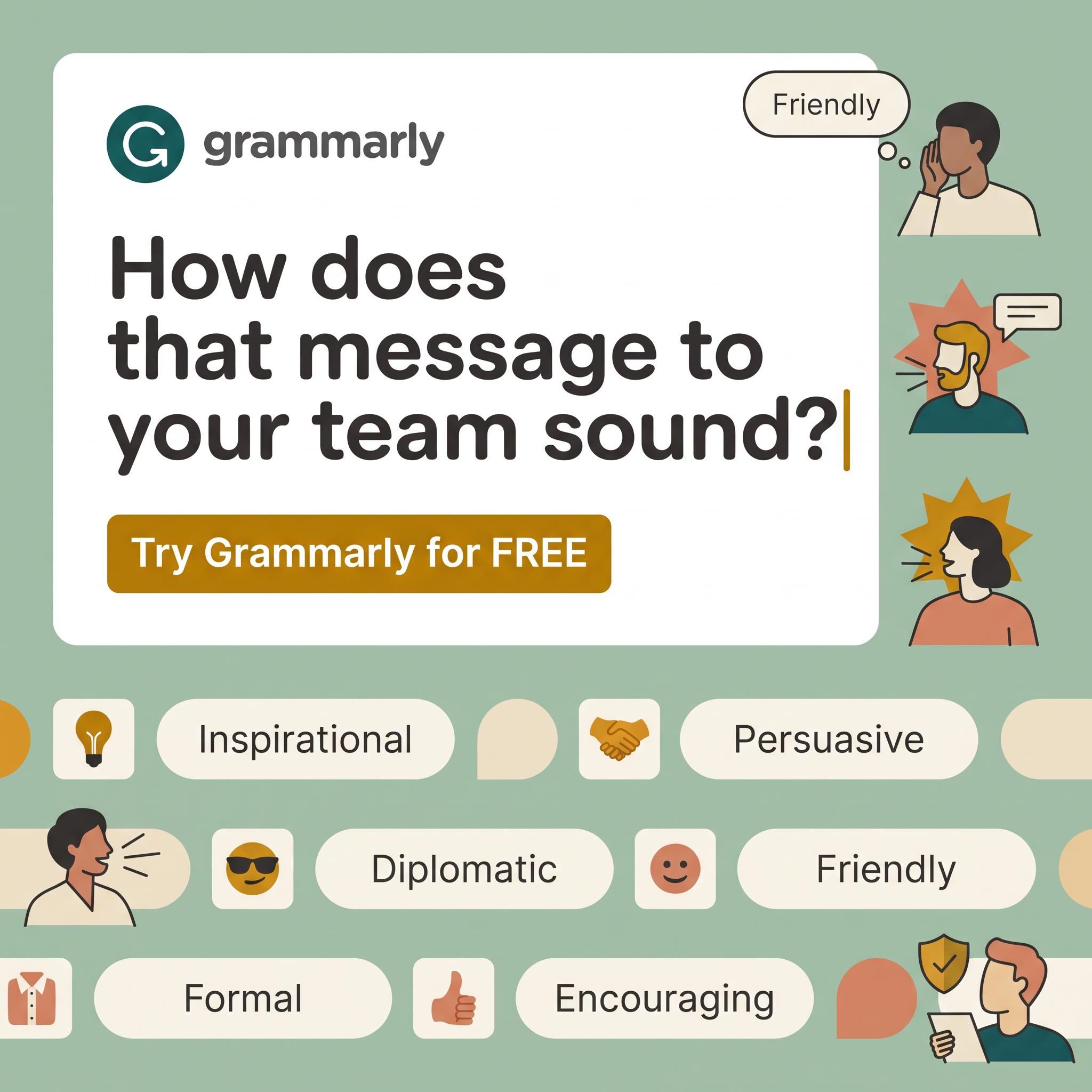
The copy is almost entirely one question, and that restraint is the point. How does that message to your team sound shifts the focus from grammar mistakes, a solved problem in people's minds, to tone, an emotional and social risk. Second person and the word team make it specific to workplace communication. There is no feature list; the tone chips do that job as single-word labels that are instantly scannable. The CTA, Try Grammarly for FREE, carries the brand name again and capitalises FREE for emphasis. Total word count stays low, which suits fast-scrolling feeds. One weakness: there is no outcome promise, such as fewer misunderstandings, so the ad relies on the viewer finishing the thought.
Visual design
The layout uses a strong top-to-bottom hierarchy: a white card with the question, a single accent button, then a decorative chip band. Sage green, cream and mustard give a calm, approachable palette that stands apart from blue-heavy SaaS ads. Flat illustrated people add warmth and diversity without the cost of photography. Rounded pills and soft corners echo modern app UI. The blinking cursor is a small but clever detail that turns a static image into a moment of typing.
How to adapt this template for your brand
- Write one question that names the doubt your product removes.
- Place it in a white card styled like your product's input field, with a cursor.
- Replace the tone chips with 5–7 labels your product actually outputs.
- Pair each chip with a simple icon or emoji tile for faster scanning.
- Use one saturated accent colour only for the free-trial CTA button.
Tips for saas & tech ads on Meta
On Meta, keep the question in the top third so it survives cropping in Feed and Explore; test a 4:5 version with the chip band slightly larger. On LinkedIn, this creative fits naturally because the team framing matches the platform's workplace context – pair it with primary text about remote or hybrid teams. For Stories and Reels, animate the chips scrolling horizontally and type the question letter by letter. Keep text overlay minimal for mobile legibility.
About this creative
This square Grammarly ad sits on a calm sage-green background. A large white card dominates the top two thirds, holding the Grammarly logo and a bold three-line question: how does that message to your team sound? A blinking text cursor after the question mark makes the card feel like a live text field, as if the viewer is typing. Below sits a mustard-yellow button reading Try Grammarly for FREE. Along the right edge, three flat illustrated people speak or whisper, each framed by a starburst or thought bubble, one labelled Friendly. The bottom third is a scrolling-style band of cream pill chips with tone names – Inspirational, Persuasive, Diplomatic, Friendly, Formal, Encouraging – each paired with an emoji or icon tile such as a lightbulb, handshake, sunglasses face and thumbs-up. The result reads like the product interface itself: a message being checked and tagged with a tone. Colours stay muted and warm, keeping it workplace friendly.
Meta ad · 1200 × 1200 · SaaS & Tech
Grammarly Tone Detector Ad: Question Hook + Feature Chips
This Grammarly ad promotes its tone detector with a single question about how your message to the team sounds. Built as a square feature-callout creative, tone labels act as visual proof of the product. Use it as a template for SaaS tools that need to make an invisible benefit tangible.
Added
All brand names and logos are property of their owners. Adplaylist is not affiliated with or endorsed by these brands.
Details
Ad copy
Primary text
Ever hit send and wondered how it came across? Grammarly checks the tone of your message before your team reads it – friendly, formal, persuasive or encouraging. Write with confidence in every app you already use.
Description
Free tone detector for every message
On-image text
grammarly | How does that message to your team sound? | Try Grammarly for FREE | Friendly | Inspirational | Persuasive | Diplomatic | Friendly | Formal | Encouraging
Headline ideas for this template
- 1Does your message sound the way you meant it?
- 2Check your tone before your team does
- 3Friendly, formal or too blunt? Find out first
- 4Hit send without second-guessing
- 5Your words, the right tone, every time
Meta image ad specs
| Placement | Ratio | Size (px) |
|---|---|---|
| Feed | 1:1 or 4:5 | 1080×1080 / 1080×1350 |
| Marketplace | 1:1 | 1200×1200 |
| Messenger inbox | 1:1 | 1200×1200 |
| Stories & Reels | 9:16 | 1080×1920 |
This template is 1:1. Request 4:5 or 9:16 to cover all placements.