Key takeaways
- Format: Tonal flat-lay of box contents around the box.
- Best for: Subscription boxes and curated gift sets.
- Hook: An authentic, culturally rich curation.
- Reuse it: Arrange contents around the box on a matching background.
Available sizes
What is a product shot ad?
A product shot ad puts the product itself at the centre of the frame, usually on a clean or styled background with little text. It works best when the packaging or product is distinctive enough to stop the scroll and the viewer already understands what it does.
See all product shot ads →Why this product shot ad works
- 01
Tonal harmony
The blue box on a blue background feels calm and premium.
- 02
Rich contents
Many distinct items make the box feel generous and special.
- 03
Cultural authenticity
Wagashi, matcha tools and woodblock prints signal genuine curation.
- 04
Breathing room
Even spacing lets each item be appreciated.
Full creative breakdown
Who this ad targets
This ad targets Japan enthusiasts, tea lovers and gift buyers aged 25 to 55 who appreciate craftsmanship and culture. They have travelled to Japan or dream of going and enjoy discovering authentic products. The box also appeals to people looking for thoughtful, premium gifts. Interest targeting is a good starting point, and lookalike audiences built from past purchasers are a strong next step once the ad has data.
Copywriting analysis
The headline is a short invitation that frames the product as a curated experience rather than a box of items. It does not mention Japan or the offer, so the primary text should add context and any price or subscription details. The copy is deliberately sparse, which signals confidence and premium positioning. One clear line explains the benefit, and the product image fills in everything else, so nothing distracts from the hero. Together, the words and visuals give the viewer one clear reason to click.
Visual design
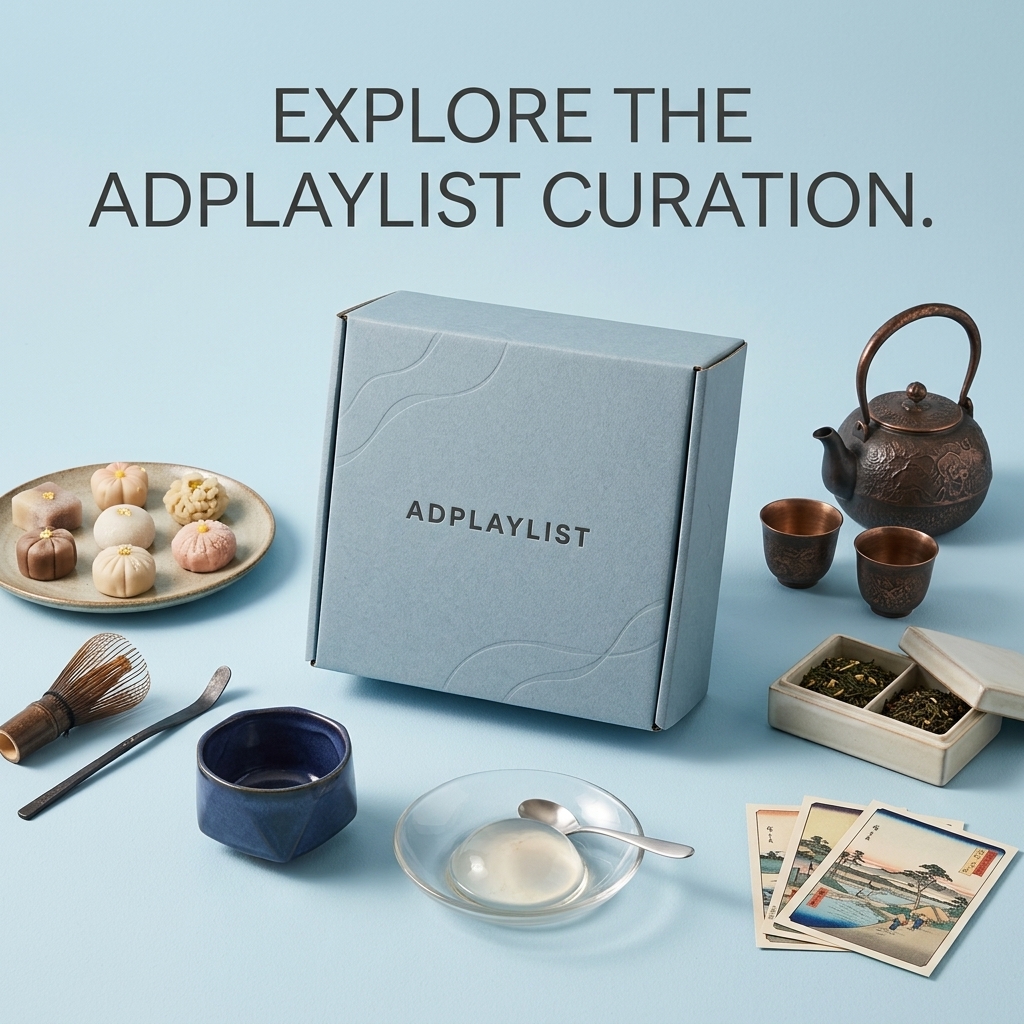
The box sits centre stage with items arranged in a loose circle. Soft blue with bronze, navy and pastel accents gives a serene, refined palette. Even lighting keeps shadows soft, and the thin headline type matches the minimalist mood. The square 1:1 format keeps every element readable on mobile, and the clear hierarchy guides the eye from brand to message to product in a natural order.
How to adapt this template for your brand
- Shoot your curated box on a clean, single-colour background that complements its finish.
- Light it softly so materials and details read clearly at thumbnail size.
- Add one short headline about the core benefit above or below the product.
- Keep the logo small and consistent, top or bottom centre.
- Test background colours to match seasonal campaigns or audience segments.
Tips for food ads on Meta
On Meta, run this curated box creative in Feed and Explore at 1:1, then crop a 4:5 version to win more mobile screen space. Keep the headline inside the safe zone so it is not covered by the profile name or CTA bar. Use the primary text for details the image leaves out, and test Advantage+ placements alongside a Feed-only ad set. Refresh the visual every three to four weeks to avoid creative fatigue.
About this creative
The creative is a flat-lay on a pale powder blue surface with a matching blue box embossed with wave lines and the Adplaylist name in the centre. Around it are a plate of colourful wagashi sweets, a bamboo matcha whisk and scoop, a deep blue ceramic tea bowl, a glass dish holding a clear water cake, a bronze cast iron teapot with two cups, a ceramic box of loose-leaf tea and a fan of woodblock-style landscape print cards. A simple dark grey headline reads explore the Adplaylist curation. As a product shot ad, it puts the hardware front and centre and lets the design speak for itself. The clean background removes every distraction, so the eye goes straight to the materials, shape and finish. A short line of copy frames the benefit while the image does the convincing, which suits premium products where looks are part of the purchase decision.
Meta ad · 1200 × 1200 · Food
Japanese Gift Box Ad Template – Product shot Example
This japanese gift box ad template uses a product shot format to show a blue gift box surrounded by wagashi, tea tools, ceramics and woodblock print cards. It is a strong reference for subscription boxes and curated gift sets. Below: the copy, why it works and five steps to adapt it.
Added
All brand names and logos are property of their owners. Adplaylist is not affiliated with or endorsed by these brands.
Details
Ad copy
Primary text
A taste of Japan, curated and delivered. Discover wagashi sweets, loose-leaf tea, handmade ceramics and art prints in every Adplaylist box.
Description
Japanese tea, sweets and craft
On-image text
EXPLORE THE ADPLAYLIST CURATION. | ADPLAYLIST (on box)
Headline ideas for this template
- 1A taste of Japan, delivered.
- 2Tea, sweets and craft from Japan.
- 3Your monthly journey to Japan.
- 4Curated with care, delivered to you.
- 5Discover Japan, one box at a time.
Meta image ad specs
| Placement | Ratio | Size (px) |
|---|---|---|
| Feed | 1:1 or 4:5 | 1080×1080 / 1080×1350 |
| Marketplace | 1:1 | 1200×1200 |
| Messenger inbox | 1:1 | 1200×1200 |
| Stories & Reels | 9:16 | 1080×1920 |
This template is 1:1. Request 4:5 or 9:16 to cover all placements.
Browse similar by tag