Key takeaways
- Format: Two-person café scene with a short headline.
- Best for: Dating, social and community apps.
- Hook: A natural, low-pressure first meeting.
- Reuse it: Show the outcome of your app, not the app itself.
Available sizes
What is a lifestyle ad?
A lifestyle ad shows the product being used in a real setting by the kind of person who buys it. Instead of listing features, it sells the feeling or outcome of owning the product, which makes it a strong fit for fashion, home, travel and wellness brands.
See all lifestyle ads →Why this lifestyle ad works
- 01
Shows the outcome
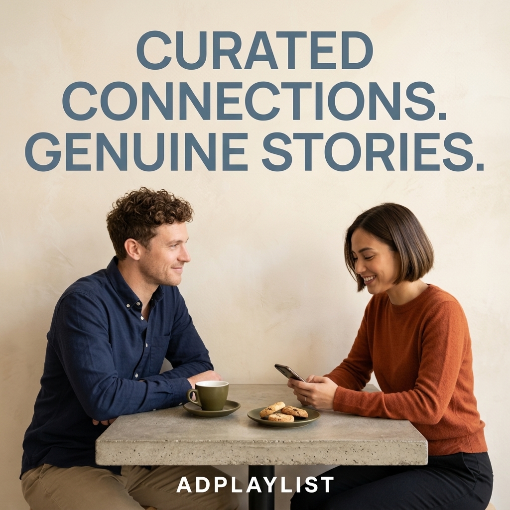
The ad shows the date, not the swiping, which is what users want.
- 02
Warm body language
Smiles and relaxed posture suggest instant chemistry.
- 03
Curated promise
'Curated' signals quality over quantity, appealing to dating fatigue.
- 04
Earthy styling
Navy, rust and olive feel grown-up and authentic.
Full creative breakdown
Who this ad targets
This ad targets single adults aged 25 to 40 who feel tired of mainstream swipe apps and want more meaningful connections. They value authenticity, conversation and quality over volume. Many are urban professionals who prefer relaxed first dates like coffee. Interest targeting is a good starting point, and lookalike audiences built from past purchasers are a strong next step once the ad has data.
Copywriting analysis
The two-part headline balances the app's method (curated connections) with the payoff (genuine stories). Full stops give it a calm, confident rhythm. There is no explicit CTA on the image, so the primary text needs to do that job. The overall copy load stays light so the image can carry the emotion. Every word supports the scene instead of competing with it, and the brand name sits above the headline so recognition happens before the message. Together, the words and visuals give the viewer one clear reason to click.
Visual design
The couple sits symmetrically below a large headline, with the table forming a strong horizontal base. The plaster wall adds texture and warmth. Steel-blue type picks up the man's shirt colour, tying text and photo together. The square 1:1 format keeps every element readable on mobile, and the clear hierarchy guides the eye from brand to message to product in a natural order.
How to adapt this template for your brand
- Pick one real moment where your dating app is used and shoot or source a natural photo of it.
- Leave clear negative space at the top or side for the brand name and headline.
- Write a headline under eight words about the feeling or outcome, not the spec.
- Add one small product cue, such as a UI card, badge or product cut-out, to anchor the benefit.
- Test two or three different scenes with the same headline to find the strongest moment.
Tips for mobile apps ads on Meta
On Meta, run this dating app creative in Feed and Explore at 1:1, then crop a 4:5 version to win more mobile screen space. Keep the headline inside the safe zone so it is not covered by the profile name or CTA bar. Use the primary text for details the image leaves out, and test Advantage+ placements alongside a Feed-only ad set. Refresh the visual every three to four weeks to avoid creative fatigue.
About this creative
The creative shows a man with curly hair in a navy shirt and a woman with a short bob in a rust-coloured sweater sitting at a small concrete café table against a warm plaster wall. He smiles at her as she laughs while looking at her phone. An olive green cup of coffee and a plate of cookies sit between them. A large steel-blue headline across the top reads curated connections, genuine stories, and the Adplaylist wordmark sits in white at the bottom. As a lifestyle ad, it sells the feeling of owning the product rather than a spec sheet. The person in frame acts as a stand-in for the viewer, so the scroller can picture the product fitting into their own routine. Copy is kept short and sits in clear negative space, which lets the photo do most of the persuasion and helps the ad feel native in a busy feed.
Meta ad · 1200 × 1200 · Mobile Apps
Dating App Ad Template – Lifestyle Example
This dating app ad template uses a lifestyle format to show a man and a woman sharing a relaxed coffee date at a concrete café table. It is a strong reference for dating, social and community apps. Below: the copy, why it works and five steps to adapt it.
Added
All brand names and logos are property of their owners. Adplaylist is not affiliated with or endorsed by these brands.
Details
Ad copy
Primary text
Skip the endless swiping. Adplaylist curates meaningful matches so you can spend less time scrolling and more time sharing real stories over coffee.
Description
Meaningful matches, real conversations
On-image text
CURATED CONNECTIONS. GENUINE STORIES. | ADPLAYLIST
Headline ideas for this template
- 1Less swiping, more stories.
- 2Meet someone worth a coffee.
- 3Dating, curated for you.
- 4Real connections start here.
- 5Quality matches, genuine chemistry.
Meta image ad specs
| Placement | Ratio | Size (px) |
|---|---|---|
| Feed | 1:1 or 4:5 | 1080×1080 / 1080×1350 |
| Marketplace | 1:1 | 1200×1200 |
| Messenger inbox | 1:1 | 1200×1200 |
| Stories & Reels | 9:16 | 1080×1920 |
This template is 1:1. Request 4:5 or 9:16 to cover all placements.
Browse similar by tag