Key takeaways
- Format: Photographed black card with a two-sentence comparison statement.
- Best for: Comparison platforms selling independence and whole-of-market choice.
- Hook: Points out that banks only compare their own products.
- Reuse it: Mirror one verb across two sentences and let a single word carry the difference.
Available sizes
What is a comparison ad?
A comparison ad sets the product against an alternative, such as a competitor, the old way of doing things or a cheaper option, usually in a two-column layout or table. It helps buyers who are already weighing options see quickly why this one is the better choice.
See all comparison ads →Why this comparison ad works
- 01
Exposes a hidden bias
Many people never consider that a bank's 'comparison' only includes its own loans; the ad makes that obvious.
- 02
One-word difference
Repeating 'compare' focuses all the contrast on 'their' versus 'everyone's', which makes the line memorable.
- 03
Premium physical feel
Shooting the message on real card stock adds weight and credibility compared with flat digital text.
- 04
Low-risk claim
It sells independence without specific rates or guarantees, making it easier to approve and evergreen.
Full creative breakdown
Who this ad targets
Borrowers about to take a loan or mortgage straight from their current bank out of habit or convenience. They are reasonably financially literate but haven't questioned whether their bank's offer is competitive. The calm, premium tone also appeals to professionals and homeowners who value impartial advice and dislike pushy sales, making it a good awareness ad before they request a quote.
Copywriting analysis
The two sentences are built as a mirror: subject, 'compare', object. 'Banks compare their products' is technically true and slightly ironic, reframing a bank's comparison tool as self-interested. 'We compare everyone's' is shorter, which gives it punch, and the possessive 'everyone's' implies the whole market without stating a number. The apostrophe-s ending is a neat twist that makes readers pause. The copy avoids price claims, keeping the promise about breadth and neutrality rather than savings.
Visual design
A low-angle studio photo of an upright matte black card on a dark glossy surface creates subtle reflection and depth. Heavy white sans-serif type is left-aligned and large, filling most of the card. The tonal palette is entirely black, charcoal and white, with soft lighting picking out the card's edges. The result feels like a luxury brand campaign, giving a commodity service a premium edge.
How to adapt this template for your brand
- Identify what your competitor does narrowly (their products, their network, their stores).
- Write it as 'They [verb] their [thing].'
- Mirror it with 'We [verb] everyone's.' or a similar one-word expansion.
- Print or mock up the line on a black card and shoot it with low, soft lighting.
- Keep branding out of the image and place it in the primary text and headline.
Tips for finance & fintech ads on Meta
On Meta, credit and loan ads must run under the Financial Products and Services special ad category, which removes age, gender and postcode targeting, so the creative has to qualify the audience itself. This awareness-style ad suits broad, lookalike-free audiences and video-view retargeting rather than conversion-only campaigns. If you claim to compare 'everyone', make sure the landing page explains panel size honestly. Try it as a LinkedIn Sponsored Content post for professional audiences, where the premium, understated look fits naturally.
About this creative
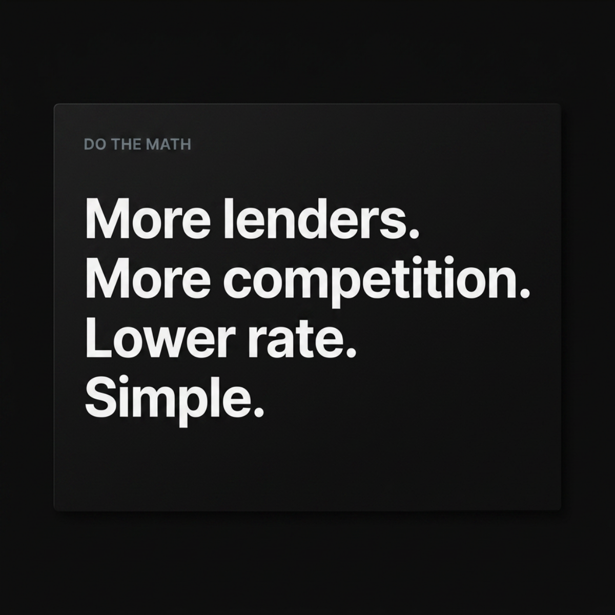
A thick matte black card stands upright on a dark reflective surface against a deep black background, lit softly so the paper texture and edges are just visible. On the card, bold white grotesque type in four left-aligned lines reads: "Banks compare their products. We compare everyone's." There are no logos, colours or supporting graphics. The photographic treatment gives a premium, physical quality, like a business card or printed manifesto, which lends authority to a simple claim. The copy uses a mirrored structure: the same verb 'compare' appears in both sentences, and the difference rests on one possessive word. 'Their products' implies a biased, limited view, while 'everyone's' implies a complete, neutral one. The line is quick to read, easy to remember and positions the advertiser as the independent alternative to going straight to a bank, without attacking any specific competitor or making a claim that needs heavy substantiation.
Meta ad · 1200 × 1200 · Finance & Fintech
Loan Comparison Ad Template: "We Compare Everyone's"
This finance ad photographs a matte black card with bold white type that contrasts banks comparing only their own products against a service that compares everyone's. It is a sharp comparison format that sells independence, ideal for loan and mortgage comparison sites positioning against direct-to-bank applications.
Added
All brand names and logos are property of their owners. Adplaylist is not affiliated with or endorsed by these brands.
Details
Ad copy
Primary text
Your bank will happily compare its own loans for you. We compare every lender in the market, side by side, so you see the full picture before you commit.
Description
Independent loan comparison
On-image text
Banks compare their products. We compare everyone's.
Headline ideas for this template
- 1Banks compare theirs. We compare all.
- 2See every lender, not just one.
- 3Independent comparison, every lender.
- 4Your bank only shows its own loans.
- 5The whole market in one search.
Meta image ad specs
| Placement | Ratio | Size (px) |
|---|---|---|
| Feed | 1:1 or 4:5 | 1080×1080 / 1080×1350 |
| Marketplace | 1:1 | 1200×1200 |
| Messenger inbox | 1:1 | 1200×1200 |
| Stories & Reels | 9:16 | 1080×1920 |
This template is 1:1. Request 4:5 or 9:16 to cover all placements.