Key takeaways
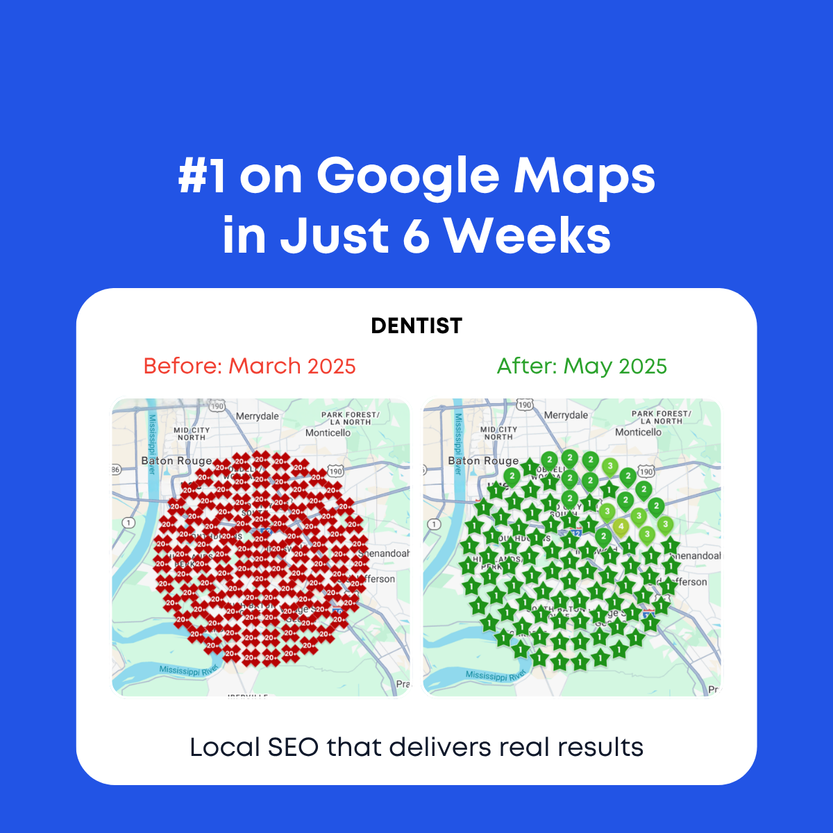
- Format: Case study card framing real geo-grid ranking screenshots.
- Best for: Agencies with grid tracker data for dental or medical clients.
- Hook: A whole city map flipping from 20+ to #1.
- Reuse it: Pair any client's grid report with industry and date labels.
Available sizes
What is a before and after ad?
A before and after ad shows the same subject in two states side by side, so the result of using the product is visible at a glance. It's common in skincare, cleaning, fitness and home improvement, but claims shown must be realistic and typical to stay within ad platform policies.
See all before / after ads →Why this before / after ad works
- 01
Dense data feels authentic
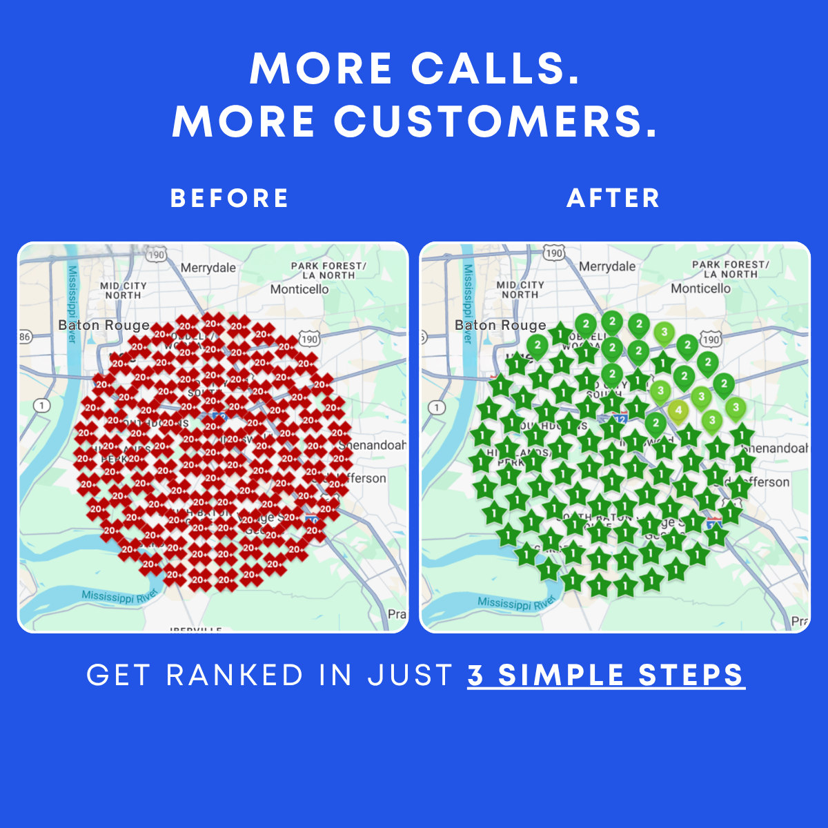
Over a hundred grid points look like a real tool export. It is hard to dismiss as a mockup.
- 02
Area-wide dominance
The green grid covers the whole city, not just the office address. It shows the practice can win patients from every neighborhood.
- 03
Familiar local geography
Real street names and landmarks make the result feel local. Baton Rouge viewers recognize their own area.
- 04
Consistent campaign frame
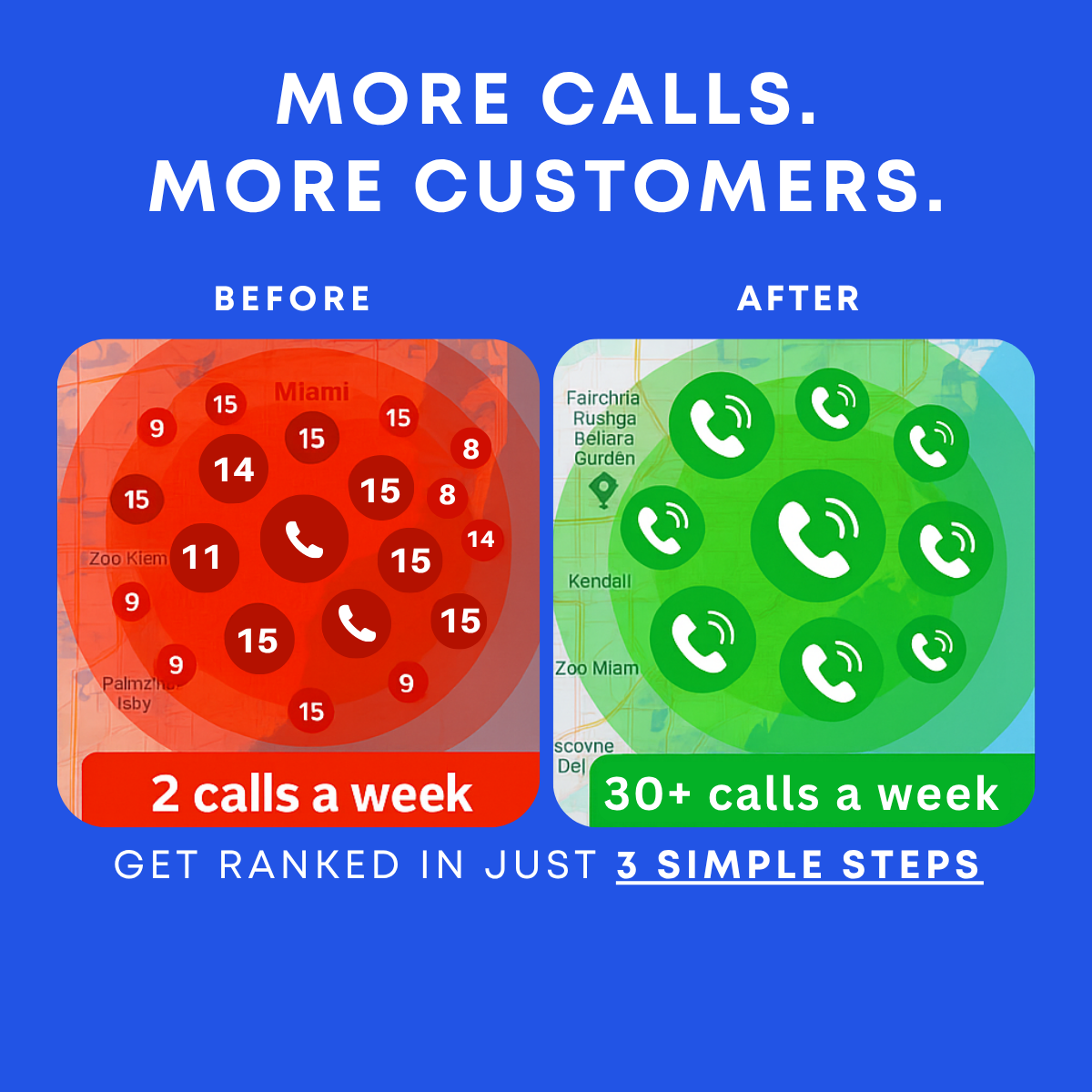
The same headline and card as the Miami version build recognition. Testing the image inside a fixed frame isolates what drives clicks.
Full creative breakdown
Who this ad targets
This ad targets dentists, orthodontists and dental group managers in competitive US cities, particularly Baton Rouge and similar mid-sized metros. These buyers often receive cold SEO pitches and want proof before talking to an agency. The detailed grid appeals to more analytical owners and marketing managers who already understand map pack rankings. On Meta and LinkedIn, it works for job-title targeting and for retargeting people who opened dental case study pages or engaged with earlier ads.
Copywriting analysis
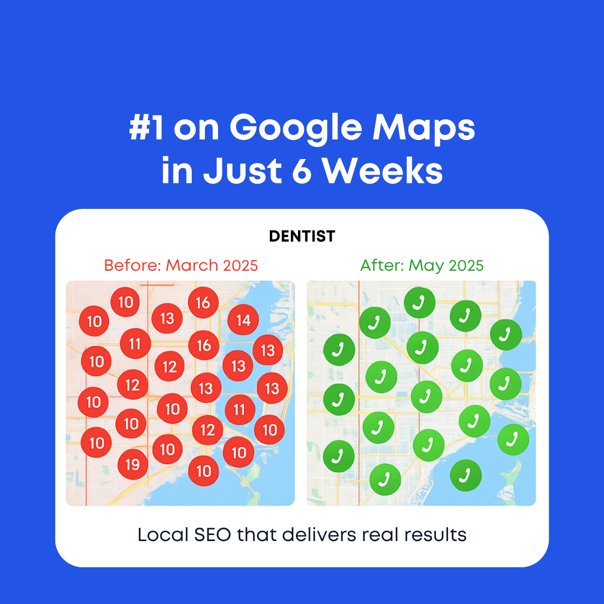
The copy is identical to the Miami dentist version, which makes this a clean visual A/B test. #1 on Google Maps in Just 6 Weeks leads with the result, the platform and speed. The labels Dentist, Before: March 2025 and After: May 2025 act like report metadata and build trust without salesy language. Local SEO that delivers real results closes with a broad promise; with this more detailed grid, the word real feels more earned than in the illustrated version. The six week claim still clashes with the eight-week gap between March and May, so the dates or headline should be aligned.
Visual design
The layout uses a blue frame, white report card and two equal map panels, creating a professional slide-like composition. The detailed geo-grid images bring dense texture: red diamonds on the left and green stars on the right produce a strong color contrast even at small sizes. The few lighter green markers on the after map add realism. Black, red and green labels set a clear hierarchy, and generous padding keeps the busy maps from feeling cluttered.
How to adapt this template for your brand
- Export real before and after grid reports from your rank tracking tool.
- Place them in a white card with industry and date labels above.
- Align the headline timeframe exactly with the dates shown.
- Add one headline stat summarizing the grid improvement.
- Localize the primary text with the city name to match targeting.
Tips for saas & tech ads on Meta
Run this alongside the Miami dentist version on Meta and compare cost per lead, since only the map image differs. Target the city shown on the map to make the proof feel close to home. On LinkedIn, it suits sponsored content for dental owners and managers. Link to a case study page that explains the grid. Avoid health or patient outcome claims to stay within healthcare ad policies.
About this creative
The ad uses a blue background with a bold white two-line headline, #1 on Google Maps in Just 6 Weeks. A large white rounded card below carries the label Dentist in black caps, with Before: March 2025 in red and After: May 2025 in green. Inside the card, two map screenshots of Baton Rouge sit side by side. The before map is covered in a dense circular grid of red diamond markers reading 20+, showing the practice ranked outside the top 20 at every point. The after map shows the same grid filled almost entirely with green star markers reading 1, with a cluster of 2, 3 and 4 pins on the northeast edge. The line Local SEO that delivers real results closes the card. This version reuses the ranking grid images from the More Calls ad inside the dentist case study frame, giving a more data-heavy and believable look than the illustrated Miami version.
Meta ad · 1200 × 1200 · SaaS & Tech
Dentist Local SEO Ad Template: Baton Rouge Ranking Grid Case Study
This square case study ad combines the dentist report card layout with real-looking geo-grid screenshots of Baton Rouge. A red field of 20+ rankings in March becomes a green field of #1 stars in May, giving dental clinics hard visual proof that local SEO can win their whole service area.
Added
All brand names and logos are property of their owners. Adplaylist is not affiliated with or endorsed by these brands.
Details
Ad copy
Primary text
In March, this dentist ranked outside the top 20 across all of Baton Rouge. By May, they were #1 almost everywhere on the map. That's what focused local SEO does. Ready to see your own grid?
Description
Real ranking grids from real clients
On-image text
#1 on Google Maps in Just 6 Weeks | DENTIST | Before: March 2025 | After: May 2025 | Local SEO that delivers real results
Headline ideas for this template
- 1Watch This Dentist Take Over the Map
- 2From 20+ to #1 Across Baton Rouge
- 3Rank #1 in Every Neighborhood
- 4The Ranking Grid Every Dentist Wants
- 5See How Your Clinic Ranks Citywide
Meta image ad specs
| Placement | Ratio | Size (px) |
|---|---|---|
| Feed | 1:1 or 4:5 | 1080×1080 / 1080×1350 |
| Marketplace | 1:1 | 1200×1200 |
| Messenger inbox | 1:1 | 1200×1200 |
| Stories & Reels | 9:16 | 1080×1920 |
This template is 1:1. Request 4:5 or 9:16 to cover all placements.
Browse similar by tag