Key takeaways
- Format: Data-led side-by-side comparison using tool screenshots.
- Best for: Local SEO agencies targeting a specific niche like dentists.
- Hook: A sea of green for the competitor versus orange for you.
- Reuse it: Run a real scan for your niche keyword and compare two businesses.
Available sizes
What is a comparison ad?
A comparison ad sets the product against an alternative, such as a competitor, the old way of doing things or a cheaper option, usually in a two-column layout or table. It helps buyers who are already weighing options see quickly why this one is the better choice.
See all comparison ads →Why this comparison ad works
- 01
Real data as proof
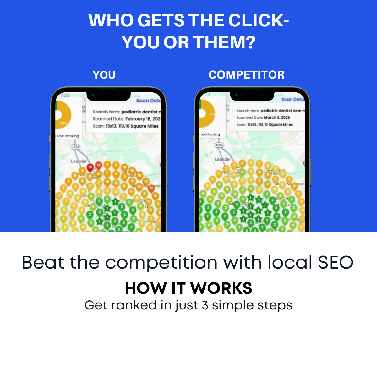
Actual tool screenshots with search terms and dates feel credible, not like a mock-up.
- 02
Niche relevance
The 'pediatric dentist near me' keyword instantly speaks to dental practices viewing the ad.
- 03
Heat-map storytelling
The colour spread shows not just one ranking but how visibility changes across a whole area.
- 04
Consistent series design
It reuses the same layout as the pin comparison ad, building recognition across a campaign.
Full creative breakdown
Who this ad targets
This ad primarily targets dental practice owners and office managers, especially pediatric dentists in suburban US markets, who want more new patient bookings from nearby families. More broadly, it suits any local practice owner who is data-minded and wants proof before hiring an agency. It also appeals to marketing managers at multi-location healthcare groups who track coverage across a service area and want to see precise competitive gaps.
Copywriting analysis
The ad keeps the same question headline as its sibling, "WHO GETS THE CLICK- YOU OR THEM?", which sets up a competitive frame. The real copy power is in the screenshot details: a specific search term, dates and a grid size add authenticity without extra persuasion. The solution line "Beat the competition with local SEO" and the three-step teaser follow. Because the scan text is small, the primary text should explain what the grid means. The hyphen after CLICK could be replaced with a dash.
Visual design
The blue and white split layout matches the series, with two phone mockups centred in the blue area. Each screen is dense with colourful ranking pins, so the comparison relies on overall colour impression rather than individual numbers: warm orange versus cool green. Scan detail boxes add a dashboard feel. The white bottom section gives breathing room and clear dark type. Fine details may be hard to read on mobile.
How to adapt this template for your brand
- Run a real geo-grid scan for a niche keyword in your target market.
- Place your prospect's scan and a top competitor's scan side by side in phone mockups.
- Keep the search term and grid details visible to prove the data is real.
- Use the primary text to explain what green and red pins mean in plain language.
- Offer a free personalised scan as the CTA so viewers can see their own grid.
Tips for saas & tech ads on Meta
On Meta, target dental practice owners and office managers with interest and job-title layering, and offer a free geo-grid scan through a lead form. Because details are small, test a cropped version with one zoomed-in phone. On LinkedIn, target dentists and practice managers by job title in specific regions. Create industry versions using different keywords such as plumber near me or lawyer near me, and refresh scan dates regularly so the data never looks outdated.
About this creative
This creative is a data-heavy version of the you-versus-competitor concept for local SEO. The blue top section asks "WHO GETS THE CLICK- YOU OR THEM?" in white uppercase type. Below, two phones labelled YOU and COMPETITOR display screenshots from a geo-grid rank tracking tool. Each shows a map around Leander, Texas, covered in numbered pins. The YOU phone has mostly yellow and orange pins with a few red ones, signalling weak rankings across much of the area. The COMPETITOR phone is mostly green, including several star-shaped first-place pins. A scan details box shows the search term pediatric dentist near me, scan dates in early 2025 and a 13x13 grid covering 113.10 square miles. The white bottom section repeats the solution: beat the competition with local SEO, with a how-it-works teaser. The real data screenshots give the ad credibility, and the niche keyword makes it highly relevant to dental practices.
Meta ad · 1200 × 1200 · SaaS & Tech
Local SEO Ad Example: Geo-Grid Scan Comparison
This square local SEO ad compares two geo-grid ranking scans side by side, showing your business in orange and yellow versus a competitor dominating in green for 'pediatric dentist near me'. It uses real tool screenshots as proof, making it a credible comparison template for agencies targeting dentists and other local practices.
Added
All brand names and logos are property of their owners. Adplaylist is not affiliated with or endorsed by these brands.
Details
Ad copy
Primary text
We scanned 'pediatric dentist near me' across 113 square miles. Your competitor dominates the map in green. Want to see your own ranking grid? Get a free scan today.
Description
Free geo-grid ranking scan
On-image text
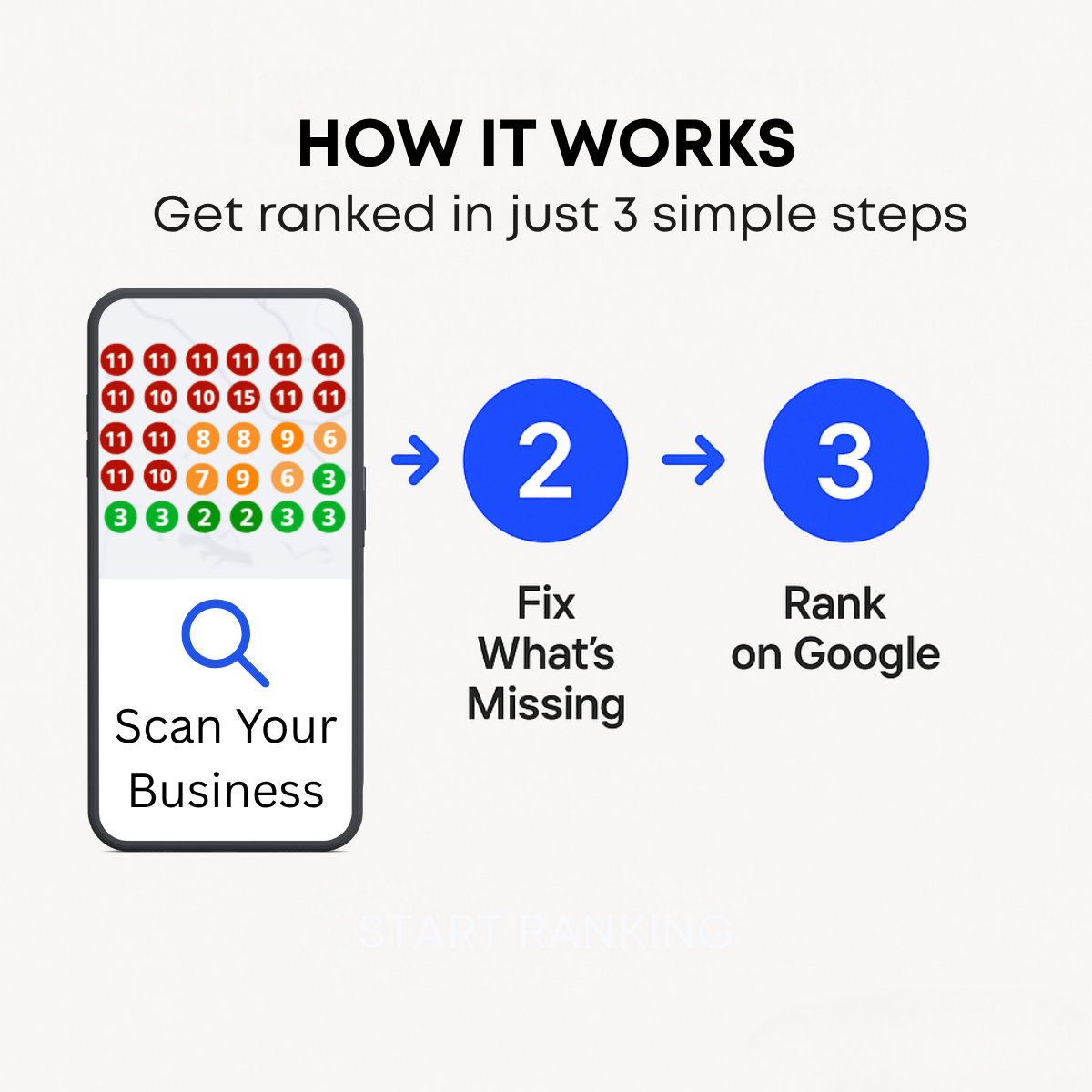
WHO GETS THE CLICK- YOU OR THEM? | YOU | COMPETITOR | Scan Details | Search term: pediatric dentist near me | Scanned Date: February 18, 2025 / March 3, 2025 | Scan: 13x13, 113.10 Square Miles | Low Ranking | Beat the competition with local SEO | HOW IT WORKS | Get ranked in just 3 simple steps
Headline ideas for this template
- 1Your Competitor Owns the Map
- 2See Where You Rank, Block by Block
- 3Free Geo-Grid Scan for Dentists
- 4Turn Orange Pins Into Green
- 5More Local Patients Start Here
Meta image ad specs
| Placement | Ratio | Size (px) |
|---|---|---|
| Feed | 1:1 or 4:5 | 1080×1080 / 1080×1350 |
| Marketplace | 1:1 | 1200×1200 |
| Messenger inbox | 1:1 | 1200×1200 |
| Stories & Reels | 9:16 | 1080×1920 |
This template is 1:1. Request 4:5 or 9:16 to cover all placements.
Browse similar by tag