Key takeaways
- Format: Phone mockup product shot with headline beside it.
- Best for: Local SEO agencies and listing management SaaS.
- Hook: 'One tap away' frames Top 3 as close and achievable.
- Reuse it: Mock up your client's listing in the top spot of a maps search.
Available sizes
What is a product shot ad?
A product shot ad puts the product itself at the centre of the frame, usually on a clean or styled background with little text. It works best when the packaging or product is distinctive enough to stop the scroll and the viewer already understands what it does.
See all product shot ads →Why this product shot ad works
- 01
Shows the outcome
A realistic listing view lets owners see exactly what a Top 3 result looks like for customers.
- 02
Premium tech aesthetic
Soft white tones and a clean mockup make the agency feel like a polished software brand.
- 03
Achievable framing
'One tap away' makes the goal feel close, reducing the perceived effort of SEO.
- 04
Crisp two-part tagline
'Local leads. Real results.' is short, rhythmic and highlights results in brand blue.
Full creative breakdown
Who this ad targets
This ad targets local business owners in hospitality, retail and services, especially cafes, restaurants and shops, who know customers pick from the top few map listings. The ratings and reviews on screen speak to owners who value reputation. It also suits marketing managers who want a modern, data-driven partner. The premium look appeals to established businesses with a budget for professional marketing rather than bargain hunters.
Copywriting analysis
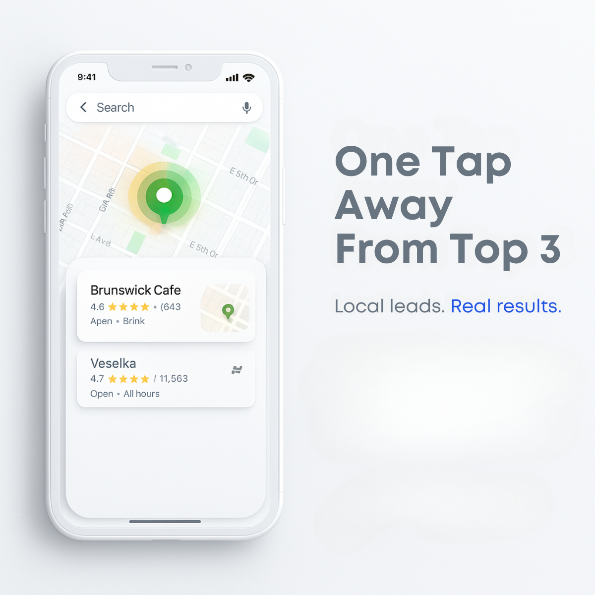
"One Tap Away From Top 3" combines user behaviour, a single tap on a phone, with the business goal of a Top 3 ranking. It suggests customers are close to choosing you if you rank well. Alliteration of 'tap' and 'top' adds rhythm. The subline "Local leads. Real results." uses two short, punchy fragments and highlights 'Real results.' in blue to emphasise proof. The copy is clean but lacks a CTA or number. Garbled interface text on the phone should be fixed for credibility.
Visual design
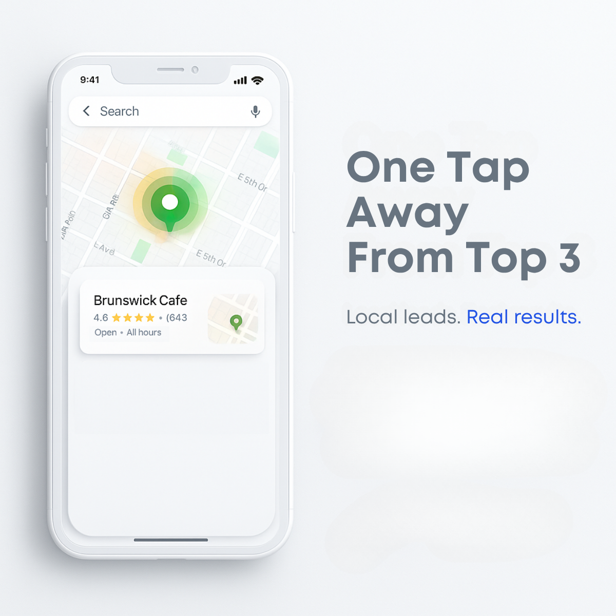
The composition places a white phone mockup on the left two-thirds and the headline on the right, balanced by generous negative space. The glowing green pin is the main focal point, with soft halos drawing the eye. Listing cards add realistic detail and star ratings in yellow. Grey headline type keeps the tone calm, and blue is used sparingly for emphasis. Soft blurred shapes in the lower right leave room for a logo or button.
How to adapt this template for your brand
- Create a clean phone mockup of a maps search showing a client listing in the top position.
- Replace garbled UI text with real, readable labels, ratings and business names you have permission to use.
- Write a short headline that links a customer action, like a tap, to your ranking promise.
- Add a two-part tagline and highlight the proof word in your brand colour.
- Use the empty lower-right area for a CTA button and logo.
Tips for saas & tech ads on Meta
On Meta, use this for awareness and retargeting audiences of local business owners in Feed and Instagram, with a free visibility check as the offer. On LinkedIn, the clean B2B aesthetic fits Sponsored Content for owners and marketing managers. Avoid using real third-party business names without permission; swap them for your clients or fictional names. Fix garbled interface text before launch, and create a 9:16 version with the phone centred for Stories.
About this creative
This creative sells local SEO with a polished, product-style phone mockup. On the left, a white smartphone shows a maps-style interface with a search bar, a light street grid and a glowing green location pin surrounded by a yellow-green halo. Below the map, two listing cards appear: Brunswick Cafe with a 4.6 star rating and Veselka with a 4.7 rating and over 11,000 reviews, imitating how businesses show up in local search results. Some interface text is slightly garbled, a sign of AI generation. On the right, large grey bold type reads "One Tap Away From Top 3", with a smaller subline "Local leads. Real results.", where 'Real results.' is highlighted in blue. The overall palette is soft white and grey with small pops of green, yellow and blue. The ad feels like a premium tech product, helping an agency look modern and credible. It suits awareness and consideration stages.
Meta ad · 1200 × 1200 · SaaS & Tech
Local SEO Ad Example: One Tap Away From Top 3
This square local SEO ad shows a sleek white phone mockup with a maps search, a glowing green location pin and two business listing cards, next to the headline One Tap Away From Top 3. It is a premium, product-style template for agencies and SaaS tools selling Google Maps visibility on Meta and LinkedIn.
Added
All brand names and logos are property of their owners. Adplaylist is not affiliated with or endorsed by these brands.
Details
Ad copy
Primary text
Customers tap the first results they see on Google Maps. We help local businesses earn a Top 3 spot, so you get the calls, visits and bookings. Local leads. Real results.
Description
Local leads. Real results.
On-image text
One Tap Away From Top 3 | Local leads. Real results. | Phone UI: 9:41 | Search | Brunswick Cafe 4.6 (643) | Veselka 4.7 11,563 Open All hours
Headline ideas for this template
- 1Be the First Tap on Google Maps
- 2Your Top 3 Spot Is Closer Than You Think
- 3Get Picked First by Local Customers
- 4Local Leads, Real Results
- 5Turn Map Views Into Visits
Meta image ad specs
| Placement | Ratio | Size (px) |
|---|---|---|
| Feed | 1:1 or 4:5 | 1080×1080 / 1080×1350 |
| Marketplace | 1:1 | 1200×1200 |
| Messenger inbox | 1:1 | 1200×1200 |
| Stories & Reels | 9:16 | 1080×1920 |
This template is 1:1. Request 4:5 or 9:16 to cover all placements.
Browse similar by tag