Key takeaways
- Format: Flat isometric illustration with two feature callouts.
- Best for: Agencies and SaaS tools explaining local visibility simply.
- Hook: 'Top 3 – You're Here' places the viewer in the winning spot.
- Reuse it: Illustrate your customer in the ideal outcome with a 'You're here' label.
Available sizes
What is a feature callout ad?
A feature callout ad is a static image that shows a single product with short text labels pointing to its key features or benefits, usually joined to the product by thin lines. It explains several selling points at a glance without a long caption, which is why it's common for supplements, skincare, electronics and kitchenware.
See all feature callouts ads →Why this feature callouts ad works
- 01
Future pacing
The 'You're Here' label lets owners imagine their business already in the Top 3.
- 02
Human context
Two people searching on phones remind owners that rankings mean real nearby customers.
- 03
Approachable illustration
Flat graphics feel friendly and simple, lowering resistance to a technical service.
- 04
Clear benefit pair
Two short callouts summarise what the service delivers without overloading the frame.
Full creative breakdown
Who this ad targets
This ad targets small local business owners who are new to SEO and may find technical screenshots intimidating, such as cafes, boutiques, salons, fitness studios and home service providers. They want more foot traffic and calls from nearby customers but are unsure how Google Maps rankings work. The friendly illustration style also suits franchise owners and community-focused businesses. It works best for cold audiences at the awareness stage.
Copywriting analysis
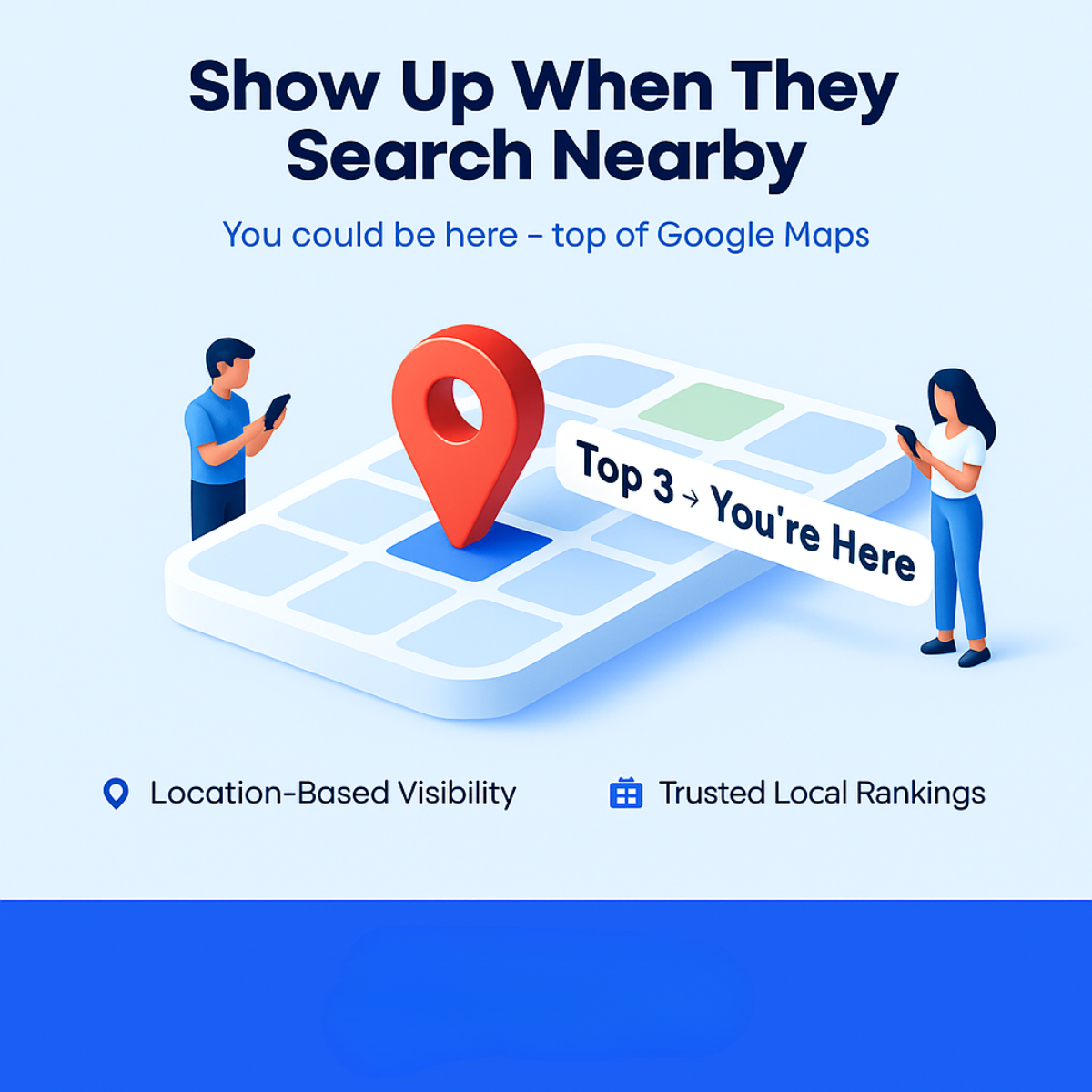
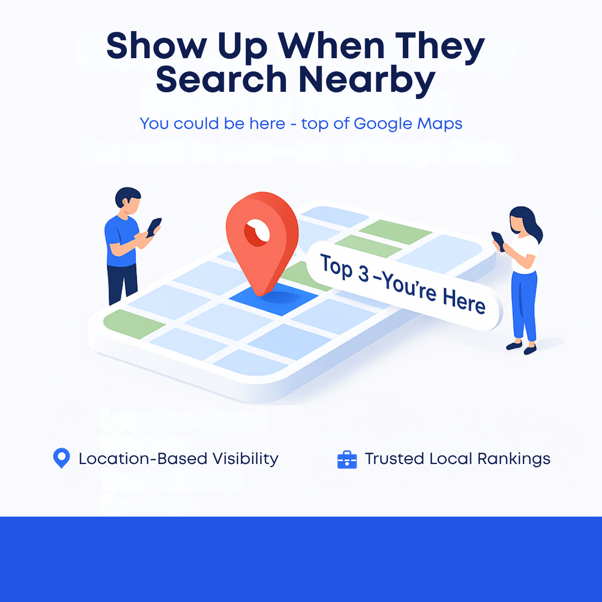
"Show Up When They Search Nearby" is clear and benefit-led, describing the outcome in everyday language. 'They' refers to customers, so owners instantly picture their audience. The subline "You could be here - top of Google Maps" uses aspirational future pacing. The map label 'Top 3 – You're Here' reinforces that promise inside the visual. The two callouts summarise the service. The copy avoids jargon, but a CTA is missing and should fill the empty blue band. The label spacing should also be fixed for polish.
Visual design
The design uses a clean white-to-light-blue background with a centred isometric map as the hero. A saturated red-orange pin is the main focal point, contrasting with the cool blue and green map tiles. Flat-style characters frame the map on both sides, adding balance and human scale. Navy headline type and bright blue accents match a Google-inspired palette. Faint ghosted text should be cleaned up, and the blue bottom band is ideal for a CTA button.
How to adapt this template for your brand
- Create or source an isometric illustration of your outcome, such as a map, storefront or dashboard.
- Add a label that places the viewer in the ideal result, like Top 3 – You're Here.
- Include simple characters that represent the end customer to show human impact.
- Write a plain-language headline describing the outcome from the customer's perspective.
- Use the bottom band for a CTA button and logo, and remove any background artifacts.
Tips for saas & tech ads on Meta
On Meta, use this for cold awareness and lead generation campaigns targeting small business owners, paired with a free ranking check lead form. The illustrated style tends to stand out among photo-heavy feeds. On Google Display and Demand Gen, the clean square works across responsive placements. Add a CTA in the blue band before launch, clean up ghost text, and create a 9:16 version with the map centred for Stories and Reels.
About this creative
This creative promotes local SEO with a friendly, illustrated style instead of screenshots or photos. The bold navy headline "Show Up When They Search Nearby" sits at the top, followed by a blue subline promising you could be at the top of Google Maps. The centre shows an isometric map tile with blue and green blocks and a large red-orange location pin on a highlighted square. A white pill label reads "Top 3 -You're Here", directly placing the viewer's business in the winning spot. On each side, a flat-style man and woman look at their phones, representing nearby customers searching. Below, two callouts with blue icons list Location-Based Visibility and Trusted Local Rankings. A solid blue band closes the bottom, likely reserved for a CTA or logo. Some ghosted text artifacts are visible in the background. The ad is warm, simple and easy to understand, making it suitable for cold audiences new to local SEO.
Meta ad · 1200 × 1200 · SaaS & Tech
Local SEO Ad Example: Show Up When They Search Nearby
This square local SEO ad uses a friendly flat illustration of an isometric map with a red pin, a Top 3 label and two people searching on their phones. It is a simple, approachable template for agencies and SaaS tools promoting Google Maps visibility to local businesses on Meta and Google Display.
Added
All brand names and logos are property of their owners. Adplaylist is not affiliated with or endorsed by these brands.
Details
Ad copy
Primary text
When people nearby search for what you offer, are you in the Top 3? Get location-based visibility and trusted local rankings that bring customers through your door.
Description
Get into the Google Maps Top 3
On-image text
Show Up When They Search Nearby | You could be here - top of Google Maps | Top 3 -You're Here | Location-Based Visibility | Trusted Local Rankings
Headline ideas for this template
- 1Be in the Top 3 When They Search
- 2Get Found by Nearby Customers
- 3Put Your Business on the Map
- 4From Invisible to Top 3 Locally
- 5Nearby Customers Are Searching Now
Meta image ad specs
| Placement | Ratio | Size (px) |
|---|---|---|
| Feed | 1:1 or 4:5 | 1080×1080 / 1080×1350 |
| Marketplace | 1:1 | 1200×1200 |
| Messenger inbox | 1:1 | 1200×1200 |
| Stories & Reels | 9:16 | 1080×1920 |
This template is 1:1. Request 4:5 or 9:16 to cover all placements.
Browse similar by tag