Key takeaways
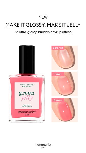
- Format: Three-panel before/after showing bare nail, one layer and two layers.
- Best for: Beauty products with a subtle but visible result, like tinted care or skin perfectors.
- Hook: The flawed bare nail on the left makes viewers check their own nails.
- Reuse it: Swap in your product's stages: before, first use, full result, with one-word labels.
Available sizes
What is a before and after ad?
A before and after ad shows the same subject in two states side by side, so the result of using the product is visible at a glance. It's common in skincare, cleaning, fitness and home improvement, but claims shown must be realistic and typical to stay within ad platform policies.
See all before / after ads →Why this before / after ad works
- 01
Proof over promises
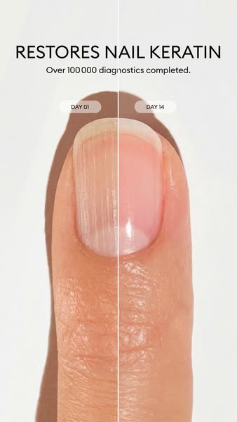
The result is shown, not claimed. Viewers watch ridges and discolouration fade across three panels, which feels more credible than any adjective.
- 02
Dosage made visible
Showing one versus two layers answers a real buying question: how much product do I need for the look I want?
- 03
Category-creating claim
Calling it the first blurring perfecting care polish gives the product its own slot in the shopper's mind instead of competing with ordinary polish.
- 04
Quiet, premium styling
Thin type, a neutral background and a small Paris wordmark keep the focus on the nails and signal a premium clean-beauty brand.
Full creative breakdown
Who this ad targets
Women aged roughly 25–55 who want neat, healthy-looking nails without a full manicure: busy professionals, people who prefer a natural 'your nails but better' look, and shoppers moving away from gel and classic polish toward care-focused, plant-based formulas. It also speaks to anyone self-conscious about ridges, yellowing or uneven tone after gel removal. The quiet styling suits buyers who value premium French beauty brands and want an understated finish rather than bold colour.
Copywriting analysis
The copy is minimal and does two jobs. ACTIVE BLUR names the product and hints at the benefit in two words, borrowing the language of blurring skincare primers that beauty shoppers already understand. The subline makes a 'first' claim, combines care and cosmetic results in 'blurring perfecting care polish', and ends with a sensory detail, 'powdery pink finish', that helps viewers picture the look. The panel labels are purely functional, which keeps the visual proof in charge. What is missing is a call to action or offer on the image, so the ad relies on the primary text and the button to drive the click.
Visual design
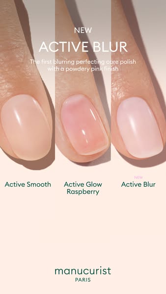
Three vertical strips of the same fingertip form a clear left-to-right story, separated by thin white dividers. Soft, even lighting reveals texture on the bare nail and a smooth sheen on the treated ones. The palette stays in skin tones, pale pink and white, so the subtle change is easy to read. The headline sits in the upper third over the skin, the labels sit on a clean white band, and the logo closes the frame at the bottom.
How to adapt this template for your brand
- Pick a product with a visible result and shoot the same subject at each stage under identical lighting.
- Split a 9:16 frame into three equal vertical panels with thin dividers.
- Label each panel with one or two words, such as Before, 1 use and Full result.
- Add a short product-name headline and a one-line claim at the top.
- Place your logo at the bottom and keep the background neutral so the result stands out.
Tips for beauty ads on Meta
Built for Meta Stories and Reels at 9:16, so keep the headline and labels inside the safe zone, clear of the top 14% and bottom 20% where interface elements sit. Use the primary text to explain the care benefits the image cannot show, such as strengthening or nourishing ingredients. For Feed placements, crop to 4:5 and keep the key visual centred. Retarget product page visitors and test the creative against a single close-up variant.
About this creative
This vertical Manucurist ad sells Active Blur, a new care polish that hides nail imperfections, through a clean three-panel before/after. Three close-ups of the same fingertip sit side by side on a soft white-to-grey background: first the bare nail with visible ridges, yellowish tips and uneven tone, then the nail after one layer, then after two layers with a smooth, powdery pink finish. Short labels under each panel, Bare nail, 1 layer and 2 layers, make the progression readable in a second. The headline ACTIVE BLUR sits at the top in thin white capitals, followed by a one-line claim that positions the product as the first blurring, perfecting care polish. The Manucurist Paris wordmark anchors the bottom of the frame. There is no bottle, no price and no offer: the nail itself is the proof. It is a strong example of letting a visible result do the selling for a subtle, natural-looking beauty product.
Meta ad · 338 × 600 · Beauty
Manucurist Active Blur Before/After Ad Template
This Manucurist ad promotes Active Blur, a blurring care polish, using a three-panel before/after that compares a bare nail with one and two layers. It is a vertical 9:16 creative for Meta Stories and Reels, and a ready-made template for any beauty product whose result is subtle but visible.
Added
All brand names and logos are property of their owners. Adplaylist is not affiliated with or endorsed by these brands.
Details
Ad copy
Primary text
Meet Active Blur, the first blurring, perfecting care polish. One layer softens ridges and discolouration, two layers give a powdery pink finish that looks like your nails, only better. Care and colour in one bottle.
Description
Care polish with a powdery pink finish
On-image text
ACTIVE BLUR | The first blurring perfecting care polish with a powdery pink finish | Bare nail | 1 layer | 2 layers | manucurist PARIS
Headline ideas for this template
- 1Your nails, but better, in one coat
- 2Blur ridges and yellowing instantly
- 3The care polish that looks like nothing
- 4One layer. Smoother-looking nails.
- 5Bare nail vs Active Blur: see the difference
Meta image ad specs
| Placement | Ratio | Size (px) |
|---|---|---|
| Feed | 1:1 or 4:5 | 1080×1080 / 1080×1350 |
| Marketplace | 1:1 | 1200×1200 |
| Messenger inbox | 1:1 | 1200×1200 |
| Stories & Reels | 9:16 | 1080×1920 |
This template is 1:1. Request 4:5 or 9:16 to cover all placements.