Key takeaways
- Format: Lifestyle portrait framed by an orbit of app icons.
- Best for: SaaS integrations, app marketplaces and all-in-one platforms.
- Hook: Relief of having every favourite tool in one connected place.
- Reuse it: Replace the icons with your integrations and the person with your persona.
Available sizes
What is a lifestyle ad?
A lifestyle ad shows the product being used in a real setting by the kind of person who buys it. Instead of listing features, it sells the feeling or outcome of owning the product, which makes it a strong fit for fashion, home, travel and wellness brands.
See all lifestyle ads →Why this lifestyle ad works
- 01
Orbit metaphor explains integrations
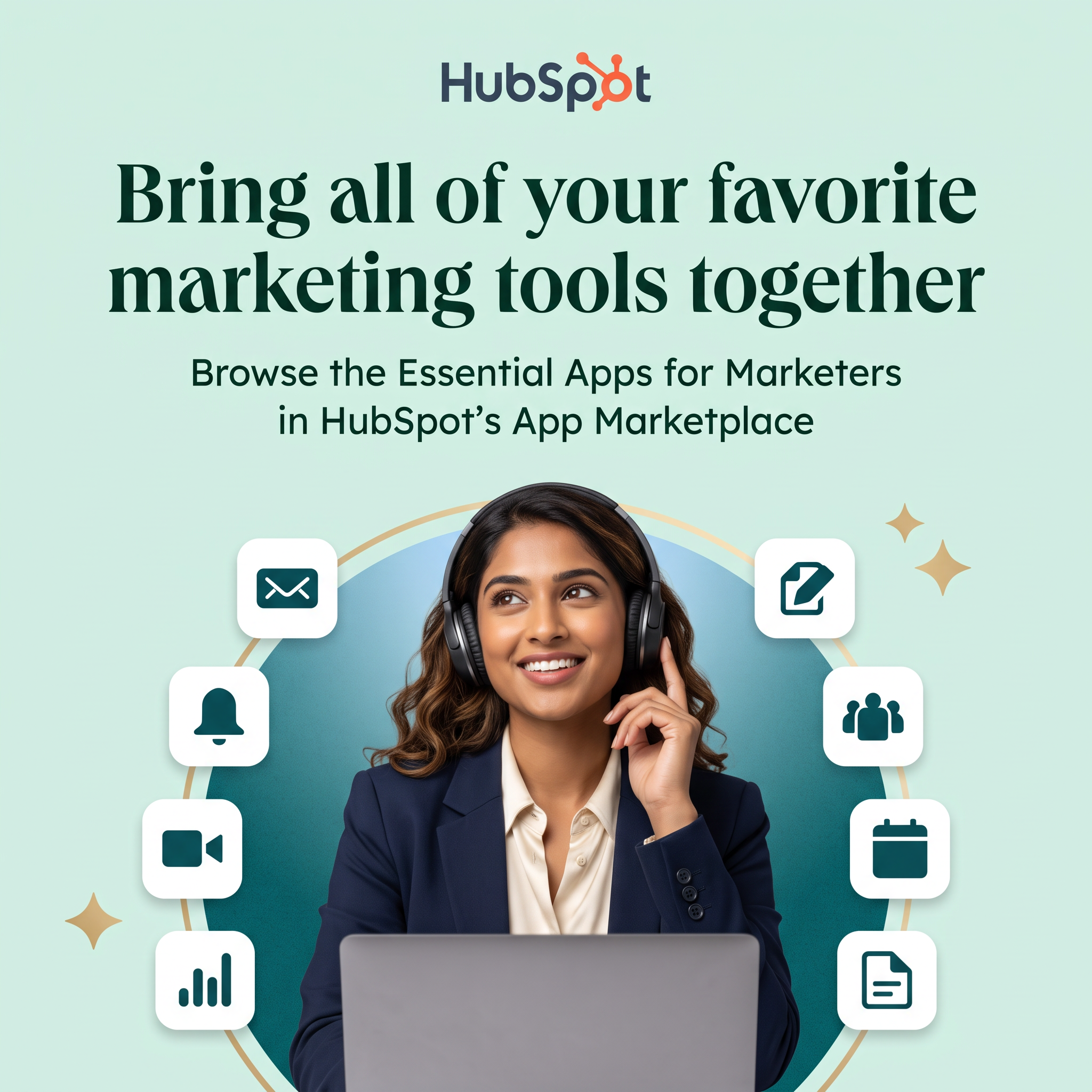
Icons circling one person show 'everything connects to you' without a word. Integrations are abstract, and this makes them visible.
- 02
'Favorite' keeps their stack
The copy doesn't ask marketers to switch tools. It promises to connect the ones they already love, which lowers resistance.
- 03
A relatable, relaxed persona
A calm, smiling marketer suggests less chaos. Viewers project themselves into that feeling of being in control.
- 04
Serif headline signals premium
The editorial serif typeface feels trustworthy and polished. It sets HubSpot apart from flat, generic SaaS ads.
Full creative breakdown
Who this ad targets
The ad targets in-house marketers, marketing ops managers and small business owners who already use several tools for email, video, scheduling and reporting. They feel the pain of switching tabs and disconnected data. Some are existing HubSpot customers who haven't explored integrations yet, making this ideal for retargeting and expansion. On LinkedIn it would target marketing job functions at SMB and mid-market companies, and on Meta it could reach followers of marketing pages and website visitors.
Copywriting analysis
The headline 'Bring all of your favorite marketing tools together' is benefit-first and inclusive. The word 'favorite' is the clever choice: it respects the tools marketers already use, avoiding the threat of a painful migration. 'Together' carries the core promise of unity and less friction. The subline is more descriptive and SEO-like, naming the App Marketplace and 'Essential Apps for Marketers', which works as a clear next step rather than a hard sell. There's no price, urgency or feature list, so the ad works as awareness and engagement. A stronger variant might quantify the ecosystem, such as '1,500+ apps'.
Visual design
The composition is split cleanly: text on top, hero image on the bottom. A soft mint background, dark green serif type and gold accents create a calm, premium feel. The circular teal gradient behind the model acts as a spotlight, while the thin gold orbit line ties the app tiles into a single system. White rounded tiles with teal icons are instantly readable at small sizes. Sparkles add a subtle hint of delight without clutter.
How to adapt this template for your brand
- Pick 6–8 icons representing your key integrations or features.
- Use a cut-out photo of a persona that matches your buyer, smiling and at ease.
- Place a coloured circle behind the person and arrange icons along an orbit line.
- Write a headline using 'your favorite tools' plus a unifying verb like 'together' or 'connected'.
- Add a descriptive subline naming the destination, such as your marketplace or integrations page.
Tips for saas & tech ads on LinkedIn
On LinkedIn, target marketing roles at small and mid-sized companies and use this as a single-image ad pointing to an integrations landing page. Pair it with a carousel that shows each app category. On Meta, use it for retargeting visitors and existing users, where the integration message helps adoption. Keep intro text short and name two or three well-known apps for recognition. Test the serif headline against a bolder sans-serif version to see which earns a higher click-through rate.
About this creative
This square HubSpot ad promotes the HubSpot App Marketplace to marketers. The HubSpot logo sits centred at the top on a soft mint background. Below it, a large dark green serif headline reads 'Bring all of your favorite marketing tools together', followed by a sans-serif subline inviting viewers to browse the essential apps for marketers in the marketplace. The lower half features a smiling woman in a navy blazer wearing over-ear headphones, looking upward thoughtfully with a laptop in front of her. She is framed by a teal gradient circle with a thin gold orbit line. Eight white rounded app tiles float along the orbit, showing icons for email, notifications, video calls, analytics, editing, team contacts, calendar and documents. Small gold sparkles add a premium, polished touch. The visual metaphor is clear: all your tools revolve around you, connected in one place, making the marketer's day calmer and more productive.
LinkedIn ad · 1200 × 1200 · SaaS & Tech
HubSpot App Marketplace Ad: SaaS Integrations Template
This HubSpot ad promotes its App Marketplace with a smiling marketer surrounded by app icons. It's a square lifestyle creative built for LinkedIn and Meta. Use it as a template for SaaS integrations, app stores, platform ecosystems or any product that connects other tools in one place.
Added
All brand names and logos are property of their owners. Adplaylist is not affiliated with or endorsed by these brands.
Details
Ad copy
Primary text
Stop jumping between tabs. Connect your email, video, calendar, analytics and more with the essential apps for marketers in HubSpot's App Marketplace.
Description
Browse integrations in HubSpot's App Marketplace.
On-image text
HubSpot | Bring all of your favorite marketing tools together | Browse the Essential Apps for Marketers in HubSpot's App Marketplace
Headline ideas for this template
- 1All your marketing tools. One connected hub.
- 2Stop switching tabs. Start connecting apps.
- 3Keep the tools you love, connect them in minutes
- 4Your marketing stack, finally in sync
- 5The essential apps every marketer should connect
Browse similar by tag