Key takeaways
- Format: Text-only quote card for awareness.
- Best for: Educational brands posting low-cost social content.
- Hook: A poetic metaphor for a clinical skill.
- Reuse it: One sentence, two colored keywords, logo underneath.
Available sizes
What is a meme ad?
A meme ad borrows a familiar meme format or internet joke and adapts it to the product or the buyer's problem. It feels native to social feeds and is highly shareable, but depends on the meme still being recognisable to the audience.
See all meme ads →Why this meme ad works
- 01
Emotion over instruction
Calling CPR a 'symphony' makes a technical skill feel meaningful and memorable.
- 02
Keyword color coding
Blue 'CPR' and red 'life-saving' let skimmers get the point without reading the full line.
- 03
Looks like a post, not an ad
The quote-card style blends into feeds and invites likes and shares.
- 04
Consistent branding
The logo and color palette tie the message to the foundation without a sales push.
Full creative breakdown
Who this ad targets
The ad targets a broad US audience: people who have thought about learning CPR, healthcare workers and students who need certification, parents, teachers, coaches and caregivers. It's top-of-funnel content aimed at building familiarity with the brand among people who aren't actively searching yet. Engagement from this post can be used to build warm audiences for later certification offers.
Copywriting analysis
The copy is a single 19-word sentence that uses metaphor – 'symphony', 'reignites', 'rhythm', 'stilled heart' – to elevate CPR from a procedure to something almost heroic. The rhythm metaphor is clever because CPR literally relies on a compression rhythm. It explains what CPR is (compressions and breaths) while staying emotional. The trade-off: there is no benefit for the viewer, no offer and no next step, so it won't drive conversions alone. It's best paired with primary text that adds the call to action, such as online certification.
Visual design
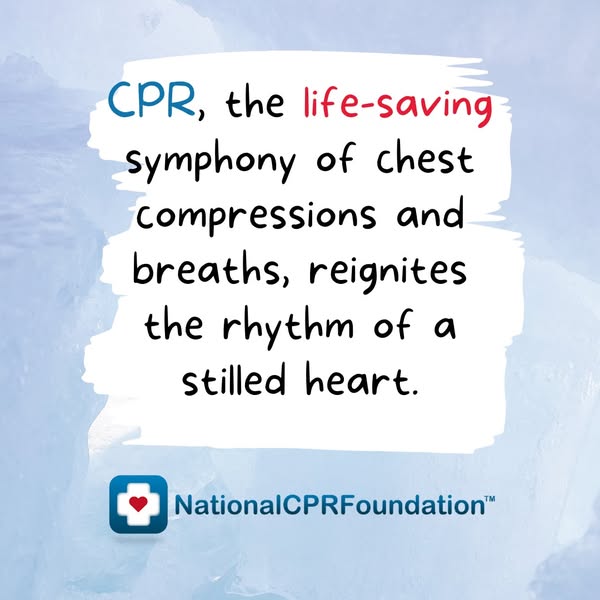
A light blue ice texture creates a calm, cool backdrop. The torn white brushstroke panel adds a handmade, approachable feel and maximizes contrast for the text. The rounded, handwritten-style font softens the medical topic. Blue and red accent words match the logo colors. Generous padding and a centered layout keep the card balanced, and the logo sits low so it doesn't compete with the message.
How to adapt this template for your brand
- Write one emotional sentence that reframes what your product or skill means.
- Pick a soft textured background in your brand's secondary color.
- Place the text on a high-contrast brushstroke or card shape in a friendly font.
- Color two keywords in your brand colors to create a skimmable message.
- Add your logo below and put the call to action in the post copy.
Tips for first aid ads on Meta
Best as a Meta Feed post or low-budget engagement campaign on Facebook and Instagram. Optimize for engagement or video views audiences, then retarget engagers with direct certification ads. Keep the post copy short and add a link to the course. Rotate several quote cards to avoid fatigue. On Instagram, use relevant hashtags like #CPR and #FirstAid if posting organically.
About this creative
This square creative from the National CPR Foundation is a pure text quote card. The background is a soft, pale blue ice texture that feels calm and clinical. In the center, a rough white brushstroke panel holds a single sentence in a friendly handwritten-style font: CPR is described as a life-saving symphony of compressions and breaths that restarts a stilled heart. Two words get color emphasis – 'CPR' in blue and 'life-saving' in red – picking up the brand's palette and guiding the eye to the key idea. Beneath the panel sits the National CPR Foundation logo: a rounded blue square with a white cross and red heart, followed by the wordmark. There is no product, person, price or call to action on the image. The goal is awareness and engagement: make people stop, feel something about CPR, and associate the feeling with the brand.
Meta ad · 338 × 600 · First Aid
National CPR Foundation CPR Quote Ad Example
This square ad from the National CPR Foundation is a quote card: one poetic sentence about CPR on a brushstroke panel over an icy blue background. It's built for organic-feeling awareness and engagement rather than hard selling. Use it as a template for educational brands that want shareable, low-cost social posts.
Added
All brand names and logos are property of their owners. Adplaylist is not affiliated with or endorsed by these brands.
Details
Ad copy
Primary text
CPR keeps blood and oxygen moving until help arrives. Learn the skill that can restart a heart – get certified online with the National CPR Foundation.
Description
Fast, affordable online CPR certification
On-image text
CPR, the life-saving symphony of chest compressions and breaths, reignites the rhythm of a stilled heart. NationalCPRFoundation™
Headline ideas for this template
- 1Every heartbeat starts with someone ready
- 2Learn the rhythm that saves lives
- 3Two hands. One heart. Learn CPR.
- 4Be the reason a heart beats again
- 5CPR: the skill everyone should know
Meta image ad specs
| Placement | Ratio | Size (px) |
|---|---|---|
| Feed | 1:1 or 4:5 | 1080×1080 / 1080×1350 |
| Marketplace | 1:1 | 1200×1200 |
| Messenger inbox | 1:1 | 1200×1200 |
| Stories & Reels | 9:16 | 1080×1920 |
This template is 1:1. Request 4:5 or 9:16 to cover all placements.
Browse similar by tag