Key takeaways
- Format: Three-column bundle comparison story ad.
- Best for: Launching bundles or tiered product sets.
- Hook: 'Our biggest bundles ever' promises a rare deal.
- Reuse it: Name bundles by use case and list contents underneath.
Available sizes
What is a comparison ad?
A comparison ad sets the product against an alternative, such as a competitor, the old way of doing things or a cheaper option, usually in a two-column layout or table. It helps buyers who are already weighing options see quickly why this one is the better choice.
See all comparison ads →Why this comparison ad works
- 01
Use-case naming
Car, Truck and Home make the choice instant – buyers pick where the kit will live, not compare specs.
- 02
Center-stage anchor
The biggest bundle sits in the middle with the longest list, nudging buyers toward the higher-value option.
- 03
Contents build value
Listing every item makes each bundle feel generous and justifies the price before the click.
- 04
One clear action
A single wide Shop Now button avoids decision fatigue after the comparison.
Full creative breakdown
Who this ad targets
This ad targets US drivers, truck owners and homeowners who know they should have a first aid kit but haven't bought one. Commuters and parents are pointed to the Car bundle, overlanders, contractors and outdoorsy truck owners to the Truck bundle, and families to the Home bundle. It also works for existing My Medic customers who might add a second kit for another vehicle or room, and for gift buyers during holiday or Father's Day promotions.
Copywriting analysis
The headline 'Our Biggest Bundles Ever.' uses superlative framing to create a sense of occasion without naming a discount. The period adds confidence. Bundle names are short and situational, so viewers self-select in seconds. The content lists use product names (MyFAK, Quick Tight TQ, Superskin, Zzips) which build brand familiarity, though cold audiences may not know what each item does. Plus-sign bullets reinforce the idea of 'more included'. 'Shop Now' is direct and fits a sales event. Adding the saving amount or a price per bundle would make the 'biggest' claim more concrete.
Visual design
A grainy red gradient fading to white keeps the brand color dominant while giving the lower half a clean surface for text. Product photography is cut out and grouped, so each bundle reads as a set. Black condensed type for labels and lists keeps things legible. Thin dividers create order, and the red pill-shaped button echoes the kits. The composition flows top to bottom: logo, headline, products, lists, CTA.
How to adapt this template for your brand
- Group your products into two or three bundles named after a use case or customer type.
- Photograph or cut out each bundle's items and cluster them around the hero product.
- Put your highest-value bundle in the center column with the largest visual.
- List contents with short bullets under each bundle name, max five lines.
- Finish with one wide CTA button and test adding prices or savings per bundle.
Tips for first aid ads on Meta
Designed for Meta Stories and Reels. The text lists are small, so check legibility on a phone before launch and keep them above the bottom safe zone. Pair with a carousel or catalog ad where each card links to one bundle for easier tracking. Use this creative for broad audiences and the single-kit discount ads for retargeting. A 4:5 Feed version can stack the columns vertically if text gets too small.
About this creative
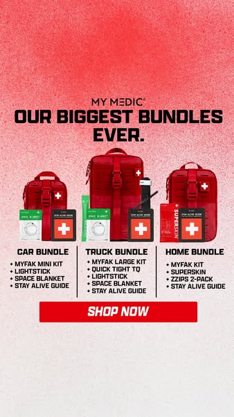
This 9:16 story ad announces 'Our Biggest Bundles Ever' from My Medic. A speckled red-to-white gradient fills the background, giving the creative energy while keeping the lower half readable. The My Medic logo sits above a bold, black, all-caps headline. In the middle, three red MyFAK kits are arranged by size – small, large, medium – each surrounded by its add-ons: lightsticks, space blankets, a tourniquet, a Superskin pack and the Stay Alive Guide. Below, three columns labelled CAR BUNDLE, TRUCK BUNDLE and HOME BUNDLE list the contents with plus-sign bullets, separated by thin vertical dividers. The Truck bundle sits in the center with the largest kit and the longest list, positioning it as the most complete option. A wide red 'SHOP NOW' button anchors the bottom. The ad turns a product range into an easy choice based on where the buyer will keep the kit.
Meta ad · 338 × 600 · First Aid
My Medic First Aid Bundles Comparison Ad
This vertical My Medic ad sells three first aid kit bundles – Car, Truck and Home – in a clean three-column comparison. Each column shows the kit and its contents, with a single Shop Now button below. It's a strong template for bundle launches, tiered offers and 'good, better, best' product ranges.
Added
All brand names and logos are property of their owners. Adplaylist is not affiliated with or endorsed by these brands.
Details
Ad copy
Primary text
Our biggest bundles ever are here. Kit out your car, truck or home with a ready-to-go first aid bundle – everything you need in one order.
Description
Car, truck and home first aid bundles
On-image text
MY MEDIC – OUR BIGGEST BUNDLES EVER. CAR BUNDLE: MyFAK Mini Kit, Lightstick, Space Blanket, Stay Alive Guide. TRUCK BUNDLE: MyFAK Large Kit, Quick Tight TQ, Lightstick, Space Blanket, Stay Alive Guide. HOME BUNDLE: MyFAK Kit, Superskin, Zzips 2-Pack, Stay Alive Guide. SHOP NOW
Headline ideas for this template
- 1A first aid bundle for every ride
- 2Car, truck or home? We've got you
- 3Everything you need, bundled
- 4Pick your bundle, be prepared
- 5Our biggest first aid deal yet
Meta image ad specs
| Placement | Ratio | Size (px) |
|---|---|---|
| Feed | 1:1 or 4:5 | 1080×1080 / 1080×1350 |
| Marketplace | 1:1 | 1200×1200 |
| Messenger inbox | 1:1 | 1200×1200 |
| Stories & Reels | 9:16 | 1080×1920 |
This template is 1:1. Request 4:5 or 9:16 to cover all placements.
Browse similar by tag