Key takeaways
- Format: Product wall with labelled flavour callouts and offer button.
- Best for: Sampler kits, starter bundles and first-purchase offers.
- Hook: A glowing, abundant wall of product on pure black.
- Reuse it: Line up every variant and annotate each with a 2–4 word note.
Available sizes
What is a feature callout ad?
A feature callout ad is a static image that shows a single product with short text labels pointing to its key features or benefits, usually joined to the product by thin lines. It explains several selling points at a glance without a long caption, which is why it's common for supplements, skincare, electronics and kitchenware.
See all feature callouts ads →Why this feature callouts ad works
- 01
Abundance sells
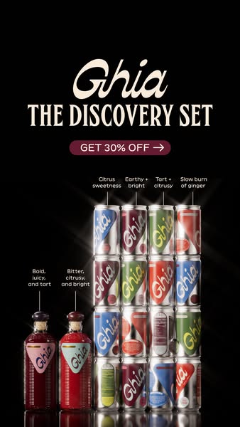
Sixteen cans plus two bottles make the set look generous and justify the bundle price.
- 02
Callouts reduce risk
Short tasting notes help newcomers pick favourites before buying, easing the fear of the unknown.
- 03
Button-shaped offer
The 'Get 30% Off →' pill looks tappable, nudging the viewer toward the CTA before they reach it.
- 04
Dark, premium stage
Black background and rim lighting give a luxury, nightlife feel that suits an apéritif.
Full creative breakdown
Who this ad targets
New-to-brand US shoppers aged 25–45 who are intrigued by non-alcoholic apéritifs but unsure which flavour to try. It also suits gift buyers and people planning to stock up for hosting. Foodies who enjoy tasting flights and wine samplers will respond to the tasting-note format, while the 30% discount converts deal-seekers ready to try the full range.
Copywriting analysis
The headline names the product as an experience: 'The Discovery Set' suggests exploration and fun rather than a bulk purchase. The offer is short and action-led, 'Get 30% Off', with an arrow reinforcing direction. The real copy work happens in the callouts: each is two to five words, sensory and specific ('Slow burn of ginger'), mimicking how a sommelier describes wine. They educate without slowing the viewer down. No body copy is needed on the image, keeping it clean and premium.
Visual design
Pure black background makes the colourful cans pop and adds drama. A strict grid arrangement shows abundance while staying orderly. Rim lighting and starburst glints create a polished, almost jewellery-like product look. Thin white leader lines and small sans-serif labels give a technical, infographic feel. Cream and burgundy accents keep the brand palette consistent.
How to adapt this template for your brand
- Arrange every variant in your set in a tidy grid or wall.
- Shoot on black with strong rim lighting to make packaging glow.
- Write a 2–5 word sensory note for each variant.
- Connect notes to products with thin leader lines.
- Place a pill-shaped offer button under the set name and test discount levels.
Tips for non-alcoholic drinks ads on Meta
Designed for Meta Stories/Reels at 9:16; keep the headline and button in the upper third and leave the bottom 15% clear for the CTA. On Feed, crop to 4:5 by trimming the top and bottom black space. Pair with 'Shop now' linking straight to the set. Strong for prospecting and for first-purchase campaigns around holidays.
About this creative
A 9:16 story ad on a deep black background promoting Ghia's Discovery Set. At the top, the cream Ghia script logo sits above 'The Discovery Set' in tall condensed serif capitals, followed by a burgundy pill button reading 'Get 30% Off' with an arrow. Below, a four-by-four wall of Le Spritz cans in blue, burgundy, green and red is lit dramatically with rim lighting and glints, so the metal shines against the dark. To the left stand two Ghia apéritif bottles, one pink-labelled and one blue-labelled. Thin lines connect each column and bottle to a short tasting note: 'Citrus sweetness', 'Earthy + bright', 'Tart + citrusy', 'Slow burn of ginger', 'Bold, juicy, and tart' and 'Bitter, citrusy, and bright'. The callouts act like a mini tasting guide, helping first-time buyers understand the range and see the set as an exploration rather than a gamble.
Meta ad · 338 × 600 · Non-Alcoholic Drinks
Ghia Discovery Set Ad With Flavour Callouts
This Ghia ad sells a variety pack by lining up every can and bottle on a black background and labelling each flavour with a short tasting note. A 30% off button sits under the product name. It's a clean template for sampler kits, starter sets and any multi-flavour bundle.
Added
All brand names and logos are property of their owners. Adplaylist is not affiliated with or endorsed by these brands.
Details
Ad copy
Primary text
Can't decide? The Ghia Discovery Set has every flavour – from citrusy and bright to a slow burn of ginger. Get 30% off and find your new favourite non-alcoholic drink.
Description
Every Ghia flavour in one set
On-image text
Ghia | THE DISCOVERY SET | GET 30% OFF → | Citrus sweetness | Earthy + bright | Tart + citrusy | Slow burn of ginger | Bold, juicy, and tart | Bitter, citrusy, and bright
Headline ideas for this template
- 1Try Every Flavour – 30% Off
- 2Your Non-Alcoholic Tasting Flight
- 3The Discovery Set Is Here
- 4Can't Choose? Get Them All
- 5Start Your Ghia Journey
Meta image ad specs
| Placement | Ratio | Size (px) |
|---|---|---|
| Feed | 1:1 or 4:5 | 1080×1080 / 1080×1350 |
| Marketplace | 1:1 | 1200×1200 |
| Messenger inbox | 1:1 | 1200×1200 |
| Stories & Reels | 9:16 | 1080×1920 |
This template is 1:1. Request 4:5 or 9:16 to cover all placements.