Key takeaways
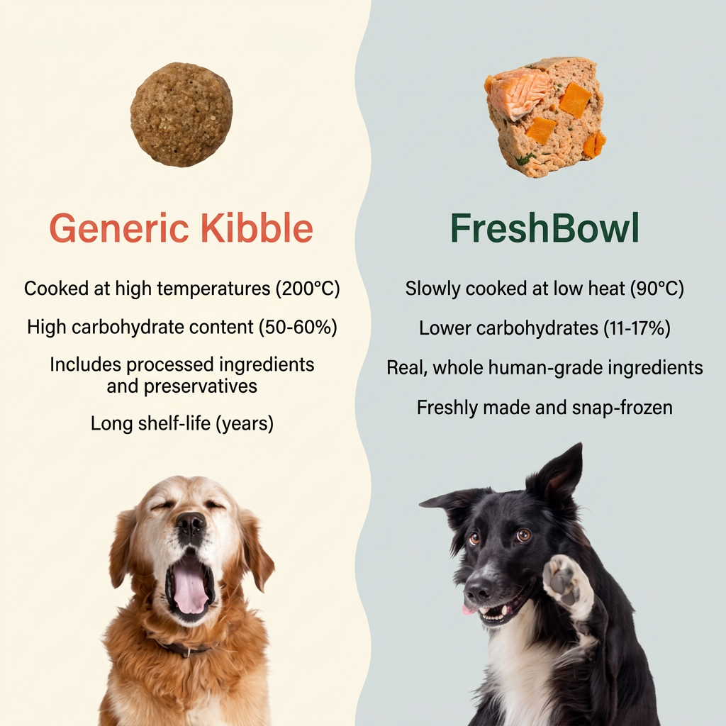
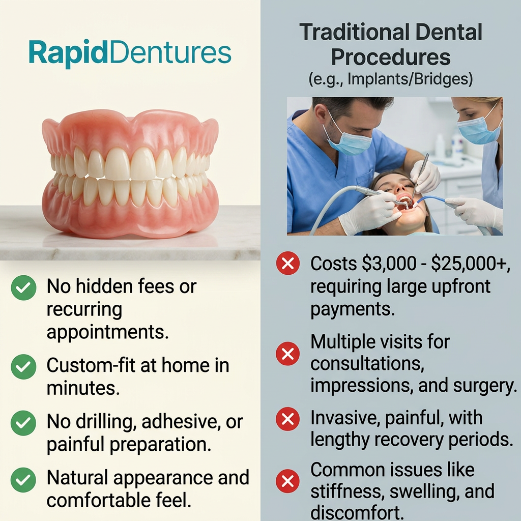
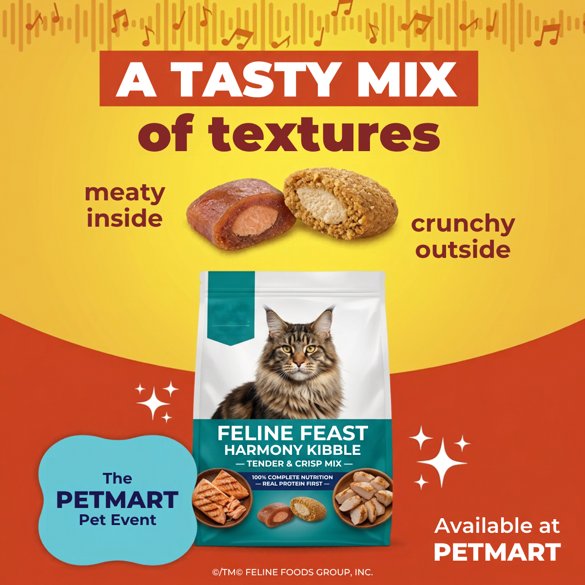
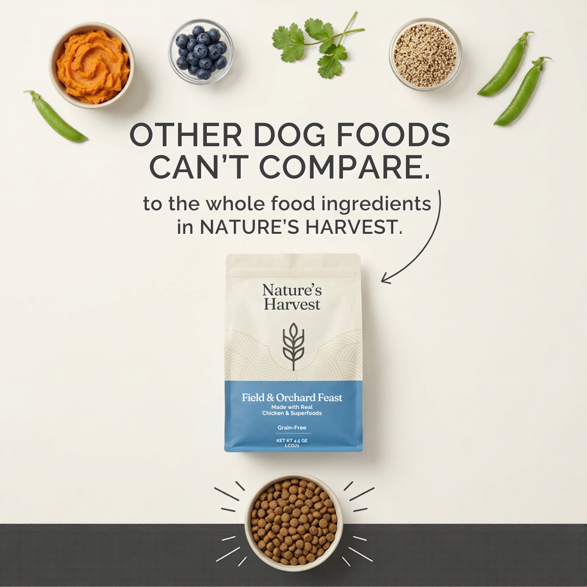
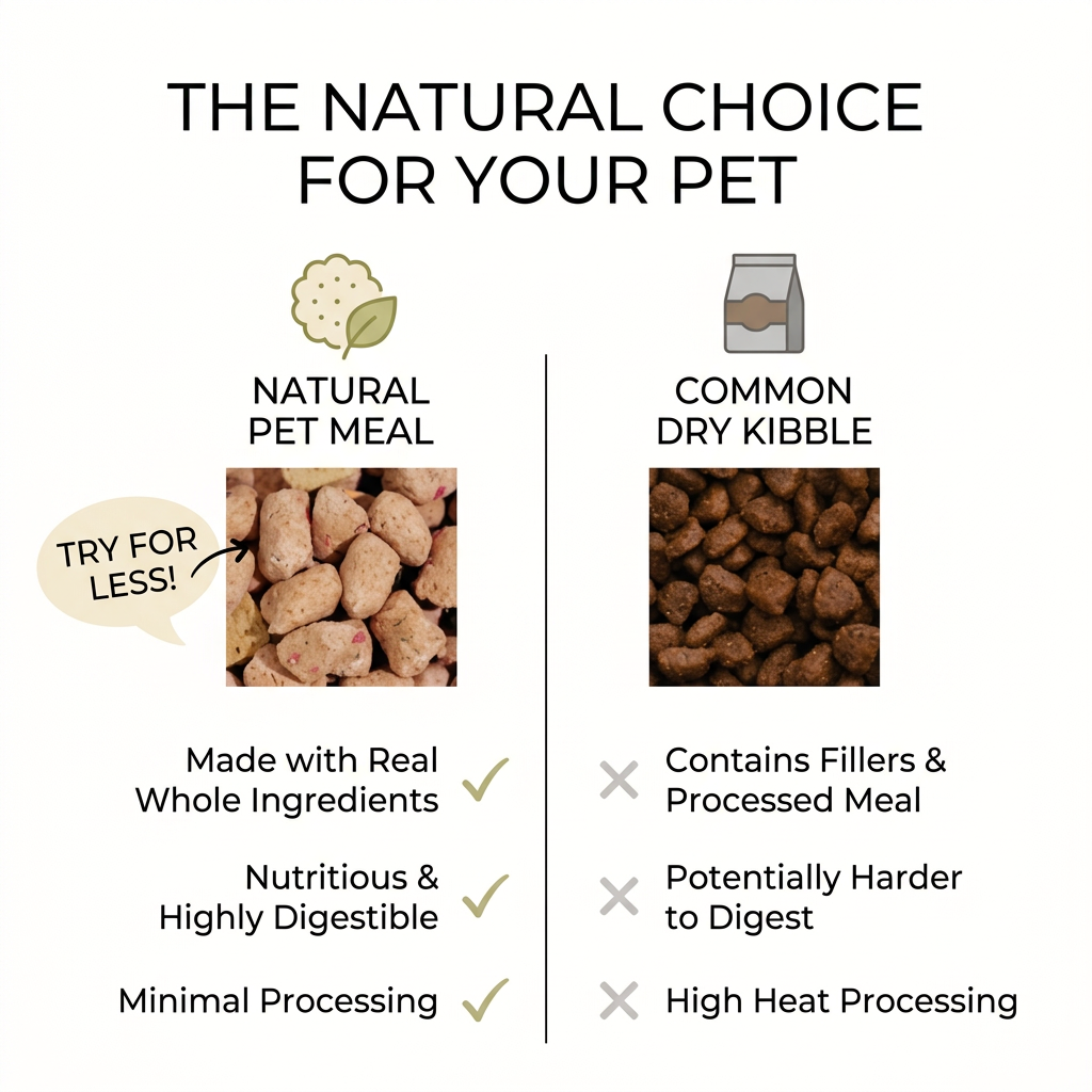
- Format: Two-column us-vs-them comparison with ticks and crosses.
- Best for: Natural, fresh or freeze-dried pet food brands positioning against kibble.
- Hook: 'The natural choice for your pet' frames the comparison before it starts.
- Reuse it: Show close-ups of your product and the category alternative with three ticks and three crosses.
Available sizes
What is a comparison ad?
A comparison ad sets the product against an alternative, such as a competitor, the old way of doing things or a cheaper option, usually in a two-column layout or table. It helps buyers who are already weighing options see quickly why this one is the better choice.
See all comparison ads →Why this comparison ad works
- 01
Instant comparison
Ticks and crosses are universally understood, so the message lands in seconds.
- 02
Visual contrast
Pale, varied chunks look fresh next to uniform dark kibble.
- 03
Category, not competitor
Comparing against 'common dry kibble' avoids naming a rival brand.
- 04
Low-risk offer
'Try for less' suggests a trial discount, lowering the barrier to switch.
Full creative breakdown
Who this ad targets
Pet owners currently feeding kibble who are curious about natural or less processed alternatives. They may have read about fillers or processing and want a simple explanation of the difference. They care about digestion and ingredient quality. Because the copy says 'pet', it can reach both dog and cat owners, which suits brands selling natural food for both species under one name.
Copywriting analysis
The headline is clear and confident. The left column uses positive, short claims, while the right uses negative ones, with 'potentially' softening the digestion claim to keep it fair. 'Contains fillers' is a broad generalisation about all kibble, which regulators may consider misleading, since not every kibble contains fillers. 'Try for less!' is vague: less than what, and by how much? Spell out the offer. The ad also needs a brand name, since viewers won't know who makes the natural meal.
Visual design
The off-white background and black type create a clean, editorial look, and the symmetrical two-column layout makes comparison effortless. The natural food photo is light and textured, while the kibble is dark and uniform, so the visual difference reinforces the copy. Green ticks feel positive, and grey crosses feel neutral rather than aggressive. The cream speech bubble is the only accent and draws attention to the offer.
How to adapt this template for your brand
- Photograph close-ups of your food and the category alternative, in the same lighting and crop.
- Write three short, fair comparisons, avoiding sweeping claims about all competitors.
- Use ticks for your product and softer crosses for the alternative.
- Spell out the trial offer, such as '50% off your first box'.
- Add your brand name or logo.
Tips for pets ads on Meta
Comparison ads perform well on Meta for audiences interested in natural pet food and kibble alternatives. Keep claims about kibble fair and substantiated, since comparative advertising rules in many markets, including the UK and EU, require accuracy. Never name or show a competitor's product. Test species-specific versions for dogs and cats, since targeted copy usually outperforms generic 'pet' messaging in both relevance and clicks.
About this creative
A side-by-side comparison ad on a plain off-white background. A large black headline at the top reads 'The natural choice for your pet'. A thin vertical line divides the frame into two columns. The left column has a line icon of a cauliflower-like food with a green leaf, the label 'Natural pet meal', and a square close-up photo of pale, irregular freeze-dried style chunks flecked with herbs and red pieces. A cream speech bubble with an arrow says 'Try for less!'. Below, three green ticks sit beside claims about real whole ingredients, being nutritious and highly digestible, and minimal processing. The right column has a grey kibble bag icon, the label 'Common dry kibble', and a square close-up of uniform dark brown kibble. Three grey crosses list fillers and processed meal, potentially harder digestion and high heat processing. The layout is symmetrical, clean and easy to scan, with no brand name shown.
Meta ad · 1200 × 1200 · Pets
Natural Pet Meal vs Dry Kibble Comparison Ad
This comparison ad puts close-ups of pale, natural pet food chunks beside dark brown dry kibble, with three ticks on one side and three crosses on the other. A speech bubble invites viewers to 'Try for less!'. Use it for natural, freeze-dried or fresh pet food brands challenging conventional kibble.
Added
All brand names and logos are property of their owners. Adplaylist is not affiliated with or endorsed by these brands.
Details
Ad copy
Primary text
Not all pet food is made the same. Our natural pet meals use real whole ingredients and minimal processing, so they're gentler to digest than common dry kibble. Try it for less today.
Description
Real ingredients, minimal processing
On-image text
THE NATURAL CHOICE FOR YOUR PET | NATURAL PET MEAL | COMMON DRY KIBBLE | TRY FOR LESS! | Made with Real Whole Ingredients ✓ | Nutritious & Highly Digestible ✓ | Minimal Processing ✓ | ✕ Contains Fillers & Processed Meal | ✕ Potentially Harder to Digest | ✕ High Heat Processing
Headline ideas for this template
- 1Kibble vs real food: see the difference
- 2The natural choice for your pet
- 3What's really in the bag?
- 4Less processing, more nutrition
- 5Try natural for less
Meta image ad specs
| Placement | Ratio | Size (px) |
|---|---|---|
| Feed | 1:1 or 4:5 | 1080×1080 / 1080×1350 |
| Marketplace | 1:1 | 1200×1200 |
| Messenger inbox | 1:1 | 1200×1200 |
| Stories & Reels | 9:16 | 1080×1920 |
This template is 1:1. Request 4:5 or 9:16 to cover all placements.
Browse similar by tag