Key takeaways
- Format: Carousel follow-up card with an illustrated scale comparison
- Best for: Making a big stat tangible and memorable
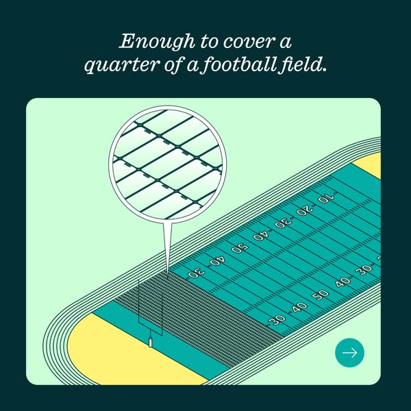
- Hook: Weekly phone volume pictured as a quarter of a football field
- Reuse it: Translate your number into a familiar space or object
Available sizes
What is a feature callout ad?
A feature callout ad is a static image that shows a single product with short text labels pointing to its key features or benefits, usually joined to the product by thin lines. It explains several selling points at a glance without a long caption, which is why it's common for supplements, skincare, electronics and kitchenware.
See all feature callouts ads →Why this feature callouts ad works
- 01
Familiar reference point
Most Americans can picture a football field, so the comparison makes the scale instantly understandable.
- 02
Zoom reveals the detail
The magnifier shows the field is made of real phones, which rewards a closer look.
- 03
Pays off the first card
It answers the question raised by the big number, giving a satisfying reason to keep swiping.
- 04
Illustration feels fresh
Switching from photography to a flat illustration breaks the visual pattern and keeps attention in the carousel.
Full creative breakdown
Who this ad targets
This card targets the same US audience as the carousel opener: smartphone owners with old devices, plus people who care about e-waste and like visual facts. The American football reference fits a US audience specifically and appeals to sports fans and general viewers alike. It suits engagement and awareness campaigns where dwell time and swipes matter, and it can also stand alone as an interesting fact post for sustainability-minded followers.
Copywriting analysis
The copy is one sentence that completes the thought of the previous card. Enough to cover a quarter of a football field is concrete and visual, turning an abstract number into a mental image. Using a quarter rather than a whole field keeps the claim believable and shows the figure was calculated. The italic serif type gives it a storytelling, editorial tone that contrasts with the bold numbers on the first card. There is no brand or CTA on this card, so it depends on the carousel sequence. A follow-up card should carry the kiosk location or the offer.
Visual design
The card uses a clean flat illustration with a limited palette of teal, mint, dark green and pale yellow, matching the brand colours. The isometric angle gives the field depth while staying simple. The dense phone grid at one end creates a strong textural contrast with the open field, and the zoom bubble draws the eye straight to it. The rounded mint panel and arrow button keep the layout consistent with the first carousel card.
How to adapt this template for your brand
- Take the big number from your first card and convert it into a familiar space or object.
- Draw that space as a simple flat illustration in your brand colours.
- Fill part of it with tiny icons of your product.
- Add a zoom bubble so viewers can see the icons are your product.
- Keep the swipe arrow and follow up with an offer or CTA card.
Tips for recycling ads on Meta
Runs well in the Meta feed at 1:1 and can be cropped to 4:5 for extra mobile real estate. Keep the headline readable at thumbnail size and let the primary text carry the emoji benefit list. Use a Get Directions CTA with a store-traffic or reach objective targeted around kiosk locations. For Google Display or Performance Max, upload the same layout as a 1200×1200 square and pair it with a short 30-character headline that repeats the cash benefit.
About this creative
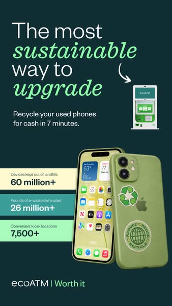
This square card continues the carousel started by the We buy 109,221 used phones weekly card. The top line, in white italic serif on the dark teal background, reads Enough to cover a quarter of a football field. Below sits a flat, isometric-style illustration on a mint rounded panel: an American football field in teal with white yard lines and numbers, surrounded by a running track in green lines and yellow corners. One end of the field, near the goalpost, is covered in a dense grid of tiny phone shapes in dark green. A large magnifying circle zooms in on that area, revealing that the pattern is made up of rows of individual smartphones. A teal arrow button in the bottom right corner invites a further swipe. The card swaps the photo style of the first card for a simple illustration, turning a big number into a memorable visual comparison.
Meta ad · 338 × 600 · Recycling
Illustrated Carousel Ad Template: Enough to Cover a Quarter of a Football Field
The second card in ecoATM's stat carousel turns 109,221 phones into a picture: enough phones to cover a quarter of a football field. A flat illustration with a zoom bubble shows the phones laid out on the turf. Use it as a template for making big numbers tangible.
Added
All brand names and logos are property of their owners. Adplaylist is not affiliated with or endorsed by these brands.
Details
Ad copy
Primary text
Recycle your used phone with us. 📱 Get instant cash. 💵 Help the planet. 🌎 Find an ecoATM near you
Description
Find an ecoATM kiosk near you
On-image text
Enough to cover a quarter of a football field.
Headline ideas for this template
- 1Picture 109,221 phones on a football field
- 2That's a lot of phones saved
- 3One week of phones, one quarter field
- 4The scale of phone recycling, visualised
- 5How many phones we buy, in one picture
Meta image ad specs
| Placement | Ratio | Size (px) |
|---|---|---|
| Feed | 1:1 or 4:5 | 1080×1080 / 1080×1350 |
| Marketplace | 1:1 | 1200×1200 |
| Messenger inbox | 1:1 | 1200×1200 |
| Stories & Reels | 9:16 | 1080×1920 |
This template is 1:1. Request 4:5 or 9:16 to cover all placements.