Key takeaways
- Format: Split-screen food comparison with one big number each.
- Best for: Food brands challenging a 'healthy' default choice.
- Hook: The surprise that ramen has half the calories of a salad.
- Reuse it: Swap in any rival product your audience assumes is healthier.
Available sizes
What is a comparison ad?
A comparison ad sets the product against an alternative, such as a competitor, the old way of doing things or a cheaper option, usually in a two-column layout or table. It helps buyers who are already weighing options see quickly why this one is the better choice.
See all comparison ads →Why this comparison ad works
- 01
Myth-busting surprise
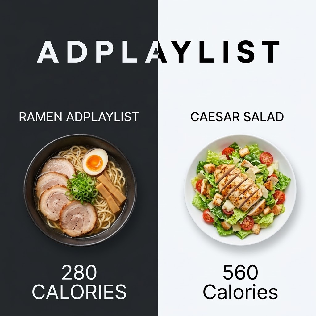
Most people assume salad is lighter, so the reversed numbers stop the scroll.
- 02
Black and white split
High contrast makes the two sides instantly readable and gives the brand the bold side.
- 03
Same angle, same scale
Top-down shots of equal size make the comparison feel fair.
- 04
Numbers do the talking
Two large calorie counts tell the whole story without extra copy.
Full creative breakdown
Who this ad targets
This ad targets calorie-conscious food lovers aged 20 to 40 who track what they eat but crave comfort food. They often default to salads for lunch and feel they are missing out. The audience includes office workers ordering delivery and fitness fans who want satisfying meals within their targets. Lookalike audiences built from past purchasers are a strong next step once the ad has data.
Copywriting analysis
The copy is limited to two product labels and two numbers, letting the contrast make the argument. The left label repeats the brand name, and the calorie text switches between capitals and title case, so both should be standardised before reuse. Comparison copy works best when it is stripped down to labels and numbers. The viewer does the maths, which feels more convincing than being told, and the surprise in the result is what drives curiosity and clicks. Together, the words and visuals give the viewer one clear reason to click.
Visual design
The hard vertical split creates a clean left-versus-right story, with the brand wordmark bridging both halves. Food photography is shot from directly above, which keeps each plate round and comparable. Large, light-weight numerals sit at the bottom of each side. The square 1:1 format keeps every element readable on mobile, and the clear hierarchy guides the eye from brand to message to product.
How to adapt this template for your brand
- Pick a popular alternative your audience sees as the default or 'healthy' choice next to your ramen.
- Split the frame in two with contrasting backgrounds.
- Shoot both options from the same angle and at the same size so the comparison feels fair.
- Add one big, verifiable number under each side.
- Make sure every claim can be backed up, and test different rivals to find the biggest surprise.
Tips for food ads on Meta
On Meta, run this ramen creative in Feed and Explore at 1:1, then crop a 4:5 version to win more mobile screen space. Keep the headline inside the safe zone so it is not covered by the profile name or CTA bar. Use the primary text for details the image leaves out, and test Advantage+ placements alongside a Feed-only ad set. Refresh the visual every three to four weeks to avoid creative fatigue.
About this creative
The creative is split vertically into a black left half and a white right half, with the Adplaylist wordmark spanning both in contrasting colours. On the left, a top-down bowl of ramen with chashu pork, a soft-boiled egg, spring onions and bamboo shoots is labelled Ramen Adplaylist, with 280 calories in large type below. On the right, a white plate of Caesar salad with sliced grilled chicken, croutons, tomatoes and parmesan is labelled Caesar salad, with 560 calories below. As a comparison ad, it places two options side by side so the viewer can judge them in a single glance. The split layout creates instant contrast, and one big number does the persuading. Because the brand's product comes out as the smarter choice, the ad challenges an assumption the viewer already holds, which makes it memorable and highly shareable in a feed.
Meta ad · 1200 × 1200 · Food
Ramen Ad Template – Comparison Example
This ramen ad template uses a comparison format to show a bowl of ramen at 280 calories beside a 560-calorie Caesar salad on a split black and white background. It is a strong reference for food brands challenging a 'healthy' default choice. Below: the copy, why it works and five steps to adapt it.
Added
All brand names and logos are property of their owners. Adplaylist is not affiliated with or endorsed by these brands.
Details
Ad copy
Primary text
Think the salad is the lighter option? Think again. A bowl of Adplaylist ramen comes in at just 280 calories, half of a typical Caesar salad, with all the comfort of a rich, slurpable bowl.
Description
280 calories vs 560 for a Caesar salad
On-image text
ADPLAYLIST | RAMEN ADPLAYLIST | CAESAR SALAD | 280 CALORIES | 560 Calories
Headline ideas for this template
- 1Lighter than your salad.
- 2280 calories of pure comfort.
- 3Ramen beats salad. Really.
- 4Half the calories, double the joy.
- 5The lunch swap you'll actually enjoy.
Meta image ad specs
| Placement | Ratio | Size (px) |
|---|---|---|
| Feed | 1:1 or 4:5 | 1080×1080 / 1080×1350 |
| Marketplace | 1:1 | 1200×1200 |
| Messenger inbox | 1:1 | 1200×1200 |
| Stories & Reels | 9:16 | 1080×1920 |
This template is 1:1. Request 4:5 or 9:16 to cover all placements.
Browse similar by tag