Key takeaways
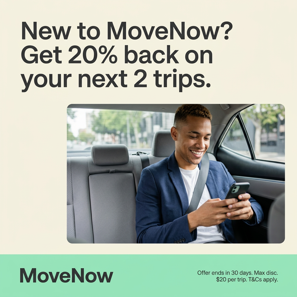
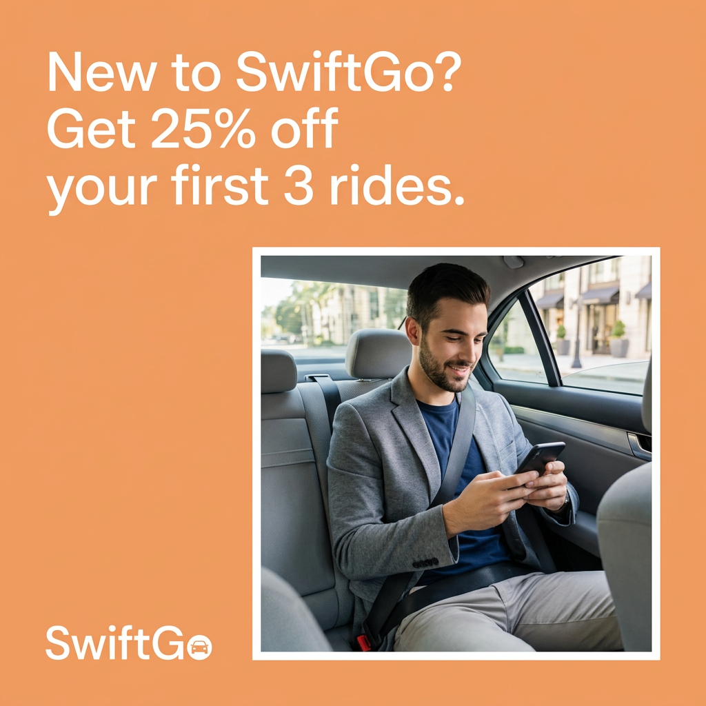
- Format: Solid-color offer ad with a framed lifestyle photo.
- Best for: Consumer apps running a simple welcome discount for new users.
- Hook: A bright orange block and a direct "New to SwiftGo?" question.
- Reuse it: Swap in your brand color and first-purchase discount, keep the framed photo.
Available sizes
What is an offer ad?
An offer ad leads with a deal, such as a percentage off, free shipping or a first-order discount, as the main hook. It's built to convert people who already know the brand or are close to buying, and works best with a clear deadline or condition.
See all offer / discount ads →Why this offer / discount ad works
- 01
Color that stops the scroll
A saturated orange background stands out against the white and blue of most social feeds.
- 02
One clear offer
25% off three rides is the only message on the image, so there is nothing to decode.
- 03
A relatable passenger
The smiling, smart-casual rider shows the outcome: a comfortable ride and time to catch up on your phone.
- 04
Logo built into the corner
The white wordmark with a car icon brands the ad clearly without competing with the headline.
Full creative breakdown
Who this ad targets
The ad targets first-time ride-hailing users or people loyal to a competing app, typically urban adults aged 22 to 45. The business-casual passenger points to commuters and professionals who take rides to work, meetings or airports. A discount on three rides, rather than one, encourages a habit to form, so it also targets people who ride a few times a month. It suits launch campaigns in new cities and broad prospecting audiences with an app-install objective.
Copywriting analysis
The copy is short and functional: a question followed by an offer. "New to SwiftGo?" instantly qualifies the reader and introduces the brand name in the first three words. "Get 25% off your first 3 rides" is a clean, quantified benefit with a built-in action verb. Using "first 3 rides" rather than one ride encourages repeat use, which is what an app really wants. The copy avoids hype and fine print, keeping the ad readable at a glance. However, the lack of a deadline or terms reduces urgency and may raise questions about caps, so a short line like "Ends Sunday" or "Max $10 per ride" could lift conversion and help with ad-policy compliance.
Visual design
The design relies on a single bold brand color and strong white typography. The headline sits top left, the photo sits bottom right, and the logo anchors the bottom left, creating a diagonal reading path. A thick white border around the photo makes it feel like a polaroid or a framed screen and separates it from the orange. The warm color palette matches the friendly tone, and the generous empty space keeps the ad clean.
How to adapt this template for your brand
- Choose one saturated brand color for the full background.
- Write a two-part headline: a qualifying question plus a quantified offer.
- Place a customer-in-action photo with a thick white frame in the lower right.
- Put your logo in white in the bottom left corner.
- Add a short deadline or cap if you need urgency or legal clarity.
Tips for apps & subscriptions ads on Meta
This creative is built for Meta feed placements and works well as an app-install ad with the Install Now CTA. Test it against a version with a deadline to measure the impact of urgency. For Stories and Reels, extend the orange background to 9:16 and move the logo up out of the UI safe zone. On TikTok, recreate the scene as a short creator-style video showing the booking flow, with the 25% offer as an on-screen sticker.
About this creative
The ad uses a solid warm orange background that fills the whole square. In the top left, white sans-serif text reads: "New to SwiftGo? Get 25% off your first 3 rides." The text is large and set over three lines, leaving the top right empty. Below, a photo with a thick white border is placed on the right side. It shows a bearded man in a grey blazer and navy T-shirt, seatbelt on, sitting in the back of a car and smiling as he looks at his smartphone. Through the window, a sunny city street with shops and trees is visible. In the bottom left corner, the SwiftGo wordmark appears in white, with a small car icon inside the final letter. There are no terms, deadline or button on the image, keeping the creative extremely clean and focused on the single offer.
Meta ad · 1200 × 1200 · Apps & Subscriptions
Ride App Ad: 25% Off the First 3 Rides
This ride app ad from SwiftGo uses a bright orange background, a question headline and a photo of a smiling passenger to promote 25% off the first three rides. It is a simple, high-contrast template for any app or service that wants to convert first-time users with a welcome discount.
Added
All brand names and logos are property of their owners. Adplaylist is not affiliated with or endorsed by these brands.
Details
Ad copy
Primary text
First time riding with SwiftGo? Enjoy 25% off your first 3 rides. Book in seconds, sit back and get there on time.
Description
New riders only. Download the app to claim.
On-image text
New to SwiftGo? Get 25% off your first 3 rides. | SwiftGo
Headline ideas for this template
- 1Your first 3 rides, 25% cheaper
- 2Skip the wait, save 25%
- 3Try SwiftGo for less this week
- 4Ride in comfort, pay a little less
- 5Welcome ride? We'll take 25% off
Meta image ad specs
| Placement | Ratio | Size (px) |
|---|---|---|
| Feed | 1:1 or 4:5 | 1080×1080 / 1080×1350 |
| Marketplace | 1:1 | 1200×1200 |
| Messenger inbox | 1:1 | 1200×1200 |
| Stories & Reels | 9:16 | 1080×1920 |
This template is 1:1. Request 4:5 or 9:16 to cover all placements.
Browse similar by tag