Key takeaways
- Format: Split-screen comparison of two variants of the same product.
- Best for: Products with two lines, styles or collections to show side by side.
- Hook: A second look headline backed by a literal two-view image.
- Reuse it: Split your frame in two and give each half one variant.
Available sizes
What is a comparison ad?
A comparison ad sets the product against an alternative, such as a competitor, the old way of doing things or a cheaper option, usually in a two-column layout or table. It helps buyers who are already weighing options see quickly why this one is the better choice.
See all comparison ads →Why this comparison ad works
- 01
The layout is the message
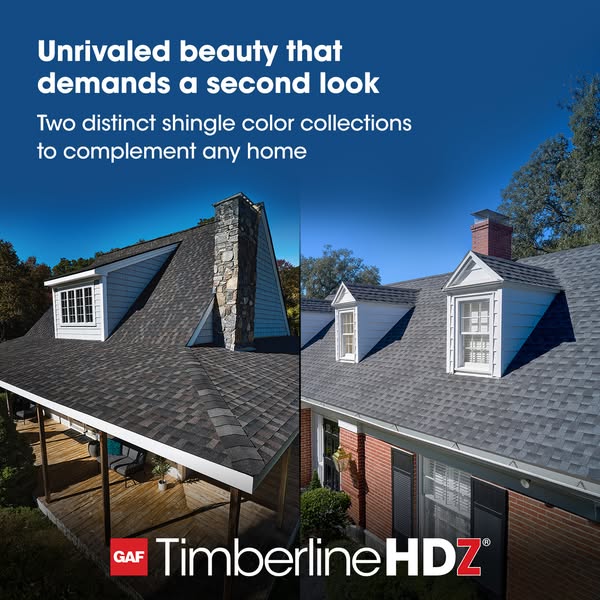
Two photos represent two collections. Viewers understand the range before they read a word.
- 02
Clever copy-visual link
Demands a second look matches the second image beside the first. It rewards a closer look.
- 03
Different homes, wider appeal
A rustic home and a classic brick colonial cover different styles. Contractors see the shingles fit many projects.
- 04
Premium blue gradient
The deep blue sky unifies the two halves. It gives the creative a polished, premium feel.
Full creative breakdown
Who this ad targets
The ad targets residential roofing contractors and sales reps who work across different home styles and want to show homeowners a range of colour options. It also speaks to remodelers and builders choosing shingles for both rustic and traditional homes. Contractors who already install Timberline HDZ may be reminded that the line now covers two distinct collections, expanding their sales options.
Copywriting analysis
The headline Unrivaled beauty that demands a second look is aspirational and confident, using a superlative alongside a playful phrase that matches the split visual. Demands a second look suggests curb appeal strong enough to make passers-by stop. The subline Two distinct shingle color collections to complement any home adds the concrete product fact and reassures contractors that the range fits many styles. The copy is homeowner-friendly, so it could also run directly to consumers. It lacks a CTA, which should be handled by the button and primary text.
Visual design
A vertical split divides the square frame into two equal photos, with a soft fade into a shared deep blue gradient at the top. White headline type sits on the dark blue for strong contrast. The left image is warmer, with stone and wood, while the right is cooler, with grey shingles and white dormers. The red GAF badge and large white wordmark sit at the bottom centre, visually tying the two sides together.
How to adapt this template for your brand
- Pick two variants of your product that clearly look different.
- Photograph each in a setting that suits its style.
- Split the frame vertically and blend the tops into one background.
- Write a headline that plays on comparison or a second look.
- Centre your brand wordmark at the bottom to bridge both images.
Tips for roofing ads on Meta
On Meta, run this square creative in Feed, where the split layout reads clearly. It also works as the cover image of a carousel, followed by cards showing individual colours from each collection. Target residential roofing contractors and remodelers, and consider testing it with homeowner audiences researching roof replacement. For Stories, place the headline lower so it stays clear of the top profile overlay.
About this creative
This square GAF ad is split vertically into two photos. On the left, a close-up shows a steep roof with a mixed brown, grey and charcoal shingle blend, a white-sided dormer with windows and a tall stone chimney, above a covered wooden deck. On the right, a traditional red-brick home has a cooler grey shingle roof, two white gabled dormers and a brick chimney, set against tall green trees. The top of both images fades into a deep blue gradient sky. Across the top, a bold white headline reads Unrivaled beauty that demands a second look, followed by a smaller line: Two distinct shingle color collections to complement any home. The red GAF badge and large white Timberline HDZ wordmark sit centred at the bottom, bridging the two photos. The split visually represents the two collections without labels, letting viewers compare warm and cool styles side by side.
Meta ad · 338 × 600 · Roofing
GAF Timberline HDZ Ad: Unrivaled Beauty, Two Color Collections
This GAF ad uses a split-screen of two homes to show off Timberline HDZ's two distinct shingle colour collections. One side shows a warm, mixed-tone roof with a stone chimney, the other a cool grey roof on a red-brick colonial. It is a clear comparison template for showing range or variants side by side.
Added
All brand names and logos are property of their owners. Adplaylist is not affiliated with or endorsed by these brands.
Details
Ad copy
Primary text
Every home has its own style, and its roof should match. Timberline HDZ shingles come in two distinct color collections, from rich, warm blends to crisp, cool tones, so you can find the perfect fit for any house.
Description
Timberline HDZ shingles in two distinct color collections.
On-image text
Unrivaled beauty that demands a second look | Two distinct shingle color collections to complement any home | GAF Timberline HDZ®
Headline ideas for this template
- 1Warm or cool? Two collections to choose from.
- 2A roof color for every home style.
- 3Curb appeal worth a second look.
- 4Two looks. One trusted shingle.
- 5Find the perfect roof for any home.
Meta image ad specs
| Placement | Ratio | Size (px) |
|---|---|---|
| Feed | 1:1 or 4:5 | 1080×1080 / 1080×1350 |
| Marketplace | 1:1 | 1200×1200 |
| Messenger inbox | 1:1 | 1200×1200 |
| Stories & Reels | 9:16 | 1080×1920 |
This template is 1:1. Request 4:5 or 9:16 to cover all placements.
Browse similar by tag