Key takeaways
- Format: Repetition typography with strikethroughs.
- Best for: Opening frame of an animated Story or brand awareness Reel.
- Hook: One alarming word repeated until it fills the screen.
- Reuse it: Repeat your problem word and visually cross it out to imply the fix.
Available sizes
What is a feature callout ad?
A feature callout ad is a static image that shows a single product with short text labels pointing to its key features or benefits, usually joined to the product by thin lines. It explains several selling points at a glance without a long caption, which is why it's common for supplements, skincare, electronics and kitchenware.
See all feature callouts ads →Why this feature callouts ad works
- 01
Pattern interrupt
A wall of the same word is visually unusual and stops the thumb.
- 02
Show, don't tell
Strikethroughs communicate elimination without any extra copy.
- 03
Infestation feeling
Many crawling termites make the problem feel urgent and real.
- 04
High contrast palette
Red, white, black and lime green are bold and readable on mobile.
Full creative breakdown
Who this ad targets
The ad targets homeowners in termite-prone areas, aged 30–65, especially during spring swarm season when people see winged termites around windows and lights. It is aimed at broad awareness among people who may be worried about termite damage but haven't booked an inspection. It works with homeowner and home improvement interest targeting on Meta. Homeowners who have spotted wings or mud tubes near the foundation are the most urgent segment to reach.
Copywriting analysis
There is only one word, repeated six times, but the repetition itself is the message: termites are many, persistent and everywhere. The strikethrough adds an implied verb – removed, eliminated, handled – without needing more text. Because there is no CTA or brand name, the ad relies on primary text and a follow-up frame to convert. For a single-frame placement, adding a small logo and a line like 'We'll handle it' would strengthen it. The lack of words also makes it work across languages and very small placements.
Visual design
The type is set edge to edge with tight leading, turning letters into a textured background. Lime-green strokes are slightly uneven, giving a hand-drawn, human touch against the rigid type. Termite silhouettes are scattered across the full frame for balance. The red background ties to Ehrlich's brand color. Without a logo, the composition is pure graphic, ideal for animation where the strikes can draw on one by one.
How to adapt this template for your brand
- Choose the one word that names your customer's problem.
- Repeat it to fill the frame in a bold condensed typeface.
- Cross out each line with a contrasting brush stroke.
- Add silhouettes of the problem for texture and urgency.
- Add a final frame with logo, benefit and CTA.
Tips for pest control ads on Meta
Animate this for Reels and Stories: let each strikethrough draw on in sequence, then cut to the logo and offer. Keep the final CTA frame within safe zones. Use it with a 'Book Now' CTA and an inspection landing page. On Google Display, add a small logo and benefit line. Test the repeated-word approach for other pests like ants or rodents.
About this creative
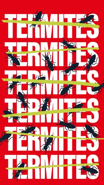
The creative fills a vertical red canvas with the word 'TERMITES' set six times in heavy, condensed white capitals, stacked edge to edge so the word becomes a pattern. Each row is crossed out with a lime-green brush stroke, as if someone has been striking termites off a list one by one. Dozens of black termite silhouettes crawl over the letters at different angles, creating a feeling of infestation and movement. There is no logo, CTA or extra copy visible, suggesting it is an opening frame or part of an animated sequence from a red-branded pest company such as Ehrlich. The repetition creates a rhythmic, almost overwhelming effect that mirrors how termites multiply, while the strikethroughs communicate the solution without words. The design is simple enough to understand in a second, yet visually dense enough to stop the scroll in a busy feed.
Meta ad · 338 × 600 · Pest Control
Repeated 'Termites' Crossed-Out Typography Ad
This vertical ad repeats the word 'TERMITES' six times in giant white type on red, with every line struck through by a hand-drawn lime-green stroke and black termite silhouettes swarming across it. It is a bold, typography-only format for Meta Stories and Reels that visually crosses termites off the viewer's list.
Added
All brand names and logos are property of their owners. Adplaylist is not affiliated with or endorsed by these brands.
Details
Ad copy
Primary text
Termites, termites, termites… crossed off your worry list. Get professional termite protection and stop the damage before it starts. Book your inspection today.
Description
Professional termite protection and inspections.
On-image text
TERMITES (repeated six times, each crossed out with a lime-green line)
Headline ideas for this template
- 1Cross Termites Off Your List
- 2Termites? Not Anymore.
- 3One Inspection. Zero Termites.
- 4Termites, Handled.
- 5Stop Termites in Their Tracks
Meta image ad specs
| Placement | Ratio | Size (px) |
|---|---|---|
| Feed | 1:1 or 4:5 | 1080×1080 / 1080×1350 |
| Marketplace | 1:1 | 1200×1200 |
| Messenger inbox | 1:1 | 1200×1200 |
| Stories & Reels | 9:16 | 1080×1920 |
This template is 1:1. Request 4:5 or 9:16 to cover all placements.
Browse similar by tag