Key takeaways
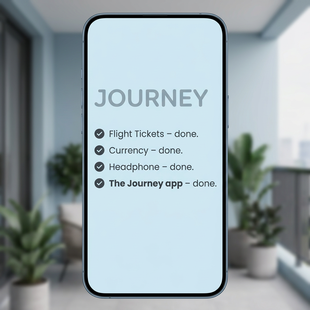
- Format: Ticked checklist on a phone screen, listicle style.
- Best for: Travel, productivity and utility apps driving installs.
- Hook: A familiar packing list where the app is the final tick.
- Reuse it: List three obvious essentials, then make your product the fourth.
Available sizes
What is a listicle ad?
A listicle ad presents the product's benefits or reasons to buy as a short numbered list, like an article headline ("5 reasons…"). The list format is easy to scan in a feed and lets one creative answer several objections at once.
See all listicle ads →Why this listicle ad works
- 01
Borrowed habit
Everyone writes a pre-trip checklist, so viewers instantly recognise the format and read it to the end.
- 02
The punchline is the product
Bolding the last line turns the app into the payoff and frames it as just as essential as tickets or money.
- 03
Native on mobile
Showing a phone screen mirrors the device the viewer is holding, which suits app-install placements.
- 04
Calm, uncluttered design
Soft blues and lots of empty space signal ease, matching the stress-free promise of a travel organiser.
Full creative breakdown
Who this ad targets
The ad targets organised travellers who plan ahead: young professionals, couples and frequent flyers who already make lists before trips. The generic items (tickets, currency, headphones) make it relevant across most markets and ages from about 22 to 45. It works best for people who have just booked travel or show interest in travel apps, airlines and holiday destinations. Retargeting visitors who browsed flights or hotels is a natural fit.
Copywriting analysis
The copy is almost entirely a checklist, and that's its strength. Each line follows the same 'item – done.' rhythm, so the repetition builds momentum toward the final line. Placing the brand name in that last slot, in bold, delivers the twist without a hard sell. The only branding is the word 'JOURNEY' at the top, which doubles as a title for the list. There's a small typo ('Headphone' instead of 'Headphones') worth fixing. The ad lacks a benefit statement, so the primary text should explain what the app actually does, such as storing bookings or itineraries.
Visual design
A single upright phone dominates the frame, with a blurred, light interior background that hints at travel without distracting. The palette is soft sky blue and muted grey, giving a calm, clean feel. Typography is a rounded sans-serif in dark grey, with circular tick icons adding a sense of completion. Most of the lower screen is empty, which focuses attention on the list but also leaves room that could hold a CTA or app store badge.
How to adapt this template for your brand
- Write a list of three everyday essentials your audience prepares before the relevant moment (a trip, a workout, a move).
- Add your product as the fourth item and set it in bold.
- Mock the list on a phone screen in your brand colours, using tick icons.
- Blur a relevant lifestyle setting behind the phone for context.
- Use the empty lower screen for an app-store badge or short benefit line.
Tips for apps & subscriptions ads on Meta
On Meta, use this for app-install campaigns with travel-intent audiences and retargeting from booking sites. On TikTok, animate it: tick each item off one by one with a satisfying sound, then reveal the app. Fix the 'Headphone' typo before launch. Add an App Store or Google Play badge in the empty space, and test a version that names one key feature, such as offline itineraries.
About this creative
The creative centres on a modern smartphone standing upright, filling most of the square frame. Behind it, a softly blurred balcony scene with potted plants, a lounge chair and a hint of city skyline sets a calm, light-blue mood. The phone screen is a pale sky-blue with the word 'JOURNEY' in large, muted grey capitals near the top. Below it sits a four-item checklist, each line marked with a dark circular tick: flight tickets, currency and headphones are all marked done. The fourth and final item, 'The Journey app – done', is set in bold, making it the punchline. The rest of the screen is left empty, which keeps the design airy and focused. There is no logo, price or button on the image, so the creative relies entirely on the checklist logic to position the app as an essential part of packing.
Meta ad · 1200 × 1200 · Apps & Subscriptions
Travel App Ad Template: The 'Done' Checklist
This square travel app ad shows a phone with a simple pre-trip checklist: flight tickets, currency and headphones are ticked off, and the final item is the Journey app itself. It's a minimal listicle format that suits app-install campaigns on Meta and TikTok aimed at frequent and holiday travellers.
Added
All brand names and logos are property of their owners. Adplaylist is not affiliated with or endorsed by these brands.
Details
Ad copy
Primary text
Tickets booked. Currency sorted. Headphones packed. The last thing on your list? The Journey app. Keep every plan, booking and reminder for your trip in one place.
Description
All your travel plans in one app.
On-image text
JOURNEY | Flight Tickets – done. | Currency – done. | Headphone – done. | The Journey app – done.
Headline ideas for this template
- 1Packed everything? Not until you've got Journey.
- 2The last thing on your travel list.
- 3Tickets, cash, headphones… Journey.
- 4Trip ready means Journey ready.
- 5Tick off your trip, one app at a time.
Meta image ad specs
| Placement | Ratio | Size (px) |
|---|---|---|
| Feed | 1:1 or 4:5 | 1080×1080 / 1080×1350 |
| Marketplace | 1:1 | 1200×1200 |
| Messenger inbox | 1:1 | 1200×1200 |
| Stories & Reels | 9:16 | 1080×1920 |
This template is 1:1. Request 4:5 or 9:16 to cover all placements.
Browse similar by tag