Key takeaways
- Format: Side-by-side product comparison with mirrored checkmark and cross lists.
- Best for: Products that replace a familiar but frustrating alternative, like suitcases, razors or software.
- Hook: A worn-out suitcase most travellers recognise, next to a cleaner modern option.
- Reuse it: Show your product clean on the left, the old way looking tired on the right, and mirror four benefits.
Available sizes
What is a comparison ad?
A comparison ad sets the product against an alternative, such as a competitor, the old way of doing things or a cheaper option, usually in a two-column layout or table. It helps buyers who are already weighing options see quickly why this one is the better choice.
See all comparison ads →Why this comparison ad works
- 01
Instant visual contrast
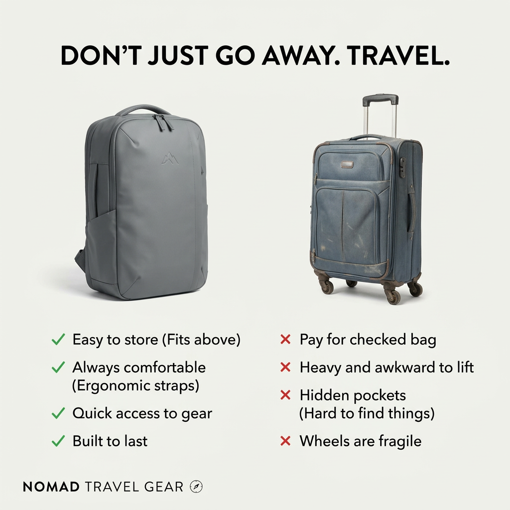
A crisp new backpack next to a battered suitcase tells the story before any text is read.
- 02
Mirrored benefit rows
Each checkmark lines up with a matching pain point, so the comparison is fair and easy to scan.
- 03
Money-saving angle
“Pay for checked bag” turns the choice into a cost saving, which is a strong motivator for frequent flyers.
- 04
Aspirational headline
“Don’t just go away. Travel.” frames the backpack as an identity choice for real travellers, not just luggage.
Full creative breakdown
Who this ad targets
Budget-conscious and frequent travellers, especially people who fly on low-cost airlines where checked bags cost extra. It also speaks to digital nomads, weekend city-breakers and backpackers aged roughly 20–40 who value mobility and hate waiting at baggage claim. Anyone who has struggled with a broken suitcase wheel on cobblestones will recognise the pain points. Good audiences include travel, budget airline and digital nomad interests, plus people browsing carry-on size rules.
Copywriting analysis
The headline uses a contrast structure: “Don’t just go away. Travel.” It separates passive holidaymakers from active travellers and invites the reader to identify with the second group. The benefit lists are short and practical, each under five words, with brackets adding a quick explanation such as “Fits above” or “Ergonomic straps.” The negative column speaks in the language of frustration: paying, heavy, awkward, hard to find, fragile. Pairing a saving (no checked-bag fee) with comfort and durability covers money, body and long-term value in one list. The copy never names a competitor brand, so it attacks a category rather than a company, which keeps it safe and broadly relatable.
Visual design
The layout is split into two equal columns on a light neutral background, giving a clean, product-catalogue feel. The heavy black sans-serif headline spans the full width at the top. Both products are photographed at the same scale and angle so the comparison feels fair. Green checkmarks and red crosses are the only colour accents, making the verdict obvious at a glance. Generous white space and a small wordmark at the bottom keep the brand understated and premium.
How to adapt this template for your brand
- Identify the old habit or rival product category your customer is leaving behind.
- Photograph your product clean and new, and the alternative looking worn or frustrating.
- Write four short benefits and four matching pain points that mirror each other row by row.
- Add a contrast headline that turns the choice into an identity statement.
- Keep colour only for the checks and crosses, and place your logo small at the bottom.
Tips for travel ads on Meta
On Meta, comparison ads perform well in Feed and as carousel openers; test a version where the second card zooms into the overhead-bin fit. Target people with upcoming trips or interest in budget airlines. On Google Display and Performance Max, the clear white background and short text resize cleanly into banners. Avoid naming a competitor brand in the copy to stay within ad policy, and keep claims like “fits above” true for common airline size limits.
About this creative
On a plain off-white background, the ad sets up a direct duel. On the left stands a modern grey backpack with a minimal mountain logo, photographed clean and new. On the right is an old blue fabric suitcase with scuffs, stains and worn corners, deliberately looking tired. Above both, a bold black headline reads “Don’t just go away. Travel.” Under each product sits a list. The backpack gets four green checkmarks: fits in the overhead storage, ergonomic straps, quick access to gear and built to last. The suitcase gets four red crosses: paying for a checked bag, heavy and awkward to lift, hidden pockets that make things hard to find, and fragile wheels. Each point mirrors the one across from it, so the reader compares row by row. The Nomad Travel Gear wordmark with a small compass icon sits bottom-left. The design is minimal, almost catalogue-like, and easy to read in a second.
Meta ad · 1200 × 1200 · Travel
Travel Backpack vs Suitcase Comparison Ad
This square comparison ad from Nomad Travel Gear puts a sleek grey carry-on backpack next to a scuffed rolling suitcase, with four green checkmarks against four red crosses. It is a clean us-versus-them template for any product that replaces an outdated habit or a frustrating alternative.
Added
All brand names and logos are property of their owners. Adplaylist is not affiliated with or endorsed by these brands.
Details
Ad copy
Primary text
Still dragging a suitcase through the airport? 🧳 The Nomad carry-on backpack fits in the overhead bin, saves you checked-bag fees and keeps your gear one zip away. Travel lighter on your next trip.
Description
Carry-on backpack built to last
On-image text
DON’T JUST GO AWAY. TRAVEL. | ✓ Easy to store (Fits above) | ✓ Always comfortable (Ergonomic straps) | ✓ Quick access to gear | ✓ Built to last | ✗ Pay for checked bag | ✗ Heavy and awkward to lift | ✗ Hidden pockets (Hard to find things) | ✗ Wheels are fragile | NOMAD TRAVEL GEAR
Headline ideas for this template
- 1One Bag. No Baggage Claim.
- 2Fits the Overhead Bin, Every Time
- 3Stop Paying for Checked Bags
- 4Travel Lighter on Your Next Trip
- 5The Backpack That Replaces Your Suitcase
Meta image ad specs
| Placement | Ratio | Size (px) |
|---|---|---|
| Feed | 1:1 or 4:5 | 1080×1080 / 1080×1350 |
| Marketplace | 1:1 | 1200×1200 |
| Messenger inbox | 1:1 | 1200×1200 |
| Stories & Reels | 9:16 | 1080×1920 |
This template is 1:1. Request 4:5 or 9:16 to cover all placements.