Key takeaways
- Format: Split-screen comparison with line-by-line feature contrast.
- Best for: Premium products that need to justify a higher price than a generic alternative.
- Hook: Self-identification: are you a savvy traveler or a basic one?
- Reuse it: Swap the suitcases for your hero product and a generic rival, keep six matched feature rows.
Available sizes
What is a comparison ad?
A comparison ad sets the product against an alternative, such as a competitor, the old way of doing things or a cheaper option, usually in a two-column layout or table. It helps buyers who are already weighing options see quickly why this one is the better choice.
See all comparison ads →Why this comparison ad works
- 01
Instant visual contrast
Rich burgundy against plain off-white signals premium versus ordinary before a single word is read. Color does half the persuading.
- 02
Matched rows make comparison effortless
Each feature on the left has a direct counterpart on the right. Viewers scan across rows and the gap in value becomes obvious.
- 03
Check marks only on one side
Ticks appear only next to the premium features, a simple cue that reads as a win on every line.
- 04
Identity-based labels
"Savvy Travelers" versus "Basic Trips" turns the purchase into a statement about who you are, not just what you buy.
Full creative breakdown
Who this ad targets
This ad targets frequent and business travelers who already own luggage but feel it is letting them down. They value durability, security and convenience features such as charging on the go and tracking a lost bag. They are willing to pay more for quality, but need a quick rational justification. The identity framing also appeals to aspirational travelers who want their gear to signal that they travel smart. It works well for retargeting audiences who viewed premium luggage but did not buy.
Copywriting analysis
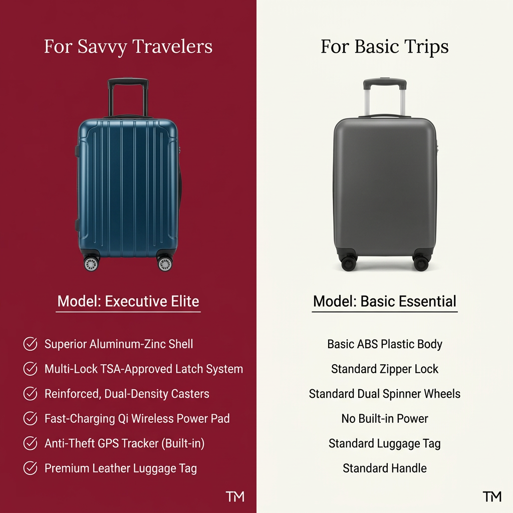
The copy is built on contrast rather than persuasion. Labels like "For Savvy Travelers" and "For Basic Trips" set up an identity choice, so the reader sorts themselves before reading the specs. On the premium side, every feature is upgraded with adjectives: superior, multi-lock, reinforced, fast-charging, anti-theft, premium. On the basic side the word "standard" repeats four times, and "No Built-in Power" states a clear absence. That repetition makes the cheaper option feel generic without insulting it. Feature lines are short, specific and parallel, which keeps them scannable on mobile. The weakness is that there is no brand name, price or call to action on the image, so the primary text and headline need to carry the offer.
Visual design
A vertical 50/50 split creates a strong, symmetrical layout. Burgundy and off-white give the premium side warmth and weight, while the basic side looks clean but cold. Both suitcases are shot at the same angle and scale, so the comparison feels fair. A serif headline adds a touch of luxury, while sans-serif body text keeps the features readable. Check-mark icons on the left are the only graphic elements, guiding the eye down the list.
How to adapt this template for your brand
- Pick your hero product and a generic or older alternative shown at the same angle and scale.
- Give the premium side a rich brand color and the basic side a neutral one.
- Write two identity labels that let the viewer choose a side, e.g. "For Pros" vs "For Beginners".
- List five or six matched features; use check marks only on your side and the word "standard" on the other.
- Add your logo, price or offer, and a CTA in the primary text or on the image.
Tips for travel ads on Meta
On Meta, this static comparison works best in feed and as a retargeting creative for people who visited product pages. Keep the image square and test a 4:5 version for more feed space. On Google Display and Performance Max, the text-heavy layout may get cropped, so supply a simplified version with fewer feature lines. Add the brand name and price to the primary text, because the image alone does not show them. A carousel with one feature per card is a strong follow-up test.
About this creative
The creative is split vertically into two halves. On the left, a deep burgundy panel carries the label "For Savvy Travelers" above a navy blue hard-shell carry-on with ribbed panels and a telescopic handle. Below it, the model name "Executive Elite" is underlined, followed by six white feature lines, each with a check-mark icon: an aluminum-zinc shell, TSA-approved latches, dual-density casters, a Qi wireless charging pad, a built-in GPS tracker and a leather luggage tag. The right half is an off-white panel labelled "For Basic Trips" with a plain grey suitcase called "Basic Essential". Its six matching lines are centered, unticked and deliberately flat: ABS plastic body, standard zipper lock, standard wheels, no built-in power, standard tag and standard handle. Both halves use the same serif headline and sans-serif body type, so the eye compares line by line. A small TM mark sits in each bottom corner instead of a logo.
Meta ad · 1200 × 1200 · Travel
Luggage Comparison Ad: Premium Carry-On vs Basic Model
This luggage ad uses a classic split-screen comparison to set a premium smart carry-on against a basic suitcase. Six ticked features face six plain alternatives, making the upgrade obvious at a glance. Use it as a template for any product with a clear premium tier and a cheaper alternative.
Added
All brand names and logos are property of their owners. Adplaylist is not affiliated with or endorsed by these brands.
Details
Ad copy
Primary text
Your suitcase should work as hard as you do. The Executive Elite brings an aluminum-zinc shell, TSA-approved locks, wireless charging and a built-in GPS tracker. Still travelling with the basics?
Description
Smart carry-on luggage for frequent travelers
On-image text
For Savvy Travelers | Model: Executive Elite | Superior Aluminum-Zinc Shell | Multi-Lock TSA-Approved Latch System | Reinforced, Dual-Density Casters | Fast-Charging Qi Wireless Power Pad | Anti-Theft GPS Tracker (Built-in) | Premium Leather Luggage Tag | TM | For Basic Trips | Model: Basic Essential | Basic ABS Plastic Body | Standard Zipper Lock | Standard Dual Spinner Wheels | No Built-in Power | Standard Luggage Tag | Standard Handle | TM
Headline ideas for this template
- 1Your suitcase should work as hard as you do
- 2Savvy or basic? Choose your carry-on
- 3Six reasons to retire your old suitcase
- 4Charge, track and lock: luggage, upgraded
- 5Built for frequent flyers, not weekend trips
Meta image ad specs
| Placement | Ratio | Size (px) |
|---|---|---|
| Feed | 1:1 or 4:5 | 1080×1080 / 1080×1350 |
| Marketplace | 1:1 | 1200×1200 |
| Messenger inbox | 1:1 | 1200×1200 |
| Stories & Reels | 9:16 | 1080×1920 |
This template is 1:1. Request 4:5 or 9:16 to cover all placements.
Browse similar by tag