Key takeaways
- Format: Generic vs branded product comparison on pedestals with mirrored feature lists.
- Best for: Feature-rich products competing against cheap, basic alternatives.
- Hook: Your plain tote is holding you back on every trip.
- Reuse it: Pit your product against a generic version and mirror five clear feature rows.
Available sizes
What is a comparison ad?
A comparison ad sets the product against an alternative, such as a competitor, the old way of doing things or a cheaper option, usually in a two-column layout or table. It helps buyers who are already weighing options see quickly why this one is the better choice.
See all comparison ads →Why this comparison ad works
- 01
Generic, not a competitor
Comparing against an unbranded bag highlights superiority without legal risk or naming rivals.
- 02
Pedestal staging
Placing both bags on plinths makes the comparison feel fair and premium, like a product showroom.
- 03
Typography tells the winner
Light text for the generic bag and bold text for Nomadtech subtly guide the eye and the verdict.
- 04
Concrete specs
Details like “+20L” and “dual-use design” give rational buyers hard numbers to justify the purchase.
Full creative breakdown
Who this ad targets
Practical travellers aged roughly 25–45 who take weekend trips, gym-to-office days or short business travel and are frustrated by disorganised packing. They value function, compartments and versatility over pure looks, and may currently use a basic tote or old gym bag. The backpack straps and weather resistance appeal to commuters and outdoor-leaning city travellers. Target by travel, fitness, productivity and organisation interests, and retarget visitors who viewed travel bag pages.
Copywriting analysis
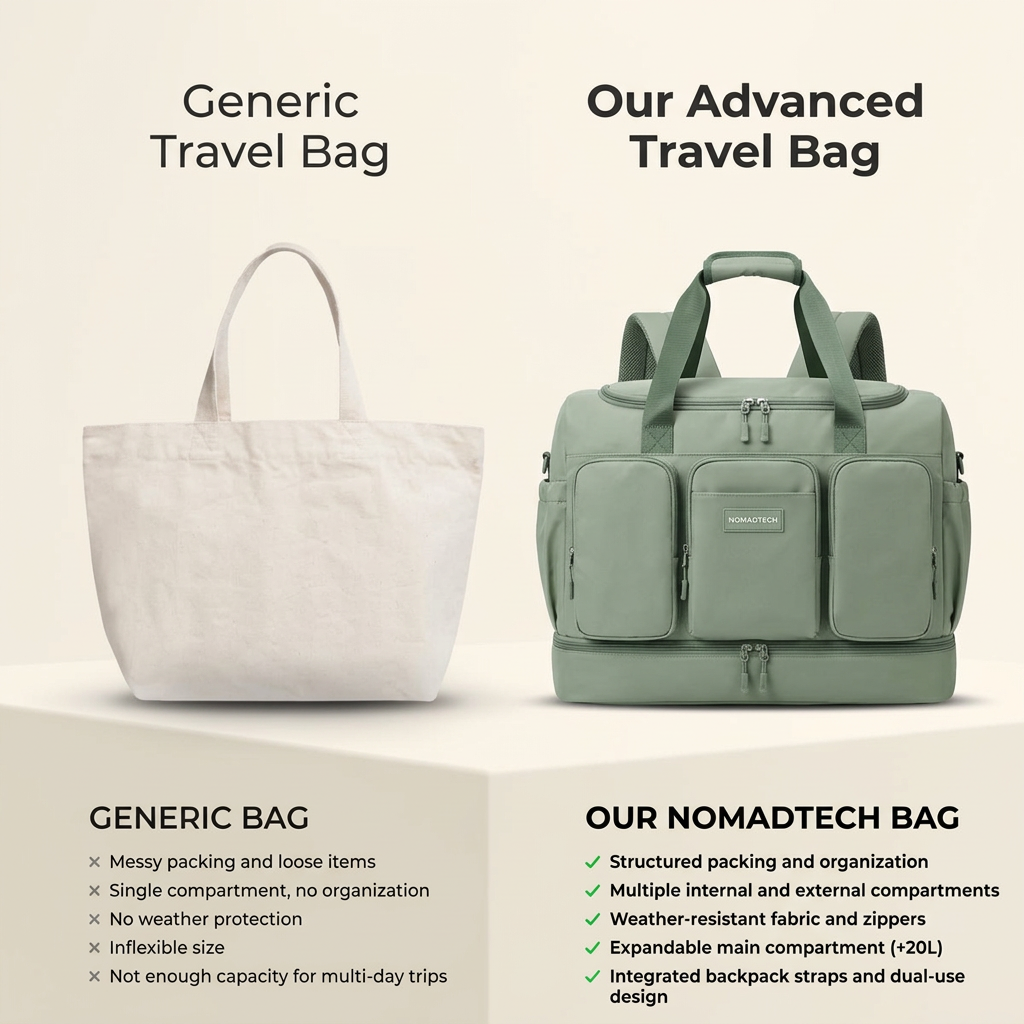
The headlines set up an imbalance: “Generic Travel Bag” in a thin weight versus “Our Advanced Travel Bag” in bold, using the word “advanced” to frame Nomadtech as an upgrade. The lists are parallel, so each pain point on the left is answered by a solution on the right: messy packing becomes structured packing, single compartment becomes multiple compartments, and so on. The negatives describe frustration (“messy,” “loose,” “inflexible”), while the positives use technical, reassuring words (“weather-resistant,” “integrated,” “expandable”). The “+20L” spec gives a concrete, memorable number. The copy is functional rather than emotional, suited to considered purchases.
Visual design
A symmetrical two-column layout on a warm cream background creates calm and balance. Both bags sit on beige pedestals with soft studio lighting, giving a clean, premium e-commerce look. The sage-green duffel is the only saturated colour, so it immediately draws attention. Headings use a modern geometric sans-serif with contrasting weights. Small grey crosses and green checkmarks keep the lists scannable, and the clear hierarchy flows from headline to product to features.
How to adapt this template for your brand
- Choose a basic, unbranded alternative that your customer currently uses.
- Photograph both products on identical plinths with the same lighting.
- Use a light font for the generic side and a bold font for your product.
- Write five mirrored rows of pain points and matching features, including one hard spec.
- Keep your product as the only saturated colour so it wins visual attention.
Tips for travel ads on Meta
On Meta, use this in Feed for consideration and retargeting; comparison ads help people who are close to buying justify the upgrade. Text-heavy lists can be small on mobile, so test a version with three rows only. On Google Performance Max and Shopping, the cream background and clear product shot meet marketplace standards. Create a carousel follow-up that zooms into the compartments and backpack straps to prove each checkmark.
About this creative
On a soft cream background, two bags stand on matching beige pedestals like museum pieces. On the left, under a light heading “Generic Travel Bag,” is a plain, unstructured natural canvas tote. On the right, under a bold heading “Our Advanced Travel Bag,” is a sage-green duffel with three front zip pockets, side pockets, a separate bottom compartment, padded backpack straps and a small Nomadtech label. Below each bag is a feature list. The generic bag gets five grey crosses: messy packing and loose items, single compartment with no organisation, no weather protection, inflexible size, and not enough capacity for multi-day trips. The Nomadtech bag gets five green checkmarks: structured packing, multiple internal and external compartments, weather-resistant fabric and zippers, an expandable main compartment adding 20 litres, and integrated backpack straps for dual use. The lighter font weight on the left and bold weight on the right reinforce which option wins.
Meta ad · 1200 × 1200 · Travel
Travel Bag Generic vs Ours Comparison Ad
This square comparison ad from Nomadtech places a plain canvas tote beside a sage-green multi-pocket travel duffel on matching pedestals, with five crosses against five checkmarks. It is a clean us-versus-generic template for any product that wins on features, organisation or build quality.
Added
All brand names and logos are property of their owners. Adplaylist is not affiliated with or endorsed by these brands.
Details
Ad copy
Primary text
Your tote wasn’t built for travel. 🎒 The Nomadtech bag has multiple compartments, weather-resistant fabric, +20L expansion and backpack straps, so your next trip starts organised.
Description
Expandable, weather-resistant travel bag
On-image text
Generic Travel Bag | Our Advanced Travel Bag | GENERIC BAG: × Messy packing and loose items × Single compartment, no organization × No weather protection × Inflexible size × Not enough capacity for multi-day trips | OUR NOMADTECH BAG: ✓ Structured packing and organization ✓ Multiple internal and external compartments ✓ Weather-resistant fabric and zippers ✓ Expandable main compartment (+20L) ✓ Integrated backpack straps and dual-use design | NOMADTECH (label)
Headline ideas for this template
- 1Upgrade From Your Old Tote
- 2Organised Packing Starts Here
- 3One Bag, Two Ways to Carry
- 4+20L When You Need It
- 5Built for Multi-Day Trips
Meta image ad specs
| Placement | Ratio | Size (px) |
|---|---|---|
| Feed | 1:1 or 4:5 | 1080×1080 / 1080×1350 |
| Marketplace | 1:1 | 1200×1200 |
| Messenger inbox | 1:1 | 1200×1200 |
| Stories & Reels | 9:16 | 1080×1920 |
This template is 1:1. Request 4:5 or 9:16 to cover all placements.