Key takeaways
- Format: Comparison ad built on one product difference.
- Best for: Explaining why your product beats the standard option.
- Hook: Water moves like a body. Sand doesn't.
- Reuse it: Name the old alternative and show your product in action at the moment of impact.
Available sizes
What is a comparison ad?
A comparison ad sets the product against an alternative, such as a competitor, the old way of doing things or a cheaper option, usually in a two-column layout or table. It helps buyers who are already weighing options see quickly why this one is the better choice.
See all comparison ads →Why this comparison ad works
- 01
Direct comparison
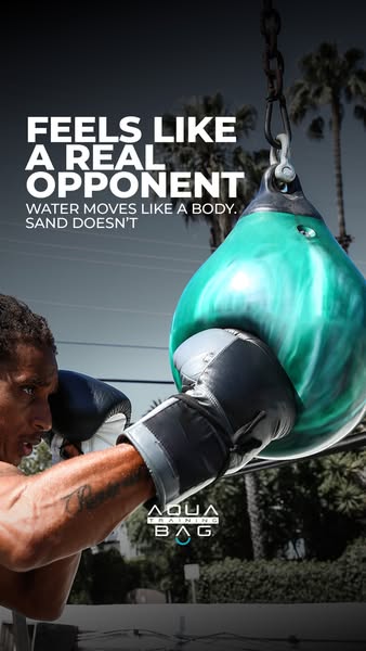
Calling out sand bags gives buyers a familiar reference point and a clear reason to switch.
- 02
Impact shot proves the claim
The glove sinking into the bag shows the softer, body-like give that the copy promises.
- 03
Emotional, not technical
Real opponent speaks to boxers' desire for realistic training rather than listing materials or specs.
- 04
Aspirational setting
Palm trees and open sky suggest a premium outdoor lifestyle, making the bag feel more desirable.
Full creative breakdown
Who this ad targets
This ad targets boxers, MMA fighters and serious home trainers who already know traditional heavy bags and want something more realistic. They care about technique, joint health and training quality. Many are men aged 20 to 45 who follow combat sports and fitness creators. The comparison also speaks to shoppers researching which bag to buy, making it useful for interest targeting around boxing, MMA and home gyms, plus retargeting of product page visitors.
Copywriting analysis
The headline, Feels Like a Real Opponent, sells a feeling rather than a feature, which is more persuasive to athletes who want lifelike training. The subline does the comparison work in seven words: Water moves like a body. Sand doesn't. It uses short, parallel sentences and ends on a blunt negative that makes the alternative sound outdated. Naming the generic category, sand, avoids attacking a specific competitor while still drawing a clear contrast. The tone is confident and slightly provocative. The copy is short enough to read in one glance, and the image backs up every word, so the message feels proven rather than claimed.
Visual design
The composition is tight and dynamic, with the bag filling the right half and the punching arm entering from the left. The low camera angle makes the bag look large and powerful. The teal bag contrasts with the warm skin tones and pale sky, becoming the focal point. Heavy white uppercase type sits in the top left over the sky and trees. The logo sits lower right, balancing the text diagonally. Motion and the dent in the bag add energy.
How to adapt this template for your brand
- Identify the standard alternative your buyers know, such as sand, foam or plastic.
- Write a headline about the feeling or result your product delivers.
- Add a two-sentence comparison line: your benefit, then the alternative's weakness.
- Capture the product at the exact moment it is used, close up and low angle.
- Test the static version against a short slow-motion impact video.
Tips for boxing ads on Meta
This 9:16 creative fits Instagram and Facebook Stories and Reels. A slow-motion video of the punch would likely outperform the still, since motion proves the water movement. Keep the headline in the upper safe zone, away from the profile bar. Use comparison messaging in mid-funnel campaigns targeting people already interested in boxing equipment. Avoid naming competitors directly to stay within Meta's ad policies.
About this creative
This vertical story ad from Aqua Training Bag shows a boxer landing a punch on a teal, water-filled punching bag outdoors. The camera is close and low, with the black and white glove pressed into the glossy bag, which dents and ripples on impact. The boxer's face, partly visible on the left edge, shows focus and effort. Palm trees, a pale sky and a hedge suggest a sunny backyard, possibly in California, giving the ad an aspirational lifestyle feel. The headline Feels Like a Real Opponent sits in the upper left in heavy white capitals, followed by a smaller subline: Water moves like a body. Sand doesn't. The Aqua Training Bag logo appears in the lower right. Rather than listing features, the ad focuses on one sensory benefit and a direct competitor comparison, letting the moment of impact prove the claim visually.
Meta ad · 338 × 600 · Boxing
Water Punching Bag Ad Template: Feels Like a Real Opponent
This Aqua Training Bag story ad uses a quick water versus sand comparison to explain why its punching bag feels more realistic. A close-up impact shot of a glove hitting the teal bag outdoors makes it a strong template for equipment brands selling a product difference.
Added
All brand names and logos are property of their owners. Adplaylist is not affiliated with or endorsed by these brands.
Details
Ad copy
Primary text
Sand bags hit back like a wall. Water moves like a real body, so every punch lands more naturally and is easier on your joints. Train with the Aqua Training Bag and feel the difference.
Description
Water moves like a body. Sand doesn't.
On-image text
FEELS LIKE A REAL OPPONENT | WATER MOVES LIKE A BODY. SAND DOESN'T | AQUA TRAINING BAG
Headline ideas for this template
- 1Train Against Something That Moves Back
- 2Sand Is Dead. Water Hits Different.
- 3The Closest Thing to Sparring at Home
- 4Easier on Joints, Harder on Excuses
- 5Punch a Bag That Feels Alive
Meta image ad specs
| Placement | Ratio | Size (px) |
|---|---|---|
| Feed | 1:1 or 4:5 | 1080×1080 / 1080×1350 |
| Marketplace | 1:1 | 1200×1200 |
| Messenger inbox | 1:1 | 1200×1200 |
| Stories & Reels | 9:16 | 1080×1920 |
This template is 1:1. Request 4:5 or 9:16 to cover all placements.