Key takeaways
- Format: Grid listicle of 8 benefits on a frosted card
- Best for: Clean-living audiences and benefit-heavy messages that need clarity
- Hook: 'Make it make sense' – calling out a contradiction in organic lifestyles
- Reuse it: Put your benefit list in a frosted two-column card above the product
Available sizes
What is a listicle ad?
A listicle ad presents the product's benefits or reasons to buy as a short numbered list, like an article headline ("5 reasons…"). The list format is easy to scan in a feed and lets one creative answer several objections at once.
See all listicle ads →Why this listicle ad works
- 01
Easy-to-scan grid
Two columns of four benefits are faster to read than scattered pills. It suits viewers who want facts quickly.
- 02
Fit objection handled
'95% universal fit' directly addresses compatibility worries. It replaces a vaguer design claim with a practical one.
- 03
Same strong hook
The organic contradiction headline stays unchanged. It creates the same moment of self-reflection as the original.
- 04
Clean hierarchy
Headline, label, list and product are stacked top to bottom. The eye moves naturally through the message.
Full creative breakdown
Who this ad targets
US clean-living shoppers aged 25–45 who buy organic food, clean beauty and natural home products and want to align all their habits with their values. They are research-minded and like clear lists of benefits before buying. People unsure whether a bidet will fit their toilet are a key sub-segment, addressed by the universal fit claim. Sensitive-skin sufferers are a secondary audience.
Copywriting analysis
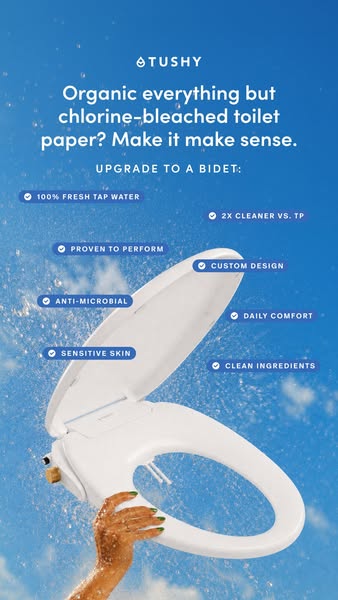
The headline and bridge label are identical to the scattered version, making this a clear layout test. The key copy change is in the benefit list: '95% universal fit' replaces 'custom design', swapping a soft claim for a quantified, objection-busting one. Benefits remain short caps phrases with check marks for scannability. The organic contradiction hook still does the emotional work, while the grid delivers rational reasons in an orderly way.
Visual design
The bright blue sky and water spray remain the main mood drivers, giving a fresh and uplifting feel. A frosted glass card adds structure and improves contrast for the white text. The two-column grid with check icons resembles a product spec sheet, signalling trust and clarity. The bidet seat is lower in the frame, held up by a hand with green nails. Overall, the layout is cleaner and calmer than the scattered version.
How to adapt this template for your brand
- Use a contradiction hook that challenges your audience's values.
- Add a short bridge label such as 'Upgrade to a [product]:'.
- Place six to eight benefits in a frosted two-column card with check icons.
- Include at least one benefit that removes a practical objection, such as fit or compatibility.
- Test the grid layout against a scattered layout of the same benefits.
Tips for bathroom ads on Meta
Run this alongside the scattered version to learn whether structure or playfulness drives better click-through. Grid layouts often perform better with older or more research-oriented audiences. On Meta, keep the card above the bottom safe zone. Use this version for retargeting, where viewers want clear reasons to buy. Primary text can expand on the 95% universal fit claim with a link to a fit-checker.
About this creative
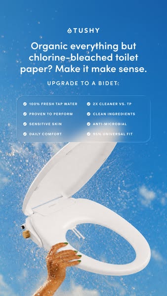
The same bright blue sky, splashing water droplets and green-nailed hand holding a white TUSHY bidet seat appear here as in the scattered version, but the layout is more structured. The headline 'Organic everything but chlorine-bleached toilet paper? Make it make sense.' sits at the top, followed by the label 'Upgrade to a bidet:'. Directly below is a frosted, semi-transparent card containing eight benefits in two neat columns, each with a check icon: 100% fresh tap water, 2X cleaner vs. TP, proven to perform, clean ingredients, sensitive skin, anti-microbial, daily comfort and 95% universal fit. 'Custom design' from the scattered version has been swapped for '95% universal fit', which answers the common question of whether a bidet will fit an existing toilet. The bidet seat sits in the lower half, leaving the upper half for structured information. This version prioritises legibility over playfulness.
Meta ad · 338 × 600 · Bathroom
TUSHY 'Organic Everything' Bidet Ad: Grid Listicle Example
This TUSHY story ad is the grid version of the 'Organic everything but chlorine-bleached toilet paper?' concept. Eight benefits sit in a neat two-column frosted card above a bidet seat held against a blue sky. Use it as a template when you want a busy benefit list to stay clean and easy to read.
Added
All brand names and logos are property of their owners. Adplaylist is not affiliated with or endorsed by these brands.
Details
Ad copy
Primary text
Organic food, clean skincare, natural cleaners – and then chlorine-bleached toilet paper? Upgrade to a TUSHY bidet: 100% fresh tap water, 2X cleaner, 95% universal fit.
Description
95% universal fit. 2X cleaner vs TP.
On-image text
TUSHY | Organic everything but chlorine-bleached toilet paper? Make it make sense. | Upgrade to a bidet: | 100% fresh tap water | 2X cleaner vs. TP | Proven to perform | Clean ingredients | Sensitive skin | Anti-microbial | Daily comfort | 95% universal fit
Headline ideas for this template
- 1Organic Everything but Bleached TP?
- 2Make It Make Sense: Get a TUSHY
- 3Fits 95% of Toilets
- 48 Reasons to Upgrade to a Bidet
- 5Clean Ingredients, Cleaner You
Meta image ad specs
| Placement | Ratio | Size (px) |
|---|---|---|
| Feed | 1:1 or 4:5 | 1080×1080 / 1080×1350 |
| Marketplace | 1:1 | 1200×1200 |
| Messenger inbox | 1:1 | 1200×1200 |
| Stories & Reels | 9:16 | 1080×1920 |
This template is 1:1. Request 4:5 or 9:16 to cover all placements.
Browse similar by tag