Key takeaways
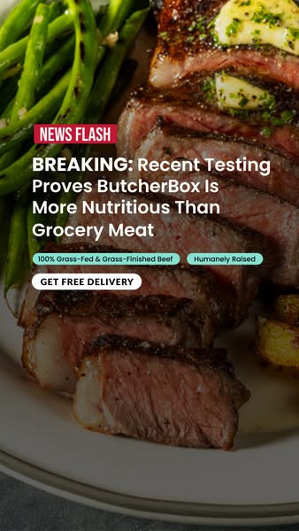
- Format: News-flash comparison headline over an appetising food close-up.
- Best for: Premium brands challenging a mainstream default like the supermarket.
- Hook: "Testing proves" paired with a direct jab at grocery meat.
- Reuse it: Name the default your buyer uses and state one tested advantage.
Available sizes
What is a comparison ad?
A comparison ad sets the product against an alternative, such as a competitor, the old way of doing things or a cheaper option, usually in a two-column layout or table. It helps buyers who are already weighing options see quickly why this one is the better choice.
See all comparison ads →Why this comparison ad works
- 01
Named competitor
Calling out 'grocery meat' makes the comparison instantly relatable for every viewer.
- 02
Proof language
'Recent testing proves' suggests evidence rather than opinion, which boosts credibility.
- 03
Appetite appeal
A perfectly cooked steak triggers hunger and makes people stop scrolling.
- 04
Benefit badges
Short pill badges add scannable reasons to believe without crowding the headline.
Full creative breakdown
Who this ad targets
The ad targets US shoppers who currently buy their meat at the supermarket and have some interest in nutrition, such as fitness enthusiasts, keto, paleo and carnivore followers, and parents trying to feed their families better. These viewers already value grass-fed products but may not have considered delivery. The comparison speaks to the doubt that grocery meat is 'good enough' and gives them a reason to switch.
Copywriting analysis
The headline follows the brand's news-flash template: BREAKING, followed by a title-case statement. 'Recent testing proves' borrows the authority of science, and 'more nutritious than grocery meat' is a simple comparison anyone can understand. The badges translate the claim into concrete attributes, grass-fed and grass-finished, humanely raised, which double as keywords for shoppers who search for those terms. The CTA, Get Free Delivery, switches from information to offer, giving a low-friction reason to click. The word 'proves' is strong and requires clear evidence on the landing page to stay compliant.
Visual design
Rich browns, pinks and greens make the food photo warm and appetising, while the darker middle band keeps white text readable. The red label and mint-green badges add two accent colours that stand out against the food. Everything sits in the central safe zone of the vertical frame. The white pill CTA mirrors the button style used across the ButcherBox news-flash series, giving the campaign a consistent look.
How to adapt this template for your brand
- Identify the default option your buyers use today, such as supermarket or generic brands.
- Gather one tested or verifiable advantage you can state clearly.
- Use an appetising close-up of your product in use as the background.
- Add a news label, the comparison headline and two benefit badges.
- Close with an offer-led CTA and link to a page with the evidence.
Tips for meat ads on Meta
Comparison claims attract attention but also scrutiny, so link to a page that explains the testing. On Stories and Reels, this format works well with a subtle zoom or steam animation on the food. Use it for cold and warm audiences interested in nutrition, fitness and grass-fed products. Test the 'proves' headline against a softer 'shows' version, and rotate badge combinations to learn which benefit resonates most.
About this creative
This vertical ad is built around an appetising close-up of a cooked steak, sliced to reveal a pink medium centre, topped with herb butter and served with green beans and roasted potatoes. The photo fills the frame and is darkened slightly in the middle to make room for text. A red NEWS FLASH tag sits above a bold white headline in title case stating that recent testing proves ButcherBox is more nutritious than grocery meat. Below, two mint-green pill badges list key benefits: 100% grass-fed and grass-finished beef, and humanely raised. A white button reads Get Free Delivery. The appetite appeal of the food photo grabs attention, while the headline creates a direct comparison with the viewer's current choice, supermarket meat. The format is part of a series of ButcherBox news-flash ads, which keeps the brand recognisable across placements while each version pushes a different proof point.
Meta ad · 338 × 600 · Meat
ButcherBox "More Nutritious Than Grocery Meat" News Flash Ad
This ButcherBox story ad pairs a juicy sliced steak with a news-style headline claiming testing shows its meat is more nutritious than grocery meat. With two benefit badges and a free-delivery button, it is a comparison ad for Meta Stories and Reels that positions the brand directly against the supermarket.
Added
All brand names and logos are property of their owners. Adplaylist is not affiliated with or endorsed by these brands.
Details
Ad copy
Primary text
Recent testing compared ButcherBox to grocery store meat, and the results speak for themselves. 🧪 100% grass-fed and grass-finished beef, humanely raised. Meat with receipts, straight to your door. No fillers. No shortcuts. No added hormones. No bull.
Description
100% grass-fed and grass-finished beef
On-image text
NEWS FLASH | BREAKING: Recent Testing Proves ButcherBox Is More Nutritious Than Grocery Meat | 100% Grass-Fed & Grass-Finished Beef | Humanely Raised | GET FREE DELIVERY
Headline ideas for this template
- 1Grocery Meat vs ButcherBox: The Results Are In
- 2Tested: Why Grass-Fed Beats The Supermarket
- 3More Nutrients, Fewer Questions
- 4The Steak That Outperformed The Grocery Store
- 5Your Supermarket Steak Just Met Its Match
Meta image ad specs
| Placement | Ratio | Size (px) |
|---|---|---|
| Feed | 1:1 or 4:5 | 1080×1080 / 1080×1350 |
| Marketplace | 1:1 | 1200×1200 |
| Messenger inbox | 1:1 | 1200×1200 |
| Stories & Reels | 9:16 | 1080×1920 |
This template is 1:1. Request 4:5 or 9:16 to cover all placements.
Browse similar by tag