Key takeaways
- Format: Phone-shot UGC photo with first-person headline and emoji checklist.
- Best for: DTC brands wanting authentic, creator-style social proof.
- Hook: A first-person confession: 'I stopped buying… Here's why.'
- Reuse it: Have a customer hold your product at home and list their reasons.
Available sizes
What is a UGC ad?
A UGC (user-generated content) ad looks like something a real customer posted: phone-quality photos, casual wording and a personal point of view. Because it blends into the feed and reads as genuine experience, it often earns more trust than a polished brand ad.
See all ugc ads →Why this ugc ad works
- 01
First-person voice
'I stopped buying' sounds like a friend's story, not a brand pitch.
- 02
Real-life setting
A home kitchen and phone-quality photo make the ad feel authentic.
- 03
Arrow checklist
Each protein maps to its standard, making the reasons quick to understand.
- 04
CTA disguised as a tick
Putting Explore ButcherBox in the checklist makes the action feel like the natural next step.
Full creative breakdown
Who this ad targets
This ad targets social-first US shoppers who trust creators and peer recommendations more than polished brand ads. They are often millennials and younger parents who follow food, fitness or family content on Instagram and TikTok. They may already feel unsure about supermarket meat quality and are looking for a simple alternative. The first-person story makes the switch feel normal and achievable for people like them.
Copywriting analysis
The headline is a personal confession followed by a promise: 'I stopped buying most of my meat at the grocery store. Here's why.' The word 'most' makes it believable rather than extreme. 'Here's why' is a strong hook that promises reasons and keeps people reading. The checklist uses a 'product → standard' structure with arrows, which turns three proteins into three proof points without full sentences. Repeating the green tick for the CTA line is clever: the viewer has been nodding along to three ticks, so the fourth, Explore ButcherBox, feels like part of the list rather than a sales ask.
Visual design
The image deliberately avoids studio polish: natural light, a slightly cluttered kitchen and a hand-held product create an authentic UGC feel. The open ButcherBox box in the background provides branding without a logo overlay. White text with a drop shadow, green tick emojis and arrows look like native Instagram Story text. The steaks in the lower half anchor the eye and show the product at real size.
How to adapt this template for your brand
- Ask a customer or creator to film or photograph your product in their own home.
- Have them hold the product towards the camera with your packaging visible.
- Write a first-person headline about what they stopped doing, plus 'Here's why'.
- Add three emoji ticks mapping each product to its key benefit.
- End the list with a fourth tick that doubles as your CTA.
Tips for meat ads on Meta
UGC creatives perform strongly in Reels and Stories, especially as short videos with the creator speaking to camera. Use Meta's partnership ads to run it from the creator's handle for extra authenticity. Keep text in the upper half so it stays clear of captions and buttons. Test several creators and settings, since UGC fatigue sets in quickly, and use cold broad audiences to let the algorithm find people who respond to creator content.
About this creative
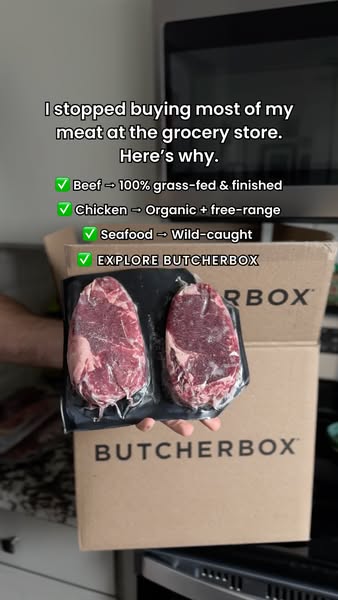
This vertical ad looks like it was shot on a phone in a real home kitchen. A hand holds a vacuum-sealed pack of two raw ribeye steaks towards the camera, with an open ButcherBox shipping box behind it on the counter and a microwave and kitchen cabinets in the background. The lighting is natural and slightly dim, which makes it feel unpolished and authentic. White text with a soft shadow sits in the upper half. A first-person headline says the person stopped buying most of their meat at the grocery store, followed by 'Here's why'. Below, a checklist uses green tick emojis and arrows: beef is 100% grass-fed and finished, chicken is organic and free-range, and seafood is wild-caught. The final tick line, Explore ButcherBox, works as a call to action inside the list. The ad mimics creator content so closely that it blends into Stories, letting the product and packaging serve as proof of a real delivery.
Meta ad · 338 × 600 · Meat
ButcherBox "I Stopped Buying Grocery Store Meat" UGC Ad
This ButcherBox story ad looks like a customer's own phone photo: a hand holds a pack of two steaks in front of an open ButcherBox in a home kitchen. A first-person headline and an emoji checklist explain why they switched, making it a UGC ad for Meta Stories and Reels that feels like a personal recommendation.
Added
All brand names and logos are property of their owners. Adplaylist is not affiliated with or endorsed by these brands.
Details
Ad copy
Primary text
"I stopped buying most of my meat at the grocery store." Here's why so many home cooks are switching to ButcherBox. 🥩 Grass-fed beef, organic free-range chicken and wild-caught seafood, delivered. Meat with receipts, straight to your door. No fillers. No shortcuts. No added hormones. No bull.
Description
Grass-fed, organic and wild-caught
On-image text
I stopped buying most of my meat at the grocery store. Here's why. | ✅ Beef → 100% grass-fed & finished | ✅ Chicken → Organic + free-range | ✅ Seafood → Wild-caught | ✅ EXPLORE BUTCHERBOX
Headline ideas for this template
- 1Why I Quit The Grocery Store Meat Aisle
- 2My Freezer Has Never Looked This Good
- 3The Switch I Wish I'd Made Sooner
- 4I Finally Know Where My Meat Comes From
- 53 Reasons I Stopped Buying Supermarket Meat
Meta image ad specs
| Placement | Ratio | Size (px) |
|---|---|---|
| Feed | 1:1 or 4:5 | 1080×1080 / 1080×1350 |
| Marketplace | 1:1 | 1200×1200 |
| Messenger inbox | 1:1 | 1200×1200 |
| Stories & Reels | 9:16 | 1080×1920 |
This template is 1:1. Request 4:5 or 9:16 to cover all placements.