Key takeaways
- Format: Square cropped product side view with tonal colour blocking.
- Best for: Selling one hero benefit for a well-known premium product.
- Hook: Three-word benefit headline: Quiet the world.
- Reuse it: Match background and type to the product colour and write your core benefit in three words.
Available sizes
What is a product shot ad?
A product shot ad puts the product itself at the centre of the frame, usually on a clean or styled background with little text. It works best when the packaging or product is distinctive enough to stop the scroll and the viewer already understands what it does.
See all product shot ads →Why this product shot ad works
- 01
Benefit in three words
'Quiet the world' explains noise cancelling as a feeling, not a spec, and is easy to remember.
- 02
Tonal calm
A single-hue palette visually expresses quiet and makes the ad feel serene in a busy feed.
- 03
Confident cropping
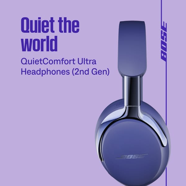
Cropping the headphones off-frame adds scale and drama while keeping the logo and materials visible.
- 04
Consistent brand frame
The vertical logo rule links this creative to the rest of the Bose campaign for instant recognition.
Full creative breakdown
Who this ad targets
This ad targets people who want to escape noise: commuters, frequent flyers, open-office workers and students, typically aged 22 to 50. It appeals to premium buyers who have heard of Bose noise cancelling and are ready to upgrade, as well as existing QuietComfort owners eyeing the 2nd Gen. Interest and in-market audiences for travel, productivity, remote work and audio equipment are a good fit, plus remarketing to visitors of headphone category pages.
Copywriting analysis
'Quiet the world' is an imperative headline that hands the reader control: you can switch the world off. It translates the technical feature, active noise cancellation, into an emotional outcome in three syllables of action. The product name underneath acts as the proof, with '(2nd Gen)' signalling an improved model. The copy uses the product name's word 'Quiet' as a deliberate echo, strengthening brand-product association. There is no CTA on the image, which keeps the composition clean and leaves the action to the platform button.
Visual design
Lavender background and indigo type create a monochrome, low-contrast palette that feels hushed and premium. The headphone is cropped tightly on the right and shown in profile, emphasising the glossy metal arm and smooth earcup. Typography is left-aligned in the upper left, balancing the tall vertical product. The thin vertical rule with the rotated logo frames the right edge, mirroring other Bose campaign creatives. Plenty of empty space below the copy reinforces the theme of quiet.
How to adapt this template for your brand
- Write your core benefit as a short imperative (Quiet the world, Own your mornings).
- Pick a background that is a lighter tint of your product colour and set the type in a darker shade.
- Crop the product tightly from one side so it feels large and tactile.
- Add the product name under the headline as proof, in a lighter type weight.
- Leave generous empty space to let the composition breathe.
Tips for headphones ads on Meta
This square works natively in Meta feeds and Google Display. In Google, use 'Quiet the world' as a short headline asset and the product name as a long headline. On Meta, keep the primary text focused on one supporting benefit, such as hours of battery or comfort. Test colour variants of the same layout to see which hue drives the best CTR. For Stories, extend the background vertically and keep the copy in the upper third.
About this creative
This square Bose creative is an exercise in tonal restraint. The entire background is a soft lavender, while the product, a QuietComfort Ultra Headphones (2nd Gen) in a deep blue-violet finish, is shown in a tight side profile on the right, cropped at the top and bottom of the frame. The glossy metal arm and slider catch highlights, and the embossed Bose logo sits on the earcup. On the left, a bold indigo headline reads 'Quiet the world', with the product name 'QuietComfort Ultra Headphones (2nd Gen)' underneath in a lighter weight of the same colour. A thin vertical indigo line runs down the right edge with the Bose logo set sideways, creating a consistent brand frame used across the campaign. The monochrome purple palette makes the creative feel calm and quiet, visually expressing the noise-cancelling benefit the headline promises.
Meta ad · 338 × 600 · Headphones
Bose Quiet the World Headphones Ad
This square Bose ad combines a three-word benefit headline with a cropped side view of the QuietComfort Ultra Headphones (2nd Gen) on lavender. It is a product shot format with tonal colour blocking, ideal for tech brands selling one core benefit on Meta and Google Display.
Added
All brand names and logos are property of their owners. Adplaylist is not affiliated with or endorsed by these brands.
Details
Ad copy
Primary text
Quiet the world and turn up what matters. QuietComfort Ultra Headphones (2nd Gen) bring Bose's best noise cancellation, immersive audio and all-day comfort.
Description
QuietComfort Ultra Headphones (2nd Gen)
On-image text
Quiet the world | QuietComfort Ultra Headphones (2nd Gen) | BOSE
Headline ideas for this template
- 1Quiet the world
- 2Turn down the noise, turn up you
- 3Silence, upgraded
- 4Your personal mute button
- 5The world can wait
Meta image ad specs
| Placement | Ratio | Size (px) |
|---|---|---|
| Feed | 1:1 or 4:5 | 1080×1080 / 1080×1350 |
| Marketplace | 1:1 | 1200×1200 |
| Messenger inbox | 1:1 | 1200×1200 |
| Stories & Reels | 9:16 | 1080×1920 |
This template is 1:1. Request 4:5 or 9:16 to cover all placements.
Browse similar by tag