Key takeaways
- Format: Three-step process diagram with a product visual.
- Best for: Service businesses that need to explain a process simply.
- Hook: 'How it works' promises clarity in a confusing category.
- Reuse it: Map your own onboarding into three short verb-led steps.
Available sizes
What is a listicle ad?
A listicle ad presents the product's benefits or reasons to buy as a short numbered list, like an article headline ("5 reasons…"). The list format is easy to scan in a feed and lets one creative answer several objections at once.
See all listicle ads →Why this listicle ad works
- 01
Reduces perceived complexity
Breaking SEO into three steps makes a technical service feel easy and low-effort for busy owners.
- 02
Real product proof
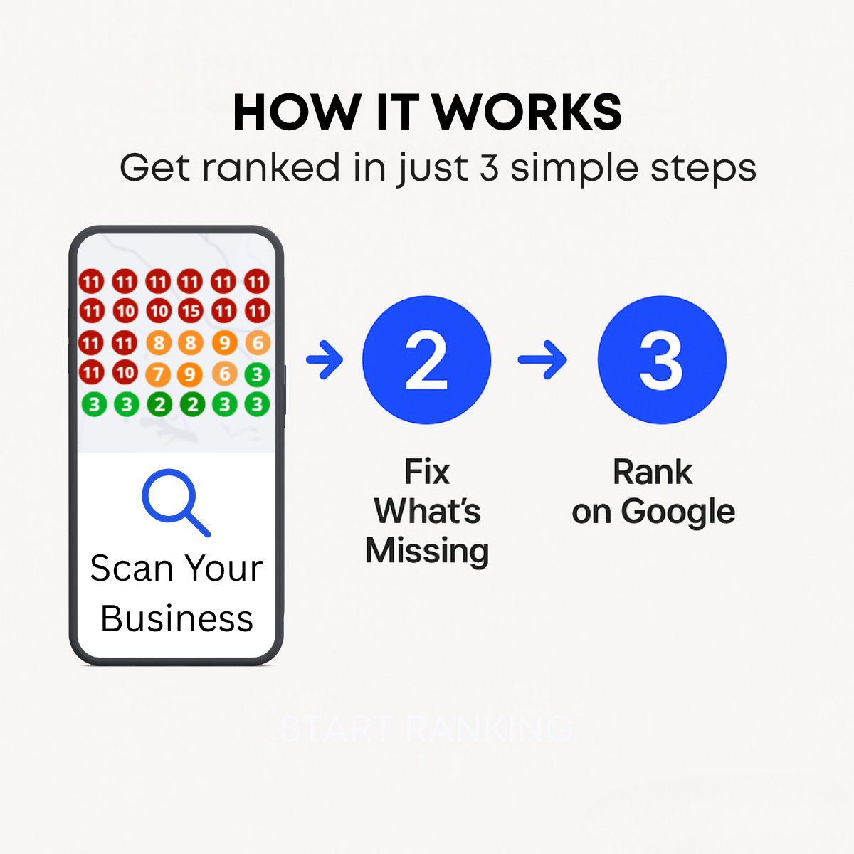
The geo-grid map shows an actual deliverable, signalling data-driven work rather than vague promises.
- 03
Colour-coded storytelling
Red to green pins visually tell a before-and-after story of poor to strong rankings.
- 04
Strong reading flow
Arrows and numbered circles guide the eye left to right, mirroring the customer journey.
Full creative breakdown
Who this ad targets
This ad targets local business owners who have heard they need SEO but do not understand what it involves, such as dentists, contractors, lawyers, med spas and restaurants. They worry about long contracts, jargon and unclear results. The step format reassures them the process is simple and structured. It also suits marketing managers comparing agencies who want to see a clear methodology. It performs best with warm audiences who engaged with earlier awareness ads.
Copywriting analysis
"HOW IT WORKS" is a familiar, reassuring heading that signals education rather than hard selling. The subline "Get ranked in just 3 simple steps" adds a concrete outcome and uses 'just' and 'simple' to lower effort perception. Each step is a short verb phrase: Scan Your Business, Fix What's Missing and Rank on Google. 'Fix What's Missing' is smart because it implies the viewer's profile is incomplete, creating a gentle knowledge gap. The copy is clear but lacks proof or a time frame. The faint CTA should be made visible.
Visual design
A light grey background keeps the layout calm, with a bold black headline centred at the top. The phone mockup on the left is the largest element and carries the most detail: a colourful geo-grid of ranking pins. Saturated royal-blue circles and arrows create a consistent accent and connect the steps. Large numerals in white make the sequence obvious. The faint button at the bottom has too little contrast and should be strengthened.
How to adapt this template for your brand
- Break your service or onboarding into three short, verb-led steps.
- Visualise step one with a real screenshot of your report, dashboard or deliverable inside a phone frame.
- Use numbered circles and arrows in one brand colour to connect the steps left to right.
- Add a subline that combines a clear outcome with the words simple or easy.
- Place a high-contrast CTA button at the bottom such as Get Your Free Scan.
Tips for saas & tech ads on Meta
On Meta, use this as the second card in a carousel after a pain-point creative, or as a retargeting ad for people who watched a video or visited the site. On LinkedIn, the educational format suits Sponsored Content aimed at owners and marketers. Fix the faint CTA before launch. Pair it with a lead form offering a free ranking scan to reduce friction, and create a 9:16 vertical version that stacks the steps for Stories.
About this creative
This creative explains a local SEO service as a simple three-step process. At the top, a bold black uppercase headline reads "HOW IT WORKS", followed by the subline "Get ranked in just 3 simple steps". On the left, a phone frame displays a geo-grid ranking map, the kind produced by local rank tracking tools, with numbered pins coloured red, orange and green to show where a business ranks across an area. Below the map, a blue magnifying glass and the text "Scan Your Business" serve as step one. Blue arrows lead to two large blue circles numbered 2 and 3, labelled "Fix What's Missing" and "Rank on Google". A very faint "START RANKING" button is visible near the bottom, suggesting an unfinished or low-contrast CTA. The light grey background keeps it clean. The ad lowers perceived complexity and works well as the explanatory frame of a carousel or as a follow-up to awareness ads.
Meta ad · 1200 × 1200 · SaaS & Tech
Local SEO Ad Example: Get Ranked in 3 Simple Steps
This square local SEO ad explains the service in three steps: scan your business, fix what's missing and rank on Google. A phone showing a coloured geo-grid ranking map makes step one tangible. It is a strong template for agencies and SaaS tools that need to simplify a complex service for local business owners.
Added
All brand names and logos are property of their owners. Adplaylist is not affiliated with or endorsed by these brands.
Details
Ad copy
Primary text
Ranking on Google Maps isn't magic. 1) We scan your business across your area. 2) We fix what's missing on your profile. 3) You rank where customers search. Start with a free scan.
Description
Free local ranking scan
On-image text
HOW IT WORKS | Get ranked in just 3 simple steps | Scan Your Business | 2 Fix What's Missing | 3 Rank on Google | START RANKING (faint)
Headline ideas for this template
- 1Scan, Fix, Rank – That's It
- 23 Steps to the Top of Google Maps
- 3See Where You Rank in Your Area
- 4Local SEO Made Simple
- 5Get Your Free Ranking Scan Today
Meta image ad specs
| Placement | Ratio | Size (px) |
|---|---|---|
| Feed | 1:1 or 4:5 | 1080×1080 / 1080×1350 |
| Marketplace | 1:1 | 1200×1200 |
| Messenger inbox | 1:1 | 1200×1200 |
| Stories & Reels | 9:16 | 1080×1920 |
This template is 1:1. Request 4:5 or 9:16 to cover all placements.
Browse similar by tag