Key takeaways
- Format: Styled product shot with a prop that matches the shade name.
- Best for: Cosmetics with food, flavour or dessert-inspired shade names.
- Hook: A polish bottle sitting on real ice cream is unexpected and fun.
- Reuse it: Turn your product or shade name into a literal prop and match the colours exactly.
Available sizes
What is a lifestyle ad?
A lifestyle ad shows the product being used in a real setting by the kind of person who buys it. Instead of listing features, it sells the feeling or outcome of owning the product, which makes it a strong fit for fashion, home, travel and wellness brands.
See all lifestyle ads →Why this lifestyle ad works
- 01
Shade name made visual
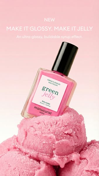
Placing the bottle on pink sorbet turns an abstract shade name into an instant, memorable picture.
- 02
Sensory appeal
The ice cream texture suggests sweetness, freshness and juiciness, which matches the glossy jelly finish the copy promises.
- 03
Monochrome impact
Everything in the frame is pink, so the image stands out in a busy feed as one bold block of colour.
- 04
Made for sharing
Playful, aesthetic product styling feels like social content rather than an ad, which can lower ad resistance and drive saves.
Full creative breakdown
Who this ad targets
Trend-aware women aged roughly 18–40 who follow nail trends on Instagram, TikTok and Pinterest and want the popular 'jelly nails' look at home. They like playful, glossy, sheer colour that can be worn subtle or bold, and they care about cleaner, plant-based formulas without giving up on fun. The ad also reaches existing Manucurist customers looking for something new for spring and summer, and gift shoppers drawn to a pretty, photogenic bottle.
Copywriting analysis
The copy reuses the Green Jelly launch line, MAKE IT GLOSSY. MAKE IT JELLY, keeping campaign messaging consistent across creatives while the visual changes. The double imperative is punchy and trend-aware. The subline lists three benefits, ultra-glossy, buildable and syrup effect, and syrup ties neatly into the dessert theme of the ice cream. The NEW tag creates launch energy. The shade name Pink Sorbet appears only on the label, but the visual explains it so well that it does not need repeating. A short primary text that leans into the dessert theme would complete the story.
Visual design
The bottle sits slightly tilted on a mound of pink ice cream that fills the lower half of the vertical frame, creating a playful, dynamic composition. The scoops' rough texture contrasts with the smooth glass bottle and glossy polish. A pink-to-white gradient background keeps the palette monochrome, and the black cap provides the only dark accent. White headline type sits at the top over the soft pink, and soft studio lighting keeps everything fresh and bright.
How to adapt this template for your brand
- Find a prop that literally represents your product or shade name.
- Match the prop colour closely to your product for a monochrome look.
- Place the product on or in the prop at a slight angle for movement.
- Use a soft gradient background in the same colour family.
- Keep the headline short and add a NEW tag if it is a launch.
Tips for beauty ads on Meta
Built for Meta Stories and Reels at 9:16, so keep the headline and labels inside the safe zone, clear of the top 14% and bottom 20% where interface elements sit. Styled shots like this also work well as organic Instagram posts, so test the creative in both paid and organic placements. For Feed placements, crop to 4:5 and keep the key visual centred. Retarget product page visitors and test the creative against a single close-up variant.
About this creative
This vertical Manucurist ad launches the Green Jelly polish in the shade Pink Sorbet with a playful food-styling idea. The bottle, filled with bright candy-pink polish and topped with a black cap, sits tilted on a pile of textured pink ice cream scoops that fill the bottom half of the frame. The ice cream matches the polish colour almost exactly, so the shade name becomes something viewers can see and nearly taste. The background is a soft pink gradient that fades to white, keeping the whole image in one sweet colour family. At the top, a small NEW tag sits above the headline MAKE IT GLOSSY. MAKE IT JELLY in white capitals, with the subline An ultra-glossy, buildable syrup effect. underneath. The label clearly shows green jelly and Pink sorbet. The result feels summery, fun and highly shareable, perfect for a trend-led launch aimed at a social media audience.
Meta ad · 338 × 600 · Beauty
Manucurist Green Jelly Pink Sorbet Lifestyle Ad Template
This Manucurist ad launches Green Jelly in the shade Pink Sorbet by placing the bottle on top of matching pink ice cream scoops. The playful, styled product shot turns the shade name into a visual story. It is a vertical 9:16 Meta creative and a great template for flavour-inspired cosmetics.
Added
All brand names and logos are property of their owners. Adplaylist is not affiliated with or endorsed by these brands.
Details
Ad copy
Primary text
New: Green Jelly in Pink Sorbet. As sweet as it looks. An ultra-glossy, buildable syrup effect for juicy, see-through jelly nails. Wear one layer for a sheer tint or build it up for a bold candy-pink finish.
Description
New Pink Sorbet jelly polish
On-image text
NEW | MAKE IT GLOSSY. MAKE IT JELLY | An ultra-glossy, buildable syrup effect. | VERNIS À ONGLES NAIL POLISH | green jelly | Pink sorbet | 15 mL e – 0,5 fl oz | manucurist PARIS
Headline ideas for this template
- 1Sweet as sorbet, glossy as syrup
- 2Your new summer nail flavour
- 3Pink Sorbet: good enough to eat
- 4Jelly nails in candy pink
- 5The scoop on our new jelly polish
Meta image ad specs
| Placement | Ratio | Size (px) |
|---|---|---|
| Feed | 1:1 or 4:5 | 1080×1080 / 1080×1350 |
| Marketplace | 1:1 | 1200×1200 |
| Messenger inbox | 1:1 | 1200×1200 |
| Stories & Reels | 9:16 | 1080×1920 |
This template is 1:1. Request 4:5 or 9:16 to cover all placements.