Key takeaways
- Format: Everyday-item price comparison
- Best for: App installs for travel eSIM and budget travel brands
- Hook: A daily data price cheaper than a local dish
- Reuse it: Swap the dish and country; keep the headline and layout identical
Available sizes
What is a comparison ad?
A comparison ad sets the product against an alternative, such as a competitor, the old way of doing things or a cheaper option, usually in a two-column layout or table. It helps buyers who are already weighing options see quickly why this one is the better choice.
See all comparison ads →Why this comparison ad works
- 01
Tangible price comparison
Comparing $1.67 to a schnitzel makes an abstract data price instantly relatable and feels like a bargain.
- 02
Destination-native cue
Using a famous local food plants the idea of the trip itself, triggering travel excitement alongside the offer.
- 03
Scroll-stopping food photo
A single hero food shot on a dark background is high contrast and appetising, which stops thumbs in Stories.
- 04
Built as a series
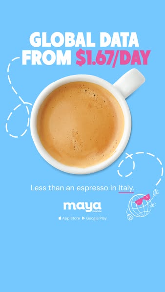
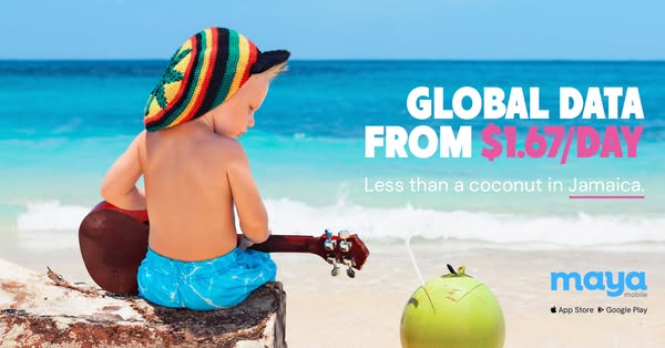
The same template rotates countries and dishes, allowing many variations while keeping strong brand recognition.
Full creative breakdown
Who this ad targets
The ad targets budget-minded travellers and backpackers, likely in the US, who are planning or dreaming about a European trip. People interested in Germany, food travel and city breaks are a natural fit. The light, humorous tone suits younger travellers aged roughly 20 to 40 who are comfortable installing apps and buying eSIMs on their phone. It works well as a prospecting creative because it explains value without needing prior brand knowledge.
Copywriting analysis
The headline is a straight value statement, 'Global data from $1.67/day', with the price in pink to draw the eye. Quoting a per-day price keeps the figure small and matches how travellers budget trips. The real hook is the second line: 'Less than a schnitzel in Germany.' It reframes the price through a concrete everyday comparison and adds humour, making the brand feel friendly rather than corporate. Underlining the country invites the series concept: viewers subconsciously expect other countries. There is no hard sell; the app store badges act as the implied CTA, keeping the copy short enough for a story view.
Visual design
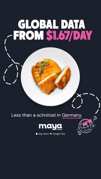
The composition is centred and symmetrical, with the plate as the clear hero. A dark navy background makes the golden food glow and keeps the white text legible. Pink is used sparingly for the price, the underline and the doodle, tying the brand accent together. Dashed flight-path lines add movement and travel context without clutter. The safe zones are respected: the headline sits below the top UI area and the logo above the bottom reply bar.
How to adapt this template for your brand
- Pick your lowest daily or unit price and set it in the headline accent colour.
- Choose an iconic, affordable local item for each target country (food, drink, ticket).
- Shoot or source a top-down hero photo on a solid background that matches your brand.
- Write the comparison line: 'Less than a [item] in [country].' and underline the country.
- Produce a series of 5–10 countries and rotate them in one ad set to fight fatigue.
Tips for travel esims ads on Meta
Run this in Instagram and Facebook Stories and Reels placements, keeping text inside the central safe area. Build a full country series and let Meta's Advantage+ creative rotation find the winner. Target interests like travel to Germany or Europe and pair with app install or conversion objectives. Add a short motion version where the dashed line animates around the plate. For Feed, create a 4:5 crop so the plate and headline stay visible.
About this creative
A vertical 9:16 story ad from Maya Mobile on a near-black navy background. At the top, a bold white and pink headline reads 'GLOBAL DATA FROM $1.67/DAY', with the price highlighted in hot pink. The centre of the frame is a top-down photo of a white plate holding a golden breaded schnitzel garnished with a sprig of rosemary. Hand-drawn white dashed lines loop around the plate like a flight path, adding motion and a travel feel. Below the food, a short line states 'Less than a schnitzel in Germany.', with 'Germany' underlined in pink. A small doodle of a globe wearing sunglasses adds personality in the corner. The Maya logo and App Store and Google Play badges sit at the bottom, signalling that this is an app-install driven creative. The design is minimal, witty and part of a repeatable country series.
Meta ad · 338 × 600 · Travel eSIMs
Maya Mobile Ad Template: Global Data for Less Than a Schnitzel
This vertical Maya Mobile ad makes a daily data price tangible by comparing it to a schnitzel in Germany. It is a playful comparison format built for Instagram and Facebook Stories, perfect for travel eSIM and app brands that want to make a small price feel concrete and memorable.
Added
All brand names and logos are property of their owners. Adplaylist is not affiliated with or endorsed by these brands.
Details
Ad copy
Primary text
Your data plan shouldn't cost more than lunch. 🌍 With Maya Mobile, global data starts at just $1.67/day – less than a schnitzel in Germany. Download the app and get connected before you land.
Description
Less than a schnitzel in Germany. Get the Maya app.
On-image text
GLOBAL DATA FROM $1.67/DAY | Less than a schnitzel in Germany. | maya mobile | App Store | Google Play
Headline ideas for this template
- 1Global data for less than a schnitzel
- 2$1.67/day keeps you online in Germany
- 3Cheaper than lunch, works in 200+ countries
- 4Eat local, stay connected
- 5Your data plan costs less than dinner
Meta image ad specs
| Placement | Ratio | Size (px) |
|---|---|---|
| Feed | 1:1 or 4:5 | 1080×1080 / 1080×1350 |
| Marketplace | 1:1 | 1200×1200 |
| Messenger inbox | 1:1 | 1200×1200 |
| Stories & Reels | 9:16 | 1080×1920 |
This template is 1:1. Request 4:5 or 9:16 to cover all placements.
Browse similar by tag