Key takeaways
- Format: Comparison — category fact versus brand fact in a two-line headline.
- Best for: Food and consumer brands launching a better-ingredient version of a familiar product.
- Hook: 'Mayo is 65% oil' surprises viewers with a fact they probably never thought about.
- Reuse it: State a little-known fact about your category, then flip it with one word about your product.
Available sizes
What is a comparison ad?
A comparison ad sets the product against an alternative, such as a competitor, the old way of doing things or a cheaper option, usually in a two-column layout or table. It helps buyers who are already weighing options see quickly why this one is the better choice.
See all comparison ads →Why this comparison ad works
- 01
One-word twist
The second line repeats the first but adds 'olive', making the upgrade obvious and memorable.
- 02
Educational hook
Most people do not know mayo is mostly oil, so the headline teaches something and earns attention.
- 03
Familiar retailer
The Amazon logo removes friction by showing the product is easy to buy from a trusted store.
- 04
Launch signal
The 'New!' starburst tells viewers this is fresh, which increases curiosity and clicks.
Full creative breakdown
Who this ad targets
This ad targets health-conscious and ingredient-aware shoppers in the US who read labels and prefer olive oil over seed oils. It also speaks to existing Graza olive oil fans who will trust a mayo from the same brand. Busy shoppers who buy groceries on Amazon are a key audience, as the retailer logo makes purchase simple. Foodies and sandwich lovers looking for a premium condiment upgrade will also find the comparison appealing.
Copywriting analysis
The copy is a textbook comparison built on parallel structure. 'Mayo is 65% oil.' states a surprising truth about the whole category. 'Ours is 65% olive oil.' repeats the line almost word for word, adding just one word to make the upgrade obvious. This repetition makes the message easy to remember and does not need any extra claims. The change in typeface between lines — bold serif to typewriter — signals a calm, factual reply. 'Available at Amazon' acts as the call to action, telling viewers exactly where to buy without a hard sell.
Visual design
A single flat mint-green background keeps the ad bold and simple. The outlined black headline stands out strongly, while the typewriter subline feels like a quieter, factual response. The two bottles sit centrally at different heights, creating balance. The dark starburst adds energy and draws the eye to the 'New' message. The Amazon logo at the bottom is large and clear, anchoring the layout and closing the reading path.
How to adapt this template for your brand
- Find a surprising, true fact about your product category.
- Write a second line that repeats the fact but changes one word to describe your product.
- Use a bold headline font for the fact and a softer font for your reply.
- Show your product centrally on a flat brand-colour background.
- Add a 'New' burst and the retailer logo where people can buy it.
Tips for food ads on Meta
On Meta, run this in Feed, Stories and Reels with interests around healthy eating, clean ingredients and Amazon shopping. Use Collaborative Ads with Amazon if available to track sales. On TikTok, reveal the first line, pause, then show the second line as a punchline for better retention. Test the comparison against a product-only version to measure the impact of the fact-based hook.
About this creative
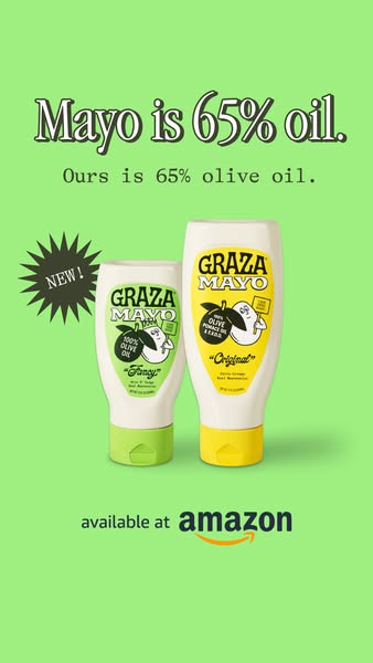
This vertical launch ad for Graza Mayo sits on a flat, bright mint-green background. At the top, a bold black serif headline with a white outline reads 'Mayo is 65% oil.' Directly underneath, a smaller typewriter-style line answers 'Ours is 65% olive oil.' The middle of the frame shows two upside-down squeeze bottles of Graza Mayo: a smaller 'Fancy' version with a green label and lime cap, made with 100% olive oil, and a taller 'Original' version with a yellow label and cap, made with olive pomace oil and extra virgin olive oil. Each label features the brand's cartoon olive character. A dark, spiky starburst on the left shouts 'New!' in cream text. At the bottom, the words 'available at' sit above a large Amazon logo with its signature smile arrow. The layout is simple and symmetrical, letting the headline's logic do the selling while the Amazon logo makes buying feel easy and familiar.
Meta ad · 1200 × 1200 · Food
Graza Mayo Ad Example: 'Mayo Is 65% Oil' Comparison
This Graza Mayo launch ad uses a clever two-line comparison: regular mayo is 65% oil, Graza's is 65% olive oil. Two squeeze bottles, a 'New!' burst and an Amazon logo sit on a bright green background. It is a vertical creative showing how one fact can drive a product launch.
Added
All brand names and logos are property of their owners. Adplaylist is not affiliated with or endorsed by these brands.
Details
Ad copy
Primary text
Mayo is 65% oil. Ours is 65% olive oil. NEW Graza Mayo — Original and Fancy — now available on Amazon. From the brand behind olive oil the way it should be.
Description
New Graza Mayo, now on Amazon.
On-image text
Mayo is 65% oil. | Ours is 65% olive oil. | NEW! | GRAZA MAYO 100% OLIVE OIL 'Fancy' | GRAZA MAYO 100% OLIVE POMACE OIL & E.V.O.O. 'Original' | available at amazon
Headline ideas for this template
- 1Mayo is 65% oil. Ours is 65% olive oil.
- 2Same mayo. Better oil.
- 3Finally, mayo made with olive oil
- 4Upgrade your mayo with one word: olive
- 5The mayo you didn't know you needed
Meta image ad specs
| Placement | Ratio | Size (px) |
|---|---|---|
| Feed | 1:1 or 4:5 | 1080×1080 / 1080×1350 |
| Marketplace | 1:1 | 1200×1200 |
| Messenger inbox | 1:1 | 1200×1200 |
| Stories & Reels | 9:16 | 1080×1920 |
This template is 1:1. Request 4:5 or 9:16 to cover all placements.
Browse similar by tag