Key takeaways
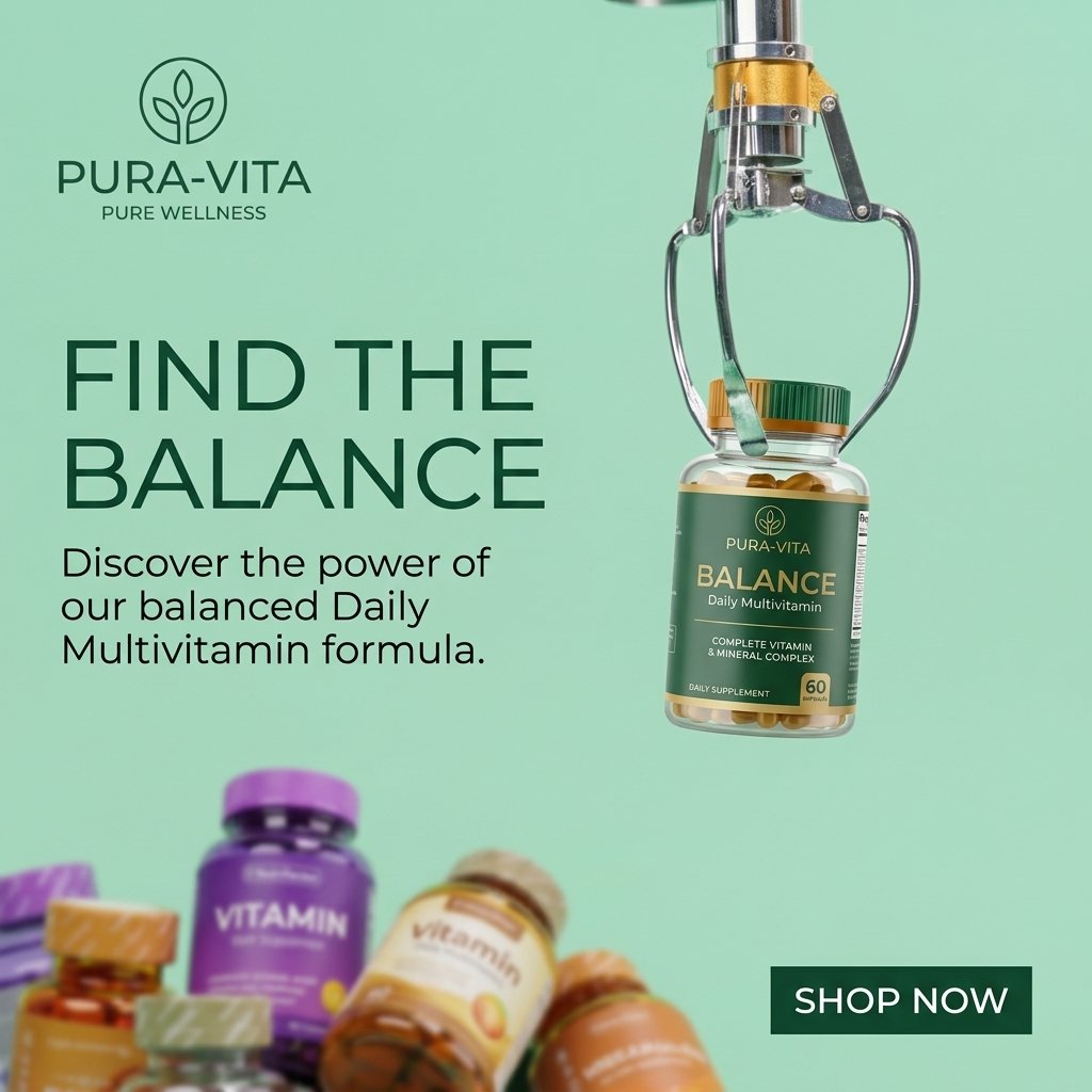
- Format: Implied comparison using a claw machine concept
- Best for: Challenger brands in crowded, commoditized categories
- Hook: An arcade claw picking the one right bottle from the pile
- Reuse it: Show your product being chosen from a blurred pile of rivals
Available sizes
What is a comparison ad?
A comparison ad sets the product against an alternative, such as a competitor, the old way of doing things or a cheaper option, usually in a two-column layout or table. It helps buyers who are already weighing options see quickly why this one is the better choice.
See all comparison ads →Why this comparison ad works
- 01
Metaphor tells the story
The claw machine instantly communicates choosing a winner from many options, without any copy.
- 02
Blur makes rivals anonymous
Out-of-focus competitor bottles feel generic, while the sharp hero product looks premium.
- 03
Playfulness stops the scroll
An unexpected arcade object in a supplement ad feels fun and memorable.
- 04
Headline doubles as metaphor
Find the Balance refers both to the product name and to finding the right choice.
Full creative breakdown
Who this ad targets
This ad targets adults aged 25 to 50 who feel overwhelmed by the number of multivitamins on store shelves and want a trustworthy pick. They may have tried supermarket brands and are open to switching. The playful concept appeals to younger, digitally native shoppers who appreciate clever creative, while the complete vitamin and mineral messaging reassures more practical buyers looking for an all-in-one formula.
Copywriting analysis
The headline, Find the Balance, ties to the product name Balance and to the visual of picking the right option. The body copy, Discover the power of our balanced Daily Multivitamin formula, explains the product but is fairly generic. The visual metaphor carries the comparison so the copy does not need to criticize competitors, which keeps it compliant and positive. Shop Now is direct. A sharper line, such as Stop guessing, start with Balance, could strengthen the comparison angle. Overall, the tone is light and witty, matching the playful visual.
Visual design
The layout splits into text on the left and the claw on the right, with the blurred pile in the bottom left creating a diagonal from crowd to hero. A flat mint background keeps the scene clean. Chrome metal adds a playful, realistic element. Dark green and gold on the hero label match the logo and button, creating cohesive branding. Depth of field separates the winner from the rest.
How to adapt this template for your brand
- Pick a visual metaphor for selection, like a claw machine, spotlight or podium.
- Show your product sharp and in focus as the chosen item.
- Place a blurred pile of generic, unbranded competitors nearby.
- Write a short headline that plays on your product name or the act of choosing.
- Use a flat brand-colored background and a single CTA button.
Tips for vitamins ads on Meta
On Meta, this concept works great as a short Reel showing the claw dropping, grabbing and lifting the bottle. For the static version, keep the claw and bottle in the top half so mobile users see it first. On TikTok, add an arcade sound effect for the hook. Avoid showing real competitor brands to stay within platform policies. Test against a straight product shot.
About this creative
This square ad uses a flat mint green background. The Pura-Vita logo, a leaf in a circle with the tagline Pure Wellness, sits in the top left in dark green. Below it, a large dark green sans-serif headline reads Find the Balance, followed by a body line inviting viewers to discover the power of the balanced Daily Multivitamin formula. In the top right, a chrome arcade claw hangs from above, its prongs gripping a clear bottle with a green cap and a dark green and gold label reading Pura-Vita Balance Daily Multivitamin, Complete Vitamin and Mineral Complex, 60 capsules. In the bottom left, a pile of other vitamin bottles in purple, orange, yellow and sage is shown out of focus, with generic Vitamin labels. The blur makes them feel anonymous compared with the sharp hero product. A dark green rectangular Shop Now button sits in the bottom right. The concept is witty, clean and easy to grasp.
Meta ad · 1200 × 1200 · Vitamins
Multivitamin Ad Template with a Claw Machine Concept
Pura-Vita's square ad shows an arcade claw lifting its Balance multivitamin out of a blurred pile of generic vitamin bottles. This comparison format playfully positions one product as the winning pick in a crowded category, ideal for brands challenging established competitors.
Added
All brand names and logos are property of their owners. Adplaylist is not affiliated with or endorsed by these brands.
Details
Ad copy
Primary text
So many vitamins, so little clarity. Pura-Vita Balance Daily Multivitamin is the one worth picking: a complete vitamin and mineral complex for everyday balance.
Description
Complete vitamin & mineral complex
On-image text
PURA-VITA PURE WELLNESS | FIND THE BALANCE | Discover the power of our balanced Daily Multivitamin formula. | PURA-VITA BALANCE Daily Multivitamin | COMPLETE VITAMIN & MINERAL COMPLEX | DAILY SUPPLEMENT | 60 | SHOP NOW
Headline ideas for this template
- 1Out of Hundreds, Pick Balance
- 2Stop Guessing. Grab the Right One.
- 3The Multivitamin Worth Choosing
- 4Win at Wellness
- 5Find Your Balance in the Pile
Meta image ad specs
| Placement | Ratio | Size (px) |
|---|---|---|
| Feed | 1:1 or 4:5 | 1080×1080 / 1080×1350 |
| Marketplace | 1:1 | 1200×1200 |
| Messenger inbox | 1:1 | 1200×1200 |
| Stories & Reels | 9:16 | 1080×1920 |
This template is 1:1. Request 4:5 or 9:16 to cover all placements.