Key takeaways
- Format: Flat-lay product shot with script headline on brand colour.
- Best for: Packaging, merch and B2B e-commerce supply products.
- Hook: Real brand designs show what your own mailer could look like.
- Reuse it: Show your product in several customer designs side by side.
Available sizes
What is a product shot ad?
A product shot ad puts the product itself at the centre of the frame, usually on a clean or styled background with little text. It works best when the packaging or product is distinctive enough to stop the scroll and the viewer already understands what it does.
See all product shot ads →Why this product shot ad works
- 01
Variety shows possibilities
Several designs side by side show the range of styles. Brands can picture their own mailer.
- 02
Real-looking brands
Mailers styled for real-looking shops feel credible. They work like mini case studies.
- 03
Friendly script headline
The handwritten “Bubble” feels personal and fun. It softens a practical B2B product.
- 04
Texture visible
You can see the bubble padding on the black mailer. It reassures buyers about product protection.
Full creative breakdown
Who this ad targets
This ad targets e-commerce brand owners, Shopify and Etsy sellers, subscription box companies and small DTC brands that ship physical products. It is also relevant for snack, cosmetics, apparel and accessories brands that care about unboxing and social sharing. Meta targeting could include interests in Shopify, e-commerce, small business, packaging design and dropshipping, plus business page admins. It works well for prospecting B2B buyers and cross-selling to existing sticker customers.
Copywriting analysis
The copy is just the product name, “Bubble Mailers”, split into a playful script word and a structured caps word. This reads like a logo and makes the product feel like a brand on its own. It is clear and direct: anyone who needs mailers understands it instantly. There are no benefits or offers on the image, so the creative relies on visuals to show customisation. The primary text should add the key buying reasons for businesses: protection, branding, low minimums, fast turnaround and free shipping.
Visual design
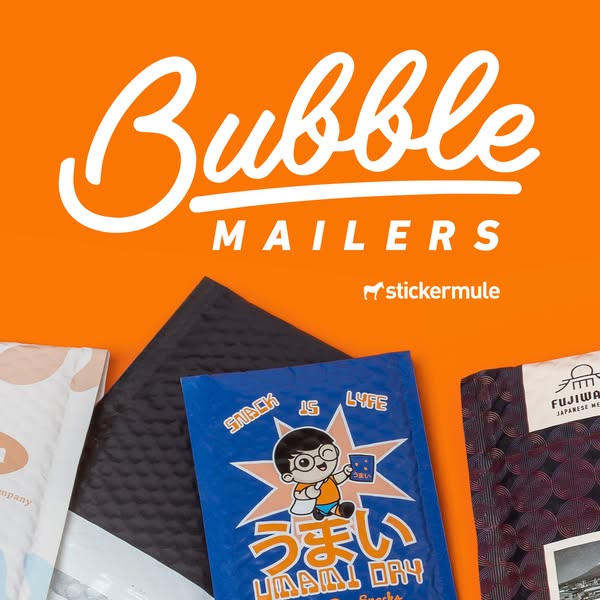
The design uses a flat, bright orange background that matches Sticker Mule's brand. The white script and caps headline create a logotype feel at the top. The mailers sit in a flat-lay row at the bottom and bleed off the frame, suggesting there are more designs beyond the image. The mix of colours, black, blue, white and dark pattern, adds contrast against orange. Natural shadows and visible textures make the products feel tactile and real.
How to adapt this template for your brand
- Lay out several customer-style versions of your product in a flat row.
- Crop them at the bottom edge so they bleed off the frame.
- Write the product name as a script plus caps logotype headline.
- Use one solid brand colour as the background.
- Add business benefits like minimums and turnaround in the primary text.
Tips for packaging ads on Meta
On Meta, run this square creative in Feed and Explore placements, where 1:1 holds attention without cropping. Keep the headline and logo inside the centre 80% so nothing gets cut by UI overlays. Pair it with a short primary text and a clear Shop Now button. Test it in Advantage+ campaigns against a 9:16 version for Stories and Reels, and refresh the creative every two to three weeks to avoid ad fatigue with high-frequency audiences.
About this creative
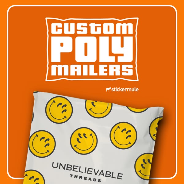
This square ad has a warm orange background with a large white script headline “Bubble” and the word “MAILERS” in spaced-out capitals underneath. A small white Sticker Mule logo sits beneath the headline on the right. The bottom half shows a row of custom bubble mailers laid flat and slightly overlapping, cropped at the bottom edge. From left to right there is a white and peach mailer, a matte black padded mailer with visible bubble texture, a blue mailer with an anime-style boy and Japanese text reading “Umami Day” and “Snack is Lyfe”, and a dark patterned mailer for a brand called Fujiwa with a Japanese building illustration. The variety of designs shows how different brands can make packaging their own. The ad is clean and product-led, aimed at e-commerce sellers who want to upgrade their unboxing experience.
Meta ad · 338 × 600 · Packaging
Bubble Mailer Ad Template: Sticker Mule Custom Packaging
This Sticker Mule ad shows a row of custom printed bubble mailers in different brand styles, from matte black to an anime-inspired “Umami Day” design. The script headline “Bubble Mailers” on orange makes it a simple, effective product-shot template for packaging and B2B e-commerce supplies.
Added
All brand names and logos are property of their owners. Adplaylist is not affiliated with or endorsed by these brands.
Details
Ad copy
Primary text
Make every delivery feel like a gift. 📦 Custom printed bubble mailers from Sticker Mule protect your products and show off your brand. Low minimums, fast turnaround and free shipping.
Description
Custom printing that kicks ass. Low minimums, free shipping.
On-image text
Bubble | Mailers | stickermule | Packaging designs: Snack is Lyfe, Umami Day, Fujiwa
Headline ideas for this template
- 1Packaging that gets unboxed on camera
- 2Your brand, padded and protected
- 3Make every delivery memorable
- 4Custom bubble mailers, made easy
- 5Ship it in style
Meta image ad specs
| Placement | Ratio | Size (px) |
|---|---|---|
| Feed | 1:1 or 4:5 | 1080×1080 / 1080×1350 |
| Marketplace | 1:1 | 1200×1200 |
| Messenger inbox | 1:1 | 1200×1200 |
| Stories & Reels | 9:16 | 1080×1920 |
This template is 1:1. Request 4:5 or 9:16 to cover all placements.
Browse similar by tag