Key takeaways
- Format: Product close-up with a material callout and vertical headline.
- Best for: Selling quality, materials and finishes to creative buyers.
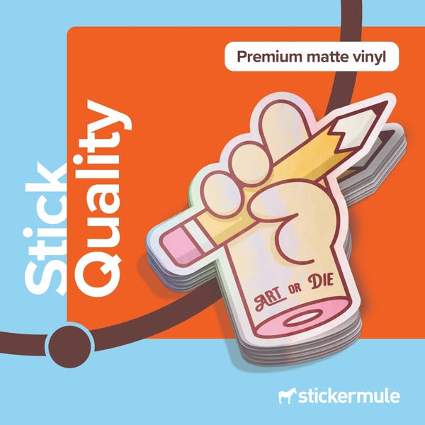
- Hook: “Stick Quality” plus the stacked product proves the claim visually.
- Reuse it: Stack your product to show thickness, layers or volume.
Available sizes
What is a product shot ad?
A product shot ad puts the product itself at the centre of the frame, usually on a clean or styled background with little text. It works best when the packaging or product is distinctive enough to stop the scroll and the viewer already understands what it does.
See all product shot ads →Why this product shot ad works
- 01
Stacked product shows depth
Stacking stickers reveals their thickness and premium feel. It is visual proof of quality rather than a claim.
- 02
Specific material callout
“Premium matte vinyl” is concrete and credible. Buyers who care about quality recognise the term.
- 03
Vertical headline breaks patterns
Rotated type is unusual in the feed. It stops the scroll and makes the layout feel designed.
- 04
Artist-friendly design
The “Art or Die” sticker speaks directly to illustrators. It signals that Sticker Mule is made for creatives.
Full creative breakdown
Who this ad targets
This ad targets illustrators, artists, designers and small creative brands who sell or give away stickers and care about print quality. It also appeals to Etsy and Shopify sellers looking for a reliable sticker supplier. Interests to target include illustration, graphic design, Procreate, art markets, Etsy selling and indie merch. Because it focuses on quality, it works well in consideration and retargeting stages, where buyers compare suppliers on finish and material.
Copywriting analysis
The headline “Stick Quality” continues the Sticker Mule series where the brand verb “stick” is paired with a single benefit. It is short, memorable and easy to repeat across creatives. The callout “Premium matte vinyl” is the only factual copy, and it does a lot of work: it names the material and the finish, which are key decision factors for artists. The sticker artwork itself, “Art or Die”, adds attitude and positions the brand as part of creative culture. The copy avoids price and urgency, so it should be paired with a primary text that adds proof (reviews, free proofs) and a direct CTA.
Visual design
The visual layout is built from flat colour blocks: a large orange rectangle overlapping a light blue background, crossed by a dark brown line with a circular dot. This creates a modern, geometric feel. The sticker stack is shot at an angle with soft shadows, giving depth against the flat background. The vertical headline balances the composition on the left, while the white label and logo anchor the right. The colours are bold but limited, keeping the product the hero.
How to adapt this template for your brand
- Stack several units of your product to show thickness or volume.
- Shoot at a slight angle with soft shadows on a flat colour background.
- Add a vertical two-word headline along one edge.
- Name the exact material or finish in a white label callout.
- Use flat colour blocks and one line element for a modern, branded layout.
Tips for printing services ads on Meta
On Meta, run this square creative in Feed and Explore placements, where 1:1 holds attention without cropping. Keep the headline and logo inside the centre 80% so nothing gets cut by UI overlays. Pair it with a short primary text and a clear Shop Now button. Test it in Advantage+ campaigns against a 9:16 version for Stories and Reels, and refresh the creative every two to three weeks to avoid ad fatigue with high-frequency audiences.
About this creative
This square ad features a close-up product shot of a stack of die cut stickers in the shape of a fist holding a yellow pencil, with the words “Art or Die” on the wrist. The stickers have a subtle holographic shimmer on the edges, and the stacking reveals their thickness and quality. The background is split into a large orange block on a light blue base, with a dark brown line and circular node running through it, matching Sticker Mule's visual system. The headline “Stick Quality” runs vertically along the left side in large blue and white letters, which is unusual and eye-catching. A white rounded label at the top right says “Premium matte vinyl”, and the white Sticker Mule logo sits bottom right. The ad is product-focused and confident, built to persuade designers and artists that their work will be printed with care and premium materials.
Meta ad · 338 × 600 · Printing Services
Premium Sticker Ad Template: Sticker Mule Stick Quality
This product shot from Sticker Mule shows a stack of holographic-edged “Art or Die” stickers with the callout “Premium matte vinyl”. The vertical headline “Stick Quality” and bold orange and blue blocks make it a strong template for brands that want to sell on material and finish.
Added
All brand names and logos are property of their owners. Adplaylist is not affiliated with or endorsed by these brands.
Details
Ad copy
Primary text
Quality that sticks. 🎨 Our premium matte vinyl stickers are thick, durable and printed with rich colour, so your art looks as good as it did on screen. Order online in minutes with free shipping.
Description
Custom printing that kicks ass. Free proofs, free shipping.
On-image text
Stick Quality | Premium matte vinyl | stickermule | Sticker design: Art or Die
Headline ideas for this template
- 1Quality you can feel
- 2Thick, matte and made to last
- 3Stickers worthy of your art
- 4Your art deserves premium vinyl
- 5Print it like you mean it
Meta image ad specs
| Placement | Ratio | Size (px) |
|---|---|---|
| Feed | 1:1 or 4:5 | 1080×1080 / 1080×1350 |
| Marketplace | 1:1 | 1200×1200 |
| Messenger inbox | 1:1 | 1200×1200 |
| Stories & Reels | 9:16 | 1080×1920 |
This template is 1:1. Request 4:5 or 9:16 to cover all placements.