Key takeaways
- Format: Text-only offer card on a solid dark background.
- Best for: Subscription apps driving trial or first-time upgrade conversions.
- Hook: A big, clear '30%' that is understood in under a second.
- Reuse it: Swap the number and product name; keep one headline and one fine-print line.
Available sizes
What is an offer ad?
An offer ad leads with a deal, such as a percentage off, free shipping or a first-order discount, as the main hook. It's built to convert people who already know the brand or are close to buying, and works best with a clear deadline or condition.
See all offer / discount ads →Why this offer / discount ad works
- 01
The number is the hero
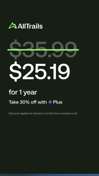
'30%' is the largest element, so the value is understood before anything else.
- 02
Premium restraint
A dark, empty canvas feels upscale and avoids the cheap look of cluttered sale banners.
- 03
Product icon as shorthand
The blue sparkle brands the Plus tier visually and builds recognition across ads.
- 04
Honest fine print
Stating 'first time members only' up front reduces checkout surprise and refund complaints.
Full creative breakdown
Who this ad targets
Free AllTrails users and lapsed visitors who already know the brand but have not paid for a subscription. The 'first time members only' line confirms this is aimed at people who have never held Plus, likely retargeting app users, website visitors and engaged social followers. It suits price-sensitive outdoor enthusiasts in the US who see value in premium features but need a nudge, especially around seasonal hiking peaks or holiday sales.
Copywriting analysis
'Save 30% on Plus' is as short as an offer can be: verb, number, product. Leading with 'Save' frames the message as a gain rather than a price. Using the tier name 'Plus' without explanation assumes awareness, which fits a retargeting audience. The fine print, 'Discount applied at checkout for first time members only', removes friction twice: no code is needed, and the eligibility is clear. There is no feature list, urgency or deadline, which keeps it clean but leaves room to test a time limit. The tone is calm and confident, consistent with a premium outdoor brand rather than a flash sale.
Visual design
The design uses a near-black green background, white headline type, a small grey fine-print line and two accent colours: the AllTrails lime-green logo and the blue Plus sparkle. Everything is left-aligned with a strong margin, giving a modern editorial feel. The headline spans two lines at a very large size for thumb-stopping legibility. The lack of imagery makes the brand colours do all the identification work, and the dark tone stands out against bright feeds.
How to adapt this template for your brand
- Decide the single offer number (percentage, price or free trial length).
- Set it as a two-line headline at the largest size the frame allows.
- Use one solid brand-dark background with your logo top-left.
- Add one line of fine print that clarifies eligibility and how the discount applies.
- Animate it into a sequence (offer → price → features) for Stories if possible.
Tips for hiking ads on Meta
Ideal for Meta Stories and Reels retargeting; keep text away from the bottom 15% UI zone. Because Meta can limit reach on text-heavy creatives, test it as one card in a carousel or an animated sequence followed by a price card. Use 'Shop Now' or 'Subscribe' as the CTA and exclude existing subscribers. On Google, use the headline as a text asset in Performance Max or App campaigns.
About this creative
A minimalist, text-only vertical ad for AllTrails' paid tier, Plus. The canvas is a deep green-black, almost charcoal, with no photography at all. The bright green AllTrails logo sits in the upper-left, followed by a huge white headline that fills the width: 'Save 30% on ✦ Plus', where a blue four-point sparkle replaces the word or acts as the Plus product icon. Below, a small grey line of fine print reads 'Discount applied at checkout for first time members only'. A faint blue gradient strip runs along the bottom edge, hinting at a frame from an animated sequence. The layout is left-aligned and very spacious, letting the percentage be the hero. Because there is no product image, the ad relies entirely on brand recognition, the strength of the offer, and the contrast between white type and the dark background. It reads like a confident, premium sale announcement rather than a loud discount banner.
Meta ad · 338 × 600 · Hiking
AllTrails Plus Discount Ad: Save 30% Text-Only Offer
This vertical AllTrails ad is a pure typographic offer: 'Save 30% on Plus' set large on a near-black green background with the brand logo and a short fine-print line. It is a no-frills discount format for Stories that subscription apps can copy for trial, upgrade or seasonal sale campaigns.
Added
All brand names and logos are property of their owners. Adplaylist is not affiliated with or endorsed by these brands.
Details
Ad copy
Primary text
Your next adventure just got cheaper. Get 30% off AllTrails Plus – offline maps, wrong-turn alerts and more. Discount applied at checkout for first-time members.
Description
First-time members only. Discount applied at checkout.
On-image text
AllTrails | Save 30% on ✦ Plus | Discount applied at checkout for first time members only
Headline ideas for this template
- 130% off Plus – this week only
- 2Upgrade your hikes for 30% less
- 3Your first year of Plus, 30% off
- 4More trail, less price: save 30%
- 5Go Plus and save 30% today
Meta image ad specs
| Placement | Ratio | Size (px) |
|---|---|---|
| Feed | 1:1 or 4:5 | 1080×1080 / 1080×1350 |
| Marketplace | 1:1 | 1200×1200 |
| Messenger inbox | 1:1 | 1200×1200 |
| Stories & Reels | 9:16 | 1080×1920 |
This template is 1:1. Request 4:5 or 9:16 to cover all placements.