Key takeaways
- Format: Vertical split with headline, stat and insurer logo wall
- Best for: Insurance-covered healthcare and telehealth services
- Hook: Dietitians, covered by insurance
- Reuse it: Swap insurer logos for partner, client or payment logos relevant to your offer
Available sizes
What is a feature callout ad?
A feature callout ad is a static image that shows a single product with short text labels pointing to its key features or benefits, usually joined to the product by thin lines. It explains several selling points at a glance without a long caption, which is why it's common for supplements, skincare, electronics and kitchenware.
See all feature callouts ads →Why this feature callouts ad works
- 01
One clear message
The ad focuses only on coverage, so viewers grasp the value in a single glance.
- 02
Concrete stat
94% pay $0 out of pocket turns a vague promise into a specific, believable proof point.
- 03
Borrowed trust from logos
Recognizable insurer logos reassure viewers and help them self-qualify instantly.
- 04
High-contrast CTA
The yellow Check your coverage button stands out against white and invites a low-effort action.
Full creative breakdown
Who this ad targets
This ad targets US adults with commercial health insurance who might benefit from nutrition support but assume a dietitian is too expensive. They may be managing weight, blood sugar, cholesterol or digestive issues. Seeing their insurer's logo creates an instant connection. It also works for retargeting people who visited Nourish but didn't book, by removing the remaining cost objection before they book.
Copywriting analysis
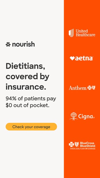
The copy is short and benefit-first. The headline, "Dietitians, covered by insurance.", combines the service and its biggest benefit in four words, ending with a period for confidence. The stat line, "94% of patients pay $0 out of pocket", adds proof with a specific number and the powerful $0. The CTA, "Check your coverage", is personal and low effort, inviting a quick eligibility check rather than a commitment. The small "check local plan for coverage" note adds a necessary qualifier without weakening the message. There are no extra features, which keeps the focus on cost.
Visual design
The layout splits vertically into a light left panel holding all text and an orange right column showing insurer logos in white. The bold dark headline uses large type with tight line spacing. A rounded yellow button adds contrast and draws attention. Logos are evenly spaced down the orange column, creating rhythm and a sense of breadth. The bright orange matches Nourish's brand and makes the ad pop in feeds.
How to adapt this template for your brand
- Lead with your single strongest benefit in a short, confident headline.
- Add one specific stat that proves it, ideally with a striking number.
- Build a logo column of partners, insurers or clients your audience recognizes.
- Use your brand color for the logo column and a contrasting color for the CTA button.
- Confirm you have rights to display partner logos and add any required coverage disclaimers.
Tips for telehealth ads on Meta
This 9:16 version suits Instagram and Facebook Stories; a 4:5 version with logos in a row works for Feed. On Google Display, resize to 300×600 half-page where the vertical logo column fits naturally. Make sure the 94% claim is documented and current. Pair the ad with a landing page that has an instant insurance checker to keep momentum from the CTA.
About this creative
This vertical story creative from Nourish focuses entirely on one message: dietitian visits can be covered by insurance. The canvas is split into a light grey-white left panel and a bright orange right column. On the left, the Nourish logo sits above a bold three-line headline, "Dietitians, covered by insurance.", set in a dark sans-serif. Below it, a supporting stat claims that 94% of patients pay $0 out of pocket, giving a concrete, believable number. A rounded yellow button reading "Check your coverage" provides a clear next step. The orange right column acts as a logo wall, stacking white versions of major US insurer logos: UnitedHealthcare, Aetna, Anthem, Cigna and BlueCross BlueShield, with a small note to check local plan coverage. These familiar brands borrow trust and help viewers instantly see whether their plan is likely included. The design is simple, scannable and built to remove the biggest barrier to booking a dietitian: cost.
Meta ad · 338 × 600 · Telehealth
Dietitians Covered by Insurance Ad Template
This Nourish ad leads with insurance coverage for registered dietitians, backed by a 94% $0 out-of-pocket stat and a column of major insurer logos. The vertical split layout suits Stories and display placements. Use it as a template for any service where cost coverage is the strongest selling point.
Added
All brand names and logos are property of their owners. Adplaylist is not affiliated with or endorsed by these brands.
Details
Ad copy
Primary text
Did you know your insurance may cover a registered dietitian? 94% of Nourish patients pay $0 out of pocket. Check your coverage in under a minute.
Description
94% of patients pay $0 out of pocket
On-image text
nourish | Dietitians, covered by insurance. | 94% of patients pay $0 out of pocket. | Check your coverage | United Healthcare | aetna | Anthem | Cigna | BlueCross BlueShield – CHECK LOCAL PLAN FOR COVERAGE
Headline ideas for this template
- 1Your dietitian could cost $0
- 294% of our patients pay nothing out of pocket
- 3See a dietitian with the insurance you already have
- 4Covered by UnitedHealthcare, Aetna, Cigna and more
- 5Check if your plan covers a dietitian
Meta image ad specs
| Placement | Ratio | Size (px) |
|---|---|---|
| Feed | 1:1 or 4:5 | 1080×1080 / 1080×1350 |
| Marketplace | 1:1 | 1200×1200 |
| Messenger inbox | 1:1 | 1200×1200 |
| Stories & Reels | 9:16 | 1080×1920 |
This template is 1:1. Request 4:5 or 9:16 to cover all placements.