Key takeaways
- Format: Offer / discount story ad with a product lineup.
- Best for: Flash sales on gear with multiple colorways.
- Hook: A huge '20% OFF' that reads in under a second.
- Reuse it: Swap the texture, offer and product row; keep the type stack.
Available sizes
What is an offer ad?
An offer ad leads with a deal, such as a percentage off, free shipping or a first-order discount, as the main hook. It's built to convert people who already know the brand or are close to buying, and works best with a clear deadline or condition.
See all offer / discount ads →Why this offer / discount ad works
- 01
The offer is the headline
'20% OFF' is the largest element on screen, so the value is clear before the viewer even knows the brand.
- 02
Colorways sell choice
Showing four colors turns one product into a personal decision and hints at use cases from car to tactical.
- 03
Texture sets the tone
The concrete background signals durability and preparedness, matching a rugged, outdoor-ready audience.
- 04
Room for native UI
The black lower third keeps Stories buttons and captions from covering the product or offer.
Full creative breakdown
Who this ad targets
The ad targets US preparedness-minded buyers: outdoor enthusiasts, hunters, campers, overlanders, gun owners, veterans and families who want a serious kit for the car or home. The tactical colorways and MOLLE details speak to people who value gear that looks rugged, not clinical. The discount makes it relevant for warm audiences who have already browsed My Medic and need a nudge, and for holiday or gift shoppers looking for a practical present.
Copywriting analysis
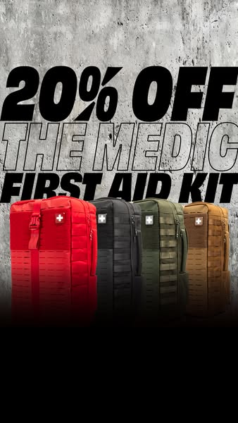
The copy is stripped back to eight words: offer, product name and category. '20% OFF' comes first because the discount is the reason to act now. 'THE MEDIC' is treated as a proper product name in outline type, building brand recognition for a hero SKU, while 'FIRST AID KIT' clarifies the category for cold viewers who have never heard of it. There are no benefits or claims on the image, which works because the product is visually self-explanatory and the primary text can carry details. The weakness is the lack of urgency – adding an end date or 'this week only' would strengthen the push.
Visual design
Heavy, condensed italic sans-serif type in black and white creates a sporty, energetic feel. Alternating solid and outlined lines builds hierarchy without adding colors. The concrete texture provides contrast and grit, and the red kit on the far left pulls the eye first. The black gradient at the bottom grounds the composition and protects the safe zone. The palette stays restrained so the four product colors stand out.
How to adapt this template for your brand
- Choose a textured background that fits your brand tone (concrete, wood, fabric).
- Stack your offer and product name in three lines of heavy type, alternating solid and outline.
- Cut out your product in every color or variant and line them up below the text.
- Fade the bottom 25–30% to a solid color to keep the 9:16 safe zone clear.
- Add an end date or urgency line in the primary text and test against a no-discount version.
Tips for first aid ads on Meta
Built for Meta Stories and Reels placements. Keep key text out of the top 14% and bottom 20% of the frame so profile bars and CTA buttons don't cover it. Pair it with a 'Shop Now' CTA and a Meta catalog to show the exact colorway viewers click. For retargeting, exclude recent purchasers and cap frequency. A 4:5 crop of the same layout works for Feed placements if you shrink the headline slightly.
About this creative
This 9:16 story ad from My Medic is built around a single message: 20% off The Medic First Aid Kit. The top half is a grey, weathered concrete texture that gives the creative a rugged, tactical feel. Over it sits a three-line headline in heavy, condensed italic type: a solid black '20% OFF', an outlined 'THE MEDIC', and a solid 'FIRST AID KIT'. The mix of filled and outlined lettering creates rhythm and keeps the product name prominent without competing with the discount. Below the text, four versions of the same backpack-style kit stand side by side in red, black, ranger green and coyote tan, each with a white cross patch and MOLLE webbing. The bottom third fades to solid black, leaving clean space for platform UI, captions or a CTA sticker. There is no logo or button on the image itself, so the ad relies on the offer, the recognizable product and the platform's native call to action.
Meta ad · 338 × 600 · First Aid
My Medic 20% Off First Aid Kit Ad Example
This vertical My Medic ad promotes The Medic first aid kit with a straight 20% discount. It uses an oversized offer headline over a concrete texture and lines up four colorways of the kit. Use it as a template for Stories and Reels discount ads for gear, safety or outdoor products.
Added
All brand names and logos are property of their owners. Adplaylist is not affiliated with or endorsed by these brands.
Details
Ad copy
Primary text
Be ready for anything. The Medic packs 450+ professional-grade supplies into one rugged bag – now 20% off in red, black, green and coyote.
Description
Professional-grade kit, 4 colorways
On-image text
20% OFF THE MEDIC FIRST AID KIT
Headline ideas for this template
- 1Ready for anything – now 20% off
- 2Pick your color. Save 20%.
- 3The Medic: 450+ supplies, 20% off
- 4Your car's missing one thing
- 5Pro-grade first aid, sale price
Meta image ad specs
| Placement | Ratio | Size (px) |
|---|---|---|
| Feed | 1:1 or 4:5 | 1080×1080 / 1080×1350 |
| Marketplace | 1:1 | 1200×1200 |
| Messenger inbox | 1:1 | 1200×1200 |
| Stories & Reels | 9:16 | 1080×1920 |
This template is 1:1. Request 4:5 or 9:16 to cover all placements.
Browse similar by tag