Key takeaways
- Format: Spec-sheet feature callout ad with offer.
- Best for: Higher-priced products that need rational proof.
- Hook: HSA/FSA approved – pay with pre-tax money.
- Reuse it: Offer bar on top, four callouts, product, CTA footer.
Available sizes
What is a feature callout ad?
A feature callout ad is a static image that shows a single product with short text labels pointing to its key features or benefits, usually joined to the product by thin lines. It explains several selling points at a glance without a long caption, which is why it's common for supplements, skincare, electronics and kitchenware.
See all feature callouts ads →Why this feature callouts ad works
- 01
HSA/FSA eligibility
Mentioning pre-tax payment removes a price objection and adds an extra reason to buy now.
- 02
Scannable features
Four short callouts answer the main questions buyers have in seconds.
- 03
Technical credibility
Grid lines and a spec-sheet style make the kit feel professional, not consumer-grade.
- 04
Group coverage
'Cover up to 10 people' frames the kit as a family or team solution, raising perceived value.
Full creative breakdown
Who this ad targets
The ad targets US buyers who research before buying: families, team managers, coaches, small offices, outdoor groups and preparedness-minded shoppers. The HSA/FSA callout is especially relevant to people with health savings or flexible spending accounts looking to use funds before year-end. Detail-oriented buyers who compare kit specs will appreciate the rational, feature-led approach.
Copywriting analysis
The copy blends offer and rational proof. '20% OFF' leads, then four feature lines that each address a buying objection: cost (HSA/FSA approved), completeness (over 450 supplies), capability (wound closure) and scale (up to 10 people). Short, all-caps phrasing reads like spec labels. The footer repeats '450 medical supplies' for emphasis. The lowercase 'shop now >' feels casual and native to social, though a stronger contrast could make it pop more.
Visual design
A muted grey and charcoal palette with sage green accents gives a modern, technical look. Fine linework, circles and grid lines create an editorial structure. The vertical 'THE MEDIC' type adds a fashion-magazine touch. The red open kit is the only saturated element, drawing the eye. Top and bottom bars frame the content and mimic a product label.
How to adapt this template for your brand
- List your top four buying reasons and shorten each to five words or fewer.
- Build a grid layout with thin lines and a dark top bar for your offer.
- Run your product name vertically along one edge in a light accent color.
- Place the product photo as the only saturated element in a muted palette.
- Add a footer bar with a key stat on the left and a CTA button on the right.
Tips for first aid ads on Meta
Built for Meta Stories and Reels. The callouts are small, so check readability on mobile and keep them above the bottom 20%. Run HSA/FSA messaging heavily in Q4, when people rush to spend remaining funds. Use this feature-led version for retargeting and comparison shoppers, and the bold offer version for prospecting.
About this creative
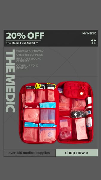
This 9:16 story ad from My Medic is styled like a technical spec sheet. A grey background holds a framed layout with thin lines, circles and grid marks, giving it an engineered, editorial feel. The top bar is dark charcoal with '20% OFF' in large white type and 'The Medic First Aid Kit //' underneath, the My Medic wordmark and a small cross icon on the right. Down the left edge, 'THE MEDIC' runs vertically in large pale green letters. Beside it, four short feature callouts in small caps list: HSA/FSA approved, over 450 supplies, includes wound closure, and cover up to 10 people. The open red kit fills the lower center, showing organized pouches of medical supplies. At the bottom, a footer bar reads 'over 450 medical supplies' on the left and a sage green 'shop now >' button on the right. The ad balances an offer with rational, feature-led persuasion.
Meta ad · 338 × 600 · First Aid
My Medic The Medic Feature Callouts Ad Example
This vertical My Medic ad combines a 20% off offer with four feature callouts for The Medic first aid kit: HSA/FSA approved, over 450 supplies, wound closure included and coverage for up to 10 people. Its technical, spec-sheet design is a smart template for products where features justify the price.
Added
All brand names and logos are property of their owners. Adplaylist is not affiliated with or endorsed by these brands.
Details
Ad copy
Primary text
HSA/FSA approved, 450+ supplies, wound closure included and enough to cover up to 10 people. Get 20% off The Medic today.
Description
HSA/FSA approved, covers up to 10 people
On-image text
20% OFF The Medic First Aid Kit // MY MEDIC. THE MEDIC. HSA/FSA APPROVED. OVER 450 SUPPLIES. INCLUDES WOUND CLOSURE. COVER UP TO 10 PEOPLE. over 450 medical supplies. shop now >
Headline ideas for this template
- 1Use your HSA/FSA – save 20%
- 2Covers up to 10 people
- 3450+ supplies, wound closure included
- 4Spend your FSA before it expires
- 5The kit built for families and teams
Meta image ad specs
| Placement | Ratio | Size (px) |
|---|---|---|
| Feed | 1:1 or 4:5 | 1080×1080 / 1080×1350 |
| Marketplace | 1:1 | 1200×1200 |
| Messenger inbox | 1:1 | 1200×1200 |
| Stories & Reels | 9:16 | 1080×1920 |
This template is 1:1. Request 4:5 or 9:16 to cover all placements.
Browse similar by tag