Key takeaways
- Format: Customer case study with floating feature callouts
- Best for: B2B SaaS and fintech brands with a famous or relatable customer
- Hook: A recognizable sports brand plus concrete automation numbers
- Reuse it: Swap in your customer photo, logo lockup and three real product metrics
Available sizes
What is a feature callout ad?
A feature callout ad is a static image that shows a single product with short text labels pointing to its key features or benefits, usually joined to the product by thin lines. It explains several selling points at a glance without a long caption, which is why it's common for supplements, skincare, electronics and kitchenware.
See all feature callouts ads →Why this feature callouts ad works
- 01
Borrowed trust
The Broncos name and stadium setting lend instant credibility, making a finance tool feel proven at a big organization.
- 02
Numbers as UI
Stats styled as app notifications show the product in action and make the results feel live and specific.
- 03
Purpose over features
The headline links automation to community impact, giving the message an emotional reason beyond saving time.
- 04
Clear split layout
Photo on top and a solid navy text panel below keep the story readable even at small mobile sizes.
Full creative breakdown
Who this ad targets
Finance leaders at nonprofits, foundations and mid-market organizations: CFOs, controllers, AP managers and executive directors who juggle tight budgets and manual invoice work. They care about accuracy and transparency for boards and donors, and they want proof that a platform works for an organization like theirs. The sports brand also catches the eye of general business decision-makers scrolling LinkedIn who may not be actively looking for spend software yet.
Copywriting analysis
The headline 'Powering impact beyond the field' is a smart play on the Broncos setting: it moves the story from football to the Foundation's mission. Italicizing 'beyond' in orange pulls the eye and echoes the team color. The supporting line names the benefit directly, real-time financial visibility, and ties it to an outcome, serving the community. The on-image chips do the hard selling with specific numbers rather than vague claims like 'save time'. Odd, precise figures such as 1,340 and 87 feel real. There is no hard CTA on the image, which keeps the tone editorial and lets the platform button do the work.
Visual design
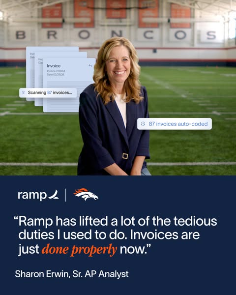
A natural, well-lit portrait sits in the top 60% with the stadium wall giving context. The subject's navy dress matches the bottom panel, creating color unity. Floating white chips with small Ramp icons break the photo frame and add depth. The lower panel uses clean white sans-serif with one orange serif italic accent, a typographic contrast that feels premium. Logos are small and placed above the headline, so the brand reads first without shouting.
How to adapt this template for your brand
- Pick a recognizable customer and get a confident on-location portrait.
- Choose three real, specific metrics your product produced for them.
- Style the metrics as UI chips from your app and place them around the person.
- Add a solid brand-color panel with a co-branded logo lockup and a short mission headline.
- Highlight one word in an accent color and test versions with different stats.
Tips for fintech ads on Meta
Customer stories perform well on LinkedIn, where finance leaders follow industry peers; promote this as a Single Image Ad to CFOs, Controllers and AP managers at nonprofits and mid-market companies. On Meta, use it for retargeting website visitors who did not book a demo, since social proof helps late-stage doubters. Pair the image with a link to the full case study and test it next to the other Broncos variations.
About this creative
This portrait ad from Ramp tells a customer story through one strong photo. A smiling woman, the executive director of the Broncos Foundation, stands on the team's indoor practice field holding an orange-and-white Broncos helmet under her arm. The giant BRONCOS lettering on the wall behind her makes the partnership instantly recognizable. Three white UI chips float around her like product notifications: 1,340 line items auto-filled, 43 bills released and 87 invoices auto-coded. These chips borrow the look of the Ramp app, so the viewer sees the product working without a screenshot. The lower third is a deep navy panel with the Ramp and Broncos logos side by side, the headline 'Powering impact beyond the field' with 'beyond' set in orange italic serif, and a supporting line about real-time financial visibility helping the Foundation serve its community. The ad blends emotional purpose with hard automation proof, which is exactly what finance buyers need.
Meta ad · 338 × 600 · Fintech
Ramp x Broncos case study ad with feature callouts
This Ramp ad turns a customer story into a scroll-stopping creative. The Broncos Foundation's executive director stands on the practice field while floating UI chips show automation results. Use this feature callout format to prove product value with real numbers in B2B SaaS and fintech campaigns on Meta and LinkedIn.
Added
All brand names and logos are property of their owners. Adplaylist is not affiliated with or endorsed by these brands.
Details
Ad copy
Primary text
The Denver Broncos Foundation runs on real-time financial data. With Ramp, 1,340 line items were auto-filled, 87 invoices auto-coded and 43 bills released, so the team spends less time on admin and more time serving their community. Make expense management easy with Ramp's spend management platform.
Description
See how the Broncos Foundation uses Ramp
On-image text
1,340 line items auto-filled | 43 bills released | 87 invoices auto-coded | ramp | [Broncos logo] | Powering impact beyond the field | Real-time financial visibility helps the Broncos Foundation serve their community.
Headline ideas for this template
- 1How the Broncos Foundation closes the books faster
- 287 invoices coded. Zero manual entry.
- 3Real-time finance for real-world impact
- 4From the field to the books: Ramp at the Broncos
- 5Less admin, more community impact
Meta image ad specs
| Placement | Ratio | Size (px) |
|---|---|---|
| Feed | 1:1 or 4:5 | 1080×1080 / 1080×1350 |
| Marketplace | 1:1 | 1200×1200 |
| Messenger inbox | 1:1 | 1200×1200 |
| Stories & Reels | 9:16 | 1080×1920 |
This template is 1:1. Request 4:5 or 9:16 to cover all placements.