Key takeaways
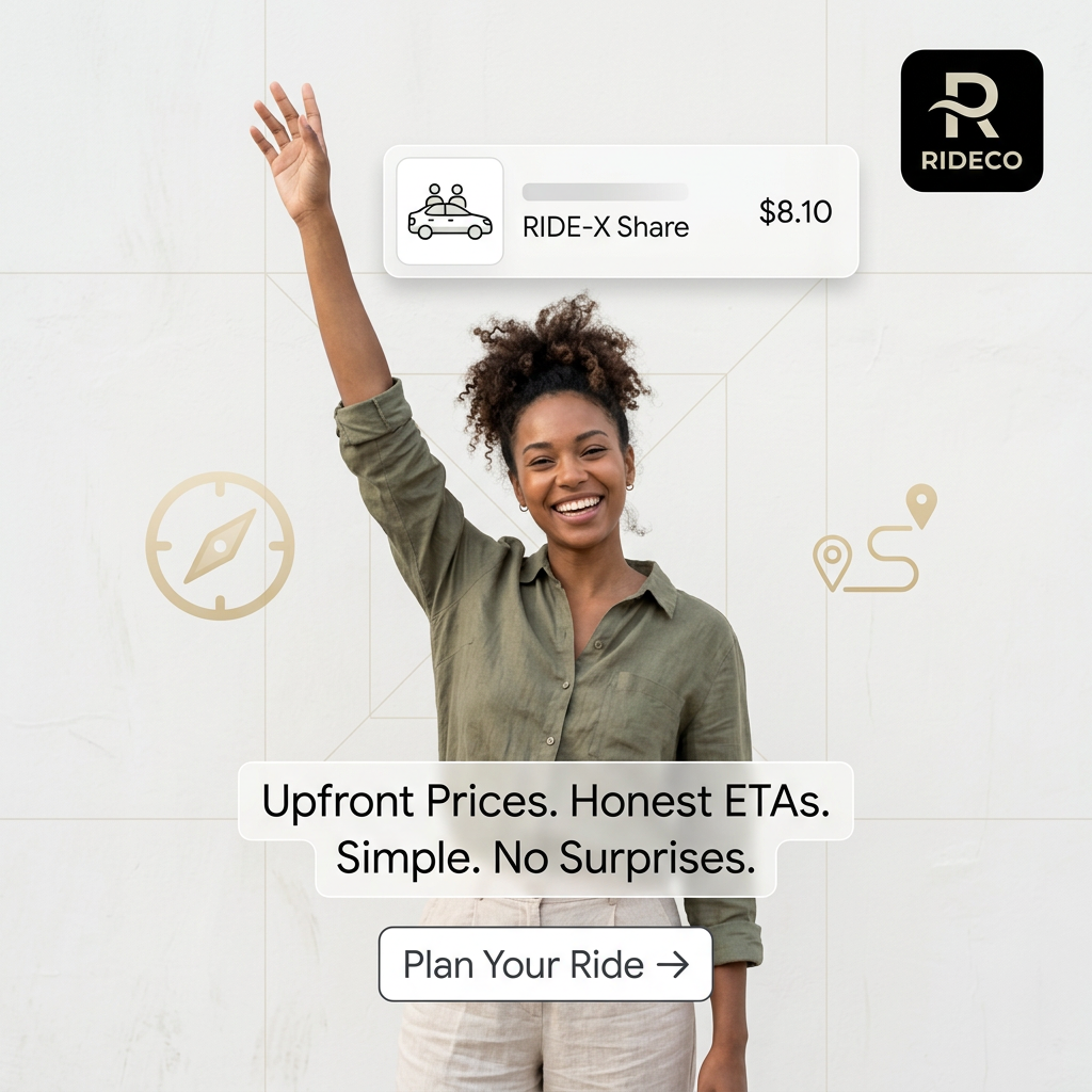
- Format: Lifestyle portrait with floating app UI and short benefit callouts.
- Best for: App install campaigns where pricing transparency is the main differentiator.
- Hook: A real fare card ($8.10) above a smiling, hand-raised rider.
- Reuse it: Show one concrete in-app number and stack three short promises underneath.
Available sizes
What is a feature callout ad?
A feature callout ad is a static image that shows a single product with short text labels pointing to its key features or benefits, usually joined to the product by thin lines. It explains several selling points at a glance without a long caption, which is why it's common for supplements, skincare, electronics and kitchenware.
See all feature callouts ads →Why this feature callouts ad works
- 01
Concrete price proof
Showing an actual fare makes "upfront prices" tangible and lets viewers judge value instantly.
- 02
Gesture matches action
The raised hand is the universal sign for hailing a ride, so the product is understood without reading.
- 03
Addresses a known pain
"No surprises" quietly targets surge pricing and unreliable ETAs, common frustrations with ride apps.
- 04
In-app look builds familiarity
Frosted UI cards preview the app experience, lowering the mental barrier to downloading.
Full creative breakdown
Who this ad targets
Urban adults aged roughly 20–40 in US cities who use ride-hailing regularly but are frustrated by surge pricing and inaccurate arrival times. They are budget-aware, open to shared rides, and likely already have Uber or Lyft installed. The ad aims to win switchers and price-comparers by promising predictability, and also appeals to newcomers who want a simple, trustworthy first ride.
Copywriting analysis
The copy is built from four very short statements: "Upfront prices. Honest ETAs. Simple. No surprises." Each is a promise and each implicitly contrasts with competitors. "Honest" is a strong trust word that suggests others are not. The staccato rhythm makes it easy to scan in under two seconds. The UI card adds proof with a specific price, which is far more persuasive than "low fares." The CTA "Plan your ride →" is softer than "Download now," framing the action as planning rather than committing. A minor weakness is repetition: "Simple" and "No surprises" overlap; one could be replaced by a feature such as "Shared rides from $8."
Visual design
A centred portrait composition with the subject as the vertical axis. UI cards and icons float symmetrically around her, creating a balanced, app-like layout. The palette is off-white with olive, beige and muted gold accents, giving a premium, calm tone unusual for ride-hailing. Frosted glass panels echo modern iOS design. Clean sans-serif typography and thin-line icons keep the look light and legible.
How to adapt this template for your brand
- Photograph a person doing the core action of your app (hailing, ordering, booking) against a plain wall.
- Mock up one real in-app card showing a specific price or result.
- Write three to four two-word promises that address competitor pain points.
- Add your app icon top right and thin-line icons related to your service.
- Finish with an outlined button CTA that uses a soft action verb.
Tips for apps & subscriptions ads on Meta
On Meta, use an app install objective and keep the fare example consistent with your store screenshots. Test variations with different ride prices or a first-ride discount. On TikTok, recreate it as a person hailing, then a screen recording of the fare appearing. On Google App campaigns, provide the UI card as a separate asset and use "Upfront prices" as a headline.
About this creative
This square ad from ride-hailing app RIDECO centres on a young woman with curly hair, wearing an olive linen shirt, smiling broadly with one arm raised as if hailing a car. She stands against a light, minimal wall with faint geometric lines. Above her, a frosted-glass UI card mimics the app: a small car icon, the ride type "RIDE-X Share" and a price of $8.10. In the top right corner sits the RIDECO app icon, a black rounded square with a gold R. Thin gold line icons of a compass and a route with map pins float either side of her, reinforcing navigation. Across her waist, frosted text boxes read "Upfront prices. Honest ETAs. Simple. No surprises." Below is an outlined button: "Plan your ride →". The overall feel is light, optimistic and premium, using gold accents and translucent UI elements to make a price-transparency message feel modern and trustworthy.
Meta ad · 1200 × 1200 · Apps & Subscriptions
Ride-Share App Ad: Upfront Prices and Honest ETAs
This square app ad from RIDECO promotes a ride-sharing service built on transparency. A smiling woman hails a ride while a floating UI card shows a shared fare of $8.10. Short callouts promise upfront prices and honest ETAs. Use it as a template for app install and trust-focused campaigns.
Added
All brand names and logos are property of their owners. Adplaylist is not affiliated with or endorsed by these brands.
Details
Ad copy
Primary text
See your fare before you book and know exactly when your driver arrives. RIDECO gives you upfront prices, honest ETAs and shared rides from $8.10. No surge surprises.
Description
Simple rides with no surprises. Download the app.
On-image text
RIDECO | RIDE-X Share $8.10 | Upfront prices. Honest ETAs. Simple. No surprises. | Plan your ride →
Headline ideas for this template
- 1Know your fare before you go
- 2Rides with zero surge surprises
- 3Your driver, right on time
- 4Shared rides from $8
- 5Honest rides, honest prices
Meta image ad specs
| Placement | Ratio | Size (px) |
|---|---|---|
| Feed | 1:1 or 4:5 | 1080×1080 / 1080×1350 |
| Marketplace | 1:1 | 1200×1200 |
| Messenger inbox | 1:1 | 1200×1200 |
| Stories & Reels | 9:16 | 1080×1920 |
This template is 1:1. Request 4:5 or 9:16 to cover all placements.